matplotlib
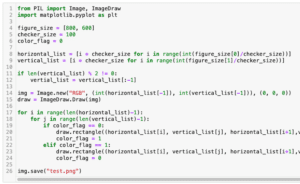
前回、Pillow(PIL)でチェッカーパターン(格子柄)を作成する方法を紹介しました。
今回はmatplotlibを使って印刷できる乱数表を作成する方法を紹介します。
それでは始めていきましょう。
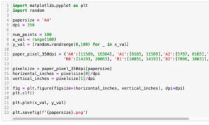
プログラム全体
まずはプログラム全体をお見せします。
import random
import matplotlib.pyplot as plt

num_row = 20
num_column = 50
orientation = "horizontal" #vertical or horizontal
fontsize = 12

dpi = 350
paper_size = [2894, 4093] #A4

number_list = [["" for _ in range(num_column)]]
for _ in range(num_row):
    number_list_in_row = [random.randrange(0, 10) for _ in range(num_column)]
    number_list.append(number_list_in_row)

if orientation == "vertical":
    fig_size = (paper_size[0]/dpi, paper_size[1]/dpi)
elif orientation == "horizontal":
    fig_size = (paper_size[1]/dpi, paper_size[0]/dpi)

fig = plt.figure(figsize=fig_size, dpi=dpi)
for row_num, row in enumerate(number_list):
    for colum_num, number in enumerate(row):
        plt.text(colum_num/len(row), row_num/len(number_list), number, fontsize=fontsize)

plt.gca().axis("off")
plt.savefig("randompaper.png")
今回もそれほど長いプログラムではないので、自己関数は無しです。
ライブラリのインポートと設定部分
まずはライブラリのインポートですが、今回はmatplotlibとrandomを使います。
import random
import matplotlib.pyplot as plt
そして次に設定部分ですが、いくつか設定項目があります。
num_row = 20
num_column = 50
orientation = "horizontal" #vertical or horizontal
fontsize = 12

dpi = 350
paper_size = [2894, 4093] #A4
「num_row」は行の数、「num_column」は列の数、「orientation」は紙の方向(縦向き:vertical、横向き:horizontal)、「fontsize」は数字のフォントサイズです。
ここまでは個々人で結構変更する項目だと思います。
「dpi」は解像度、「paper_size」は設定したdpi時のピクセル数です。
今回は350 dpiで1つの辺が2894ピクセル、もう一つの辺が4093ピクセルでこれはA4のサイズです。
もしA3とか他のサイズが良い場合はここの値を変えてください。
乱数の作成
次に乱数の作成です。
number_list = [["" for _ in range(num_column)]]
for _ in range(num_row):
    number_list_in_row = [random.randrange(0, 10) for _ in range(num_column)]
    number_list.append(number_list_in_row)
ここでは行ごとにリストにまとめてそれを「number_list」というリストに格納していきます。
ただmatplotlibを使って数字を配置して行ったときに、上下の余白の差が気になることから1行目(一番下の行)は空白になるようにしています。
number_list = [["" for _ in range(num_column)]]その後、行の数だけfor文で処理を繰り返しますが、そこではrandomモジュールとリスト内包表記で1行分の乱数を取得し、「number_list」に格納しています。
for _ in range(num_row):
    number_list_in_row = [random.randrange(0, 10) for _ in range(num_column)]
    number_list.append(number_list_in_row)
matplotlibを使った乱数表の作成
次にmatplotlibを使って乱数を表示していきます。
if orientation == "vertical":
    fig_size = (paper_size[0]/dpi, paper_size[1]/dpi)
elif orientation == "horizontal":
    fig_size = (paper_size[1]/dpi, paper_size[0]/dpi)

fig = plt.figure(figsize=fig_size, dpi=dpi)
for row_num, row in enumerate(number_list):
    for colum_num, number in enumerate(row):
        plt.text(colum_num/len(row), row_num/len(number_list), number, fontsize=fontsize)

plt.gca().axis("off")
plt.savefig("randompaper.png")
最初にグラフサイズを定義しますが、こちらの記事で紹介した通りmatplotlibで使われるサイズは「インチ」です。
そしてインチは「ピクセル数/dpi」で計算されるため、設定部分ではdpiとピクセル数を設定したわけです。
次に指定した紙の方向より縦のインチ数と横のインチ数を取得します。
if orientation == "vertical":
    fig_size = (paper_size[0]/dpi, paper_size[1]/dpi)
elif orientation == "horizontal":
    fig_size = (paper_size[1]/dpi, paper_size[0]/dpi)
そして取得した縦横のインチ数を用い、グラフサイズを設定し、plt.textを使って数値を配置していきます。
fig = plt.figure(figsize=fig_size, dpi=dpi)
for row_num, row in enumerate(number_list):
    for colum_num, number in enumerate(row):
        plt.text(colum_num/len(row), row_num/len(number_list), number, fontsize=fontsize)
最後にmatplotlibで自動で出力される枠線やらなんやらを「plt.gca().axis(“off”)」で全て消して、画像を保存しておしまいです。
plt.gca().axis("off")
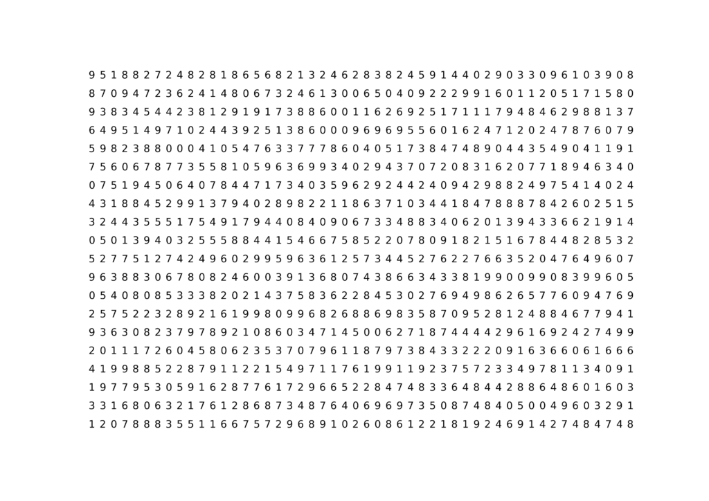
plt.savefig("randompaper.png")これで出力するとこんな感じの画像が出力されます。
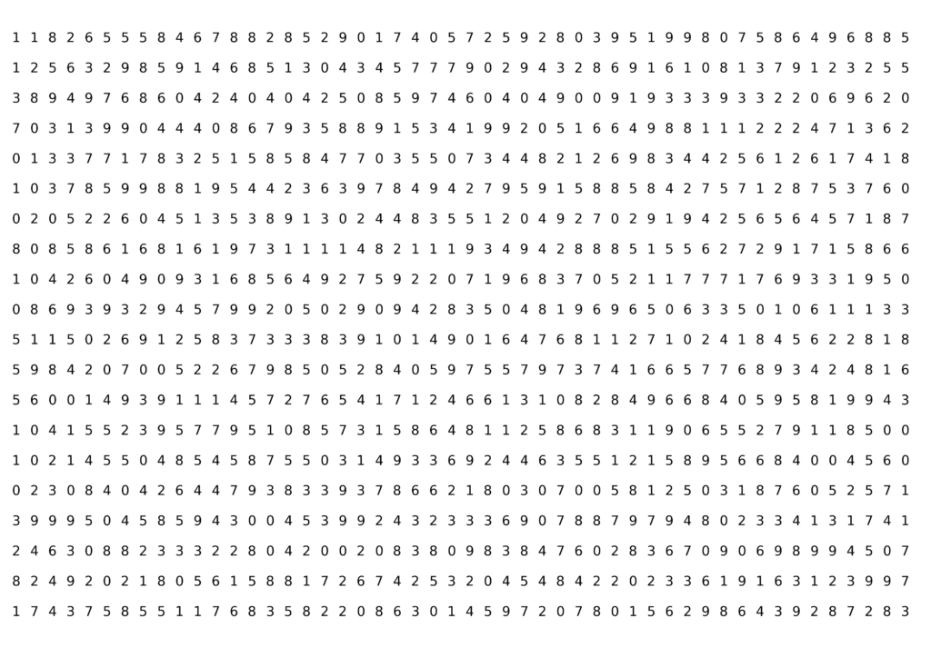
ちなみに紙の縁ギリギリまで使いたい方は「fig.tight_layout()」を「plt.savefig()」の前に追加するとこんな感じになります。
次回はカラーコードのRGBとHexを相互変換する方法を紹介します。
ではでは今回はこんな感じで。
コメント