matplotlib
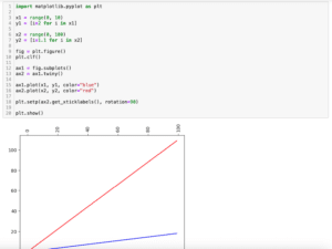
前回、PythonのmatplotlibでX軸を2本にした場合の目盛りを傾ける方法を紹介しました。
今回はmatplotlibでY軸を2本にした際、Y軸を片側に寄せる方法を紹介します。
まずはY軸が2本のグラフですが、「ax1 = fig.subplots()」と「ax2 = ax1.twinx()」で作成します。
import matplotlib.pyplot as plt

x = range(0, 10)
y1 = [i*2 for i in x]
y2 = [i**3 for i in x]

fig = plt.figure()
plt.clf()

ax1 = fig.subplots()
ax2 = ax1.twinx()

ax1.plot(x, y1, c="blue")
ax2.plot(x, y2, c="red")

plt.show()

実行結果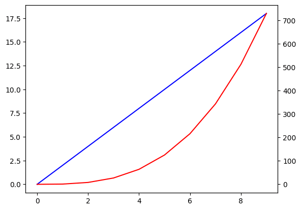
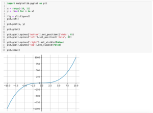
それでは始めていきましょう。
2本のY軸をグラフの左側に表示する方法
まずは2本のY軸をグラフの左側に表示してみましょう。
その場合、2本目のY軸を「ax2.spines[“left”].set_position((“axes”, -0.15))」と「ax2.yaxis.set_ticks_position(‘left’)」で左側に移動します。
import matplotlib.pyplot as plt

x = range(0, 10)
y1 = [i*2 for i in x]
y2 = [i**3 for i in x]

fig = plt.figure()
plt.clf()

ax1 = fig.subplots()
ax2 = ax1.twinx()

ax1.plot(x, y1, c="blue")
ax2.plot(x, y2, c="red")

ax2.spines["left"].set_position(("axes", -0.15))
ax2.yaxis.set_ticks_position('left')

plt.show()

実行結果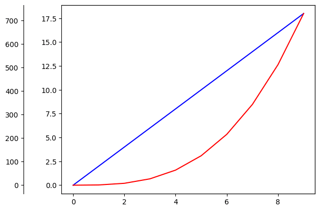
ちなみに「ax2.spines[“left”].set_position((“axes”, -0.15))」は軸の線を左側に動かします。
import matplotlib.pyplot as plt

x = range(0, 10)
y1 = [i*2 for i in x]
y2 = [i**3 for i in x]

fig = plt.figure()
plt.clf()

ax1 = fig.subplots()
ax2 = ax1.twinx()

ax1.plot(x, y1, c="blue")
ax2.plot(x, y2, c="red")

ax2.spines["left"].set_position(("axes", -0.15))

plt.show()

実行結果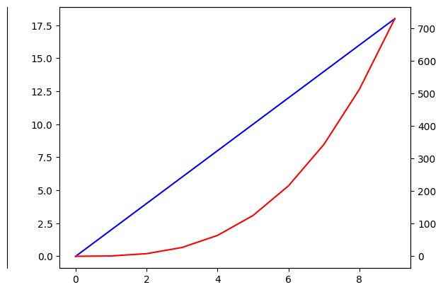
また「ax2.yaxis.set_ticks_position(‘left’)」は目盛りを左側に動かします。
import matplotlib.pyplot as plt

x = range(0, 10)
y1 = [i*2 for i in x]
y2 = [i**3 for i in x]

fig = plt.figure()
plt.clf()

ax1 = fig.subplots()
ax2 = ax1.twinx()

ax1.plot(x, y1, c="blue")
ax2.plot(x, y2, c="red")

ax2.yaxis.set_ticks_position('left')

plt.show()

実行結果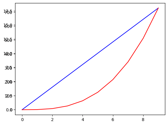
軸のラベルを表示する場合は「ax1.set_ylabel(“1本目のY軸のラベル”)」、「ax2.set_ylabel(“2本目のY軸のラベル”)」を使いますが、動かした2本目のY軸はラベルも別途動かす必要があることに注意してください。
その場合は「ax2.yaxis.set_label_position(‘left’)」を使います。
import matplotlib.pyplot as plt

x = range(0, 10)
y1 = [i*2 for i in x]
y2 = [i**3 for i in x]

fig = plt.figure()
plt.clf()

ax1 = fig.subplots()
ax2 = ax1.twinx()

ax1.plot(x, y1, c="blue")
ax2.plot(x, y2, c="red")

ax1.set_ylabel("ax1 label")
ax2.set_ylabel("ax2 label")

ax2.spines["left"].set_position(("axes", -0.15))
ax2.yaxis.set_ticks_position('left')

ax2.yaxis.set_label_position('left')

plt.show()

実行結果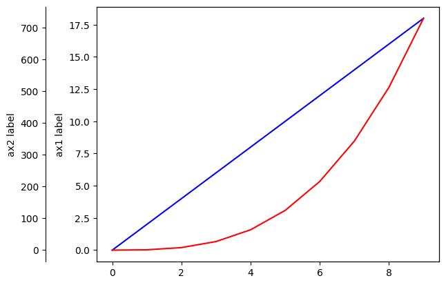
「ax2.yaxis.set_label_position(‘left’)」を忘れると軸のラベルだけ右側に残ります。
import matplotlib.pyplot as plt

x = range(0, 10)
y1 = [i*2 for i in x]
y2 = [i**3 for i in x]

fig = plt.figure()
plt.clf()

ax1 = fig.subplots()
ax2 = ax1.twinx()

ax1.plot(x, y1, c="blue")
ax2.plot(x, y2, c="red")

ax1.set_ylabel("ax1 label")
ax2.set_ylabel("ax2 label")

ax2.spines["left"].set_position(("axes", -0.15))
ax2.yaxis.set_ticks_position('left')

plt.show()

実行結果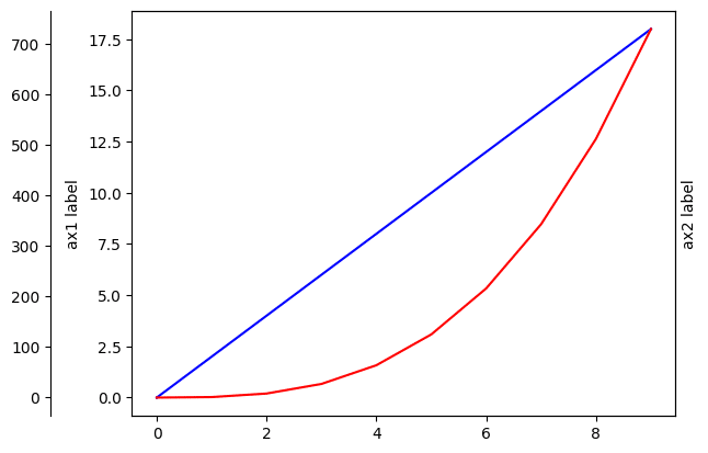
2本のY軸をグラフの右側に表示する方法
次に2本のY軸をグラフの右側に表示する方法です。
右側に表示する場合は「ax1.spines[“right”].set_position((“axes”, 1.15))」、「ax1.yaxis.set_ticks_position(‘right’)」、「ax1.yaxis.set_label_position(‘right’)」を使って1本目のY軸を右側に動かします。
import matplotlib.pyplot as plt

x = range(0, 10)
y1 = [i*2 for i in x]
y2 = [i**3 for i in x]

fig = plt.figure()
plt.clf()

ax1 = fig.subplots()
ax2 = ax1.twinx()

ax1.plot(x, y1, c="blue")
ax2.plot(x, y2, c="red")

ax1.set_ylabel("ax1 label")
ax2.set_ylabel("ax2 label")

ax1.spines["right"].set_position(("axes", 1.15))
ax1.yaxis.set_ticks_position('right')
ax1.yaxis.set_label_position('right')

plt.show()

実行結果
ただしこれだと1本目のY軸が外側に、2本目のY軸が内側になってしまいます。
逆に1本目のY軸を内側に、2本目のY軸を外側にするには、「ax1.spines[“right”].set_position((“axes”, 1))」、「ax2.spines[“right”].set_position((“axes”, 1.15))」として2本とも動かしてあげます。
import matplotlib.pyplot as plt

x = range(0, 10)
y1 = [i*2 for i in x]
y2 = [i**3 for i in x]

fig = plt.figure()
plt.clf()

ax1 = fig.subplots()
ax2 = ax1.twinx()

ax1.plot(x, y1, c="blue")
ax2.plot(x, y2, c="red")

ax1.set_ylabel("ax1 label")
ax2.set_ylabel("ax2 label")

ax1.spines["right"].set_position(("axes", 1))
ax1.yaxis.set_ticks_position('right')
ax1.yaxis.set_label_position('right')

ax2.spines["right"].set_position(("axes", 1.15))

plt.show()

実行結果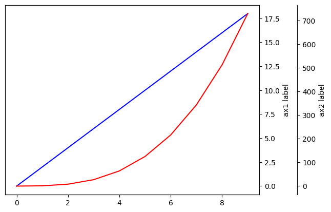
次回はmatplotlibでグラフの中心に軸を配置する方法を紹介します。
ではでは今回はこんな感じで。
コメント