subplots_adjust
前回、subplot、subplotsでの凡例の表示方法を解説しました。
今回は前に「今度解説します」と言っていたグラフ間の隙間の調整方法を解説していきます。
コマンドとしては「subplots_adjust」を使いますが、これはsubplot、subplotsの両方で使えますので、今回はsubplotsを使った例のみ紹介します。
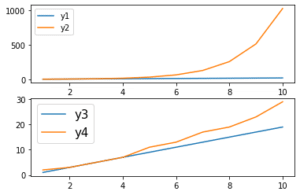
ということで基本のプログラムはこれ。
from matplotlib import pyplot as plt

x = [1, 2, 3, 4, 5, 6, 7, 8, 9, 10]
y1 = [2, 4, 6, 8, 10, 12, 14, 16, 18, 20]
y2 = [2, 4, 8, 16, 32, 64, 128, 256, 512, 1024]
y3 = [1, 3, 5, 7, 9, 11, 13, 15, 17, 19]
y4 = [2, 3, 5, 7, 11, 13, 17, 19, 23, 29]

fig = plt.figure()
axes= fig.subplots(2,2)

axes[0][0].plot(x, y1, label="y1")
axes[0][1].plot(x, y2, label="y2")
axes[1][0].plot(x, y3, label="y3")
axes[1][1].plot(x, y4, label="y4")

plt.suptitle("title")

plt.show()

実行結果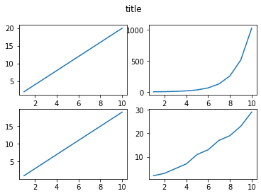
と言うことで試していきましょう。
上下のサイズの調整:Top、bottom
まずはグラフの上下を変えてみましょう。
その場合はsubplots_adjustの括弧の中に「top = X」とか「bottom = X」として調整します。
まずは上側を変えてみましょう。
from matplotlib import pyplot as plt

x = [1, 2, 3, 4, 5, 6, 7, 8, 9, 10]
y1 = [2, 4, 6, 8, 10, 12, 14, 16, 18, 20]
y2 = [2, 4, 8, 16, 32, 64, 128, 256, 512, 1024]
y3 = [1, 3, 5, 7, 9, 11, 13, 15, 17, 19]
y4 = [2, 3, 5, 7, 11, 13, 17, 19, 23, 29]

fig = plt.figure()
axes= fig.subplots(2,2)

axes[0][0].plot(x, y1, label="y1")
axes[0][1].plot(x, y2, label="y2")
axes[1][0].plot(x, y3, label="y3")
axes[1][1].plot(x, y4, label="y4")

plt.suptitle("title")

plt.subplots_adjust(top=0.5)

plt.show()

実行結果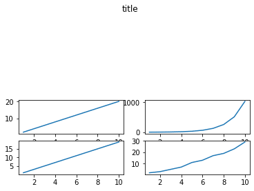
グラフの一番上が上から半分までの位置になりました。
次に下側を変えてみましょう。
from matplotlib import pyplot as plt

x = [1, 2, 3, 4, 5, 6, 7, 8, 9, 10]
y1 = [2, 4, 6, 8, 10, 12, 14, 16, 18, 20]
y2 = [2, 4, 8, 16, 32, 64, 128, 256, 512, 1024]
y3 = [1, 3, 5, 7, 9, 11, 13, 15, 17, 19]
y4 = [2, 3, 5, 7, 11, 13, 17, 19, 23, 29]

fig = plt.figure()
axes= fig.subplots(2,2)

axes[0][0].plot(x, y1, label="y1")
axes[0][1].plot(x, y2, label="y2")
axes[1][0].plot(x, y3, label="y3")
axes[1][1].plot(x, y4, label="y4")

plt.suptitle("title")

plt.subplots_adjust(bottom=0.5)

plt.show()

実行結果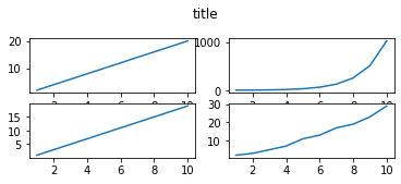
今度は上側は変わらずグラフの一番下が下から半分までの位置になりました。
ただし空白部分は削除され、単に縦に圧縮された形になっています。
ちなみに何も説明せずに数値を入力していますが、これは比率になっているので注意してください。
つまり1は元のサイズに対して1倍、つまり100%。
0.5だと元のサイズの50%、つまり半分のサイズになります。
では1より大きい数を入力したらどうなるでしょうか。
ということで「subplots_adjust(top = 2)」を試してみましょう。
from matplotlib import pyplot as plt

x = [1, 2, 3, 4, 5, 6, 7, 8, 9, 10]
y1 = [2, 4, 6, 8, 10, 12, 14, 16, 18, 20]
y2 = [2, 4, 8, 16, 32, 64, 128, 256, 512, 1024]
y3 = [1, 3, 5, 7, 9, 11, 13, 15, 17, 19]
y4 = [2, 3, 5, 7, 11, 13, 17, 19, 23, 29]

fig = plt.figure()
axes= fig.subplots(2,2)

axes[0][0].plot(x, y1, label="y1")
axes[0][1].plot(x, y2, label="y2")
axes[1][0].plot(x, y3, label="y3")
axes[1][1].plot(x, y4, label="y4")

plt.suptitle("title")

plt.subplots_adjust(top=2)

plt.show()

実行結果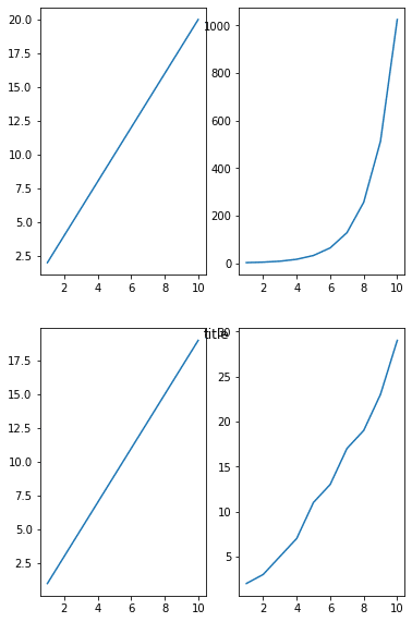
縦に2倍に引き伸ばされました。
しかし注意しなければいけないのは、subtitleで表示した「title」と言う文字は同じ場所にあるということ。
subplots_adjustでグラフサイズを調整したとしても、他の場所が調整が必要になることもあるようです。
左右のサイズの調整:right、left
左右のサイズの調整をするには、right = X、left = Xを使用します。
例えば右からのサイズを設定してみましょう。
from matplotlib import pyplot as plt

x = [1, 2, 3, 4, 5, 6, 7, 8, 9, 10]
y1 = [2, 4, 6, 8, 10, 12, 14, 16, 18, 20]
y2 = [2, 4, 8, 16, 32, 64, 128, 256, 512, 1024]
y3 = [1, 3, 5, 7, 9, 11, 13, 15, 17, 19]
y4 = [2, 3, 5, 7, 11, 13, 17, 19, 23, 29]

fig = plt.figure()
axes= fig.subplots(2,2)

axes[0][0].plot(x, y1, label="y1")
axes[0][1].plot(x, y2, label="y2")
axes[1][0].plot(x, y3, label="y3")
axes[1][1].plot(x, y4, label="y4")

plt.suptitle("title")

plt.subplots_adjust(right=0.5)

plt.show()

実行結果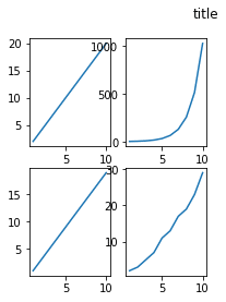
グラフの右端が右から50%の位置になったため、「title」の位置が右端に来たかのような図になりました。
でも「title」の位置が変わっているのではなく、あくまでもグラフのサイズが変わっていることに注意してください。
次に左からの距離を変えてみましょう。
from matplotlib import pyplot as plt

x = [1, 2, 3, 4, 5, 6, 7, 8, 9, 10]
y1 = [2, 4, 6, 8, 10, 12, 14, 16, 18, 20]
y2 = [2, 4, 8, 16, 32, 64, 128, 256, 512, 1024]
y3 = [1, 3, 5, 7, 9, 11, 13, 15, 17, 19]
y4 = [2, 3, 5, 7, 11, 13, 17, 19, 23, 29]

fig = plt.figure()
axes= fig.subplots(2,2)

axes[0][0].plot(x, y1, label="y1")
axes[0][1].plot(x, y2, label="y2")
axes[1][0].plot(x, y3, label="y3")
axes[1][1].plot(x, y4, label="y4")

plt.suptitle("title")

plt.subplots_adjust(left=0.5)

plt.show()

実行結果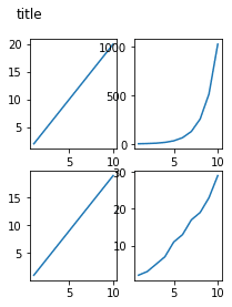
今度はグラフの左端が左から50%の位置になったので、「title」の位置が左に移動したかのような図になりました。
こちらもあくまでもグラフのサイズが変わったということに注意してください。
グラフ間の距離の調整:wspace、hspace
グラフ間の距離の調整をする場合、wspace、hspaceを使います。
wspaceは横方向、hspaceは縦方向の調整ができます。
まずはwspaceを試してみましょう。
from matplotlib import pyplot as plt

x = [1, 2, 3, 4, 5, 6, 7, 8, 9, 10]
y1 = [2, 4, 6, 8, 10, 12, 14, 16, 18, 20]
y2 = [2, 4, 8, 16, 32, 64, 128, 256, 512, 1024]
y3 = [1, 3, 5, 7, 9, 11, 13, 15, 17, 19]
y4 = [2, 3, 5, 7, 11, 13, 17, 19, 23, 29]

fig = plt.figure()
axes= fig.subplots(2,2)

axes[0][0].plot(x, y1, label="y1")
axes[0][1].plot(x, y2, label="y2")
axes[1][0].plot(x, y3, label="y3")
axes[1][1].plot(x, y4, label="y4")

plt.suptitle("title")

plt.subplots_adjust(wspace=1)

plt.show()

実行結果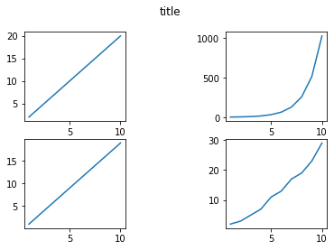
この場合それぞれのグラフの横方向を1として、グラフ間の横方向を指定するようです。
そのため「wspace = 1」とした場合グラフ間の横方向の隙間が同じだけ空くということになります。
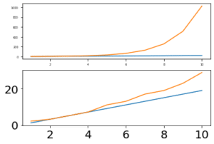
次にhspaceを試してみましょう。
from matplotlib import pyplot as plt

x = [1, 2, 3, 4, 5, 6, 7, 8, 9, 10]
y1 = [2, 4, 6, 8, 10, 12, 14, 16, 18, 20]
y2 = [2, 4, 8, 16, 32, 64, 128, 256, 512, 1024]
y3 = [1, 3, 5, 7, 9, 11, 13, 15, 17, 19]
y4 = [2, 3, 5, 7, 11, 13, 17, 19, 23, 29]

fig = plt.figure()
axes= fig.subplots(2,2)

axes[0][0].plot(x, y1, label="y1")
axes[0][1].plot(x, y2, label="y2")
axes[1][0].plot(x, y3, label="y3")
axes[1][1].plot(x, y4, label="y4")

plt.suptitle("title")

plt.subplots_adjust(hspace=1)

plt.show()

実行結果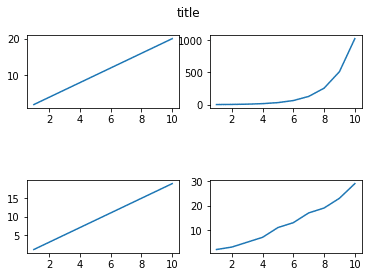
「hspace = 1」とした場合、グラフ間の縦方向の隙間がグラフの縦方向のサイズと同じだけ空きます。
subplots_adjustまとめ
図でまとめてみるとこんな感じです。
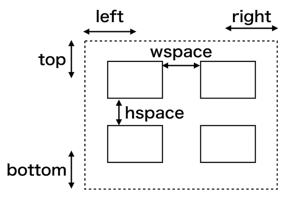
この関係性を覚えておけば、グラフや文字が被ったときでも、グラフを見やすく配置することができると思います。
次回はsubplots、subplotを使った際の軸の数値のサイズを変更する方法を解説していきます。
ということで今回はこんな感じで。
コメント