2軸グラフの表示
前にpythonのグラフ操作ライブラリmatplotlibを使って、色々なグラフの表示を解説しました。

今になって思ったのが2軸グラフというのをまだ紹介していなかったこと。
2軸グラフがどんなグラフかというとこんなグラフです。
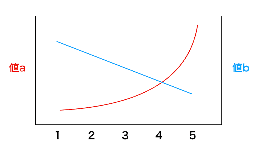
一つのXの値に対して、二つのYデータがあるとき、左右に違う軸を使って表示します。
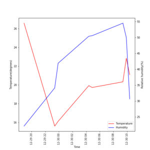
ちなみにこの2軸グラフは温度・湿度ロガーのデータを表示した際にも紹介しています。
その際はあくまでも温度・湿度ロガーのデータ解析がメインだったので、せっかくならちゃんと2軸グラフの作り方を解説しておこうというのが今回の趣旨です。
まずは準備と1軸グラフではダメな理由
ということで始めていきましょう。
pythonでグラフを表示する際に使用するライブラリは「matplotlib」 で、その中の「pyplot」モジュールを使用します。
まずはmatplotlibのpyplotをインポートします。
from matplotlib import pyplot as plt「as plt」とすることで「pyplot」と書かなくても「plt」と書くことで「pyplot」と書いたのと同じことができる様になります。
つまり省略形ということです。
このmatplotlibのpyplotは慣例的に「plt」とするので、ここでもその様に省略形を用いましょう。
次にデータを決めます。
今回はなるべく単純に、だけど2軸にする意味があるデータとしましょう。
x = [1, 2, 3, 4, 5, 6, 7, 8, 9, 10]
y1 = [2, 4, 6, 8, 10, 12, 14, 16, 18, 20]
y2 = [2, 4, 8, 16, 32, 64, 128, 256, 512, 1024]
xは単に1から10までの数字を並べてみました。
yの値は二ついるので、y1、y2として、y1は2ずつ増加するリストに、y2は倍々になっていくリストにしてみました。
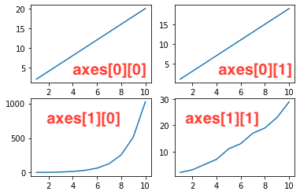
これを単純にグラフ表示してみるとこんな感じになります。
from matplotlib import pyplot as plt

x = [1, 2, 3, 4, 5, 6, 7, 8, 9, 10]
y1 = [2, 4, 6, 8, 10, 12, 14, 16, 18, 20]
y2 = [2, 4, 8, 16, 32, 64, 128, 256, 512, 1024]

fig = plt.figure()

plt.plot(x, y1)
plt.plot(x, y2)

plt.show()

実行結果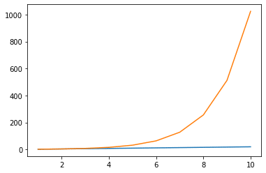
これではy2の変化が大きいため、グラフの縦軸の数値が大きくなりすぎてしまい、y1の変化が見えなくなってしまっています。
2軸グラフとするとこのy1の変化も分かりやすく表示することができます。
2軸グラフを表示してみよう
2軸グラフを表示するにはこんな感じのプログラムになります。
fig = plt.figure()

ax1 = fig.subplots()
ax2 = ax1.twinx()

ax1.plot(x, y1)
ax2.plot(x, y2)

plt.show()
まずは「ax1 = fig.subplots()」で第一軸(左側のy軸)を作ります。
この時に使うsubplotsとは、複数の別のグラフを表示する際に用いるコマンドです。
subplotsに関してはまた今後、詳細を解説していきたいと思います。
今回は2軸を表示する際にはこうするんだなと思ってもらえれば大丈夫です。
第二軸(右側のy軸)を作るのが次の「ax2 = ax1.twinx()」です。
nxという名前だと「ax1. twinx()」だと、ax1に対して異なるX軸をもつもう一つのグラフを作り出すと考えてしまうかもしれませんが、名前の由来は実は違います。
Matplotlibの公式ページを見てみるとこう書いてあります。
Create a twin Axes sharing the xaxis
https://matplotlib.org/3.1.1/api/_as_gen/matplotlib.axes.Axes.twinx.html
つまりX軸が共通で、もう一つのY軸を作り出すというのが名前の由来のようです。
とりあえずこうして1つのX軸を共通にもつ2つのY軸のグラフができました。
そしてそれぞれのグラフ(ax1、ax2)にデータをプロットします。
ax1.plot(x, y1)
ax2.plot(x, y2)
そしてplt.show()で表示するというわけです。
全体を書いてみるとこんな感じになります。
from matplotlib import pyplot as plt

x = [1, 2, 3, 4, 5, 6, 7, 8, 9, 10]
y1 = [2, 4, 6, 8, 10, 12, 14, 16, 18, 20]
y2 = [2, 4, 8, 16, 32, 64, 128, 256, 512, 1024]

fig = plt.figure()

ax1 = fig.subplots()
ax2 = ax1.twinx()

ax1.plot(x, y1)
ax2.plot(x, y2)

plt.show()

実行結果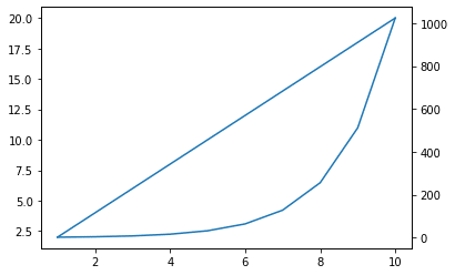
確かに2本グラフが表示され、y1もy2の変化量が大幅に違うのにちゃんと変化しているグラフが得られました。
ここで気になるのは、最初のグラフではそれぞれの線が異なる色で書かれていました。

しかし2軸グラフでは同じ色で書かれています。
これは最初のグラフ(Y軸が1軸のグラフ)では一つのグラフに対して2つのデータが表示されているため、1つ目のデータ、2つ目のデータと認識され、自動で色分けしてくれています。
それに対し、最後のグラフ(Y軸が2軸のグラフ)では、二つのグラフを用意して、それぞれに一つずつグラフを表示させているため、どちらも1番目のデータと認識されてしまっています。
そのため、1番目のデータを表示する薄い青を使ってグラフを表示しているのです。
ということでグラフの色を変える方法を解説していきます。
グラフの線の色を変える方法
実はグラフの線の色や太さを変える方法は前に解説しています。

これは2軸グラフになっても有効で、データをプロットするコマンドで、「color=”色の名前”」か「c=”色の名前”」とすると色を変えることができます。
ax1.plot(x, y1, color="blue")
ax2.plot(x, y2, c="r")
全体のコードはこうなります。
from matplotlib import pyplot as plt

x = [1, 2, 3, 4, 5, 6, 7, 8, 9, 10]
y1 = [2, 4, 6, 8, 10, 12, 14, 16, 18, 20]
y2 = [2, 4, 8, 16, 32, 64, 128, 256, 512, 1024]

fig = plt.figure()

ax1 = fig.subplots()
ax2 = ax1.twinx()

ax1.plot(x, y1, color="blue")
ax2.plot(x, y2, c="r")

plt.show()

実行結果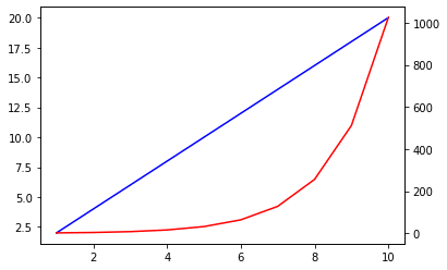
色が変わりました。
この様に線の色を変えるだけでなく、太さや点線にするなどは普通のグラフのコマンドが使えますので、前の解説ページを参考にしてみてください。
凡例を表示する方法
ただし、凡例を表示する方法だけはちょっと工夫が必要です。
普通のグラフに対しての凡例の表示の仕方はこちらのページで解説しています。

plotの中に「label=”凡例名”」を追加することでそれぞれのデータの名前を指定し、別の行にplt.legend()とすることで表示するということです。
2軸グラフで同じことを試してみましょう。
from matplotlib import pyplot as plt

x = [1, 2, 3, 4, 5, 6, 7, 8, 9, 10]
y1 = [2, 4, 6, 8, 10, 12, 14, 16, 18, 20]
y2 = [2, 4, 8, 16, 32, 64, 128, 256, 512, 1024]

fig = plt.figure()

ax1 = fig.subplots()
ax2 = ax1.twinx()

ax1.plot(x, y1, color="blue", label="a")
ax2.plot(x, y2, c="r", label="b")
plt.legend()

plt.show()

実行結果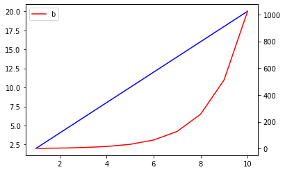
二つ目のグラフ(y2)の凡例は表示されましたが、一つ目のグラフ(y1)の凡例は見当たりません。
これは二つの凡例がかぶってしまっているためで、それを修正するにはplotの返り値を取得し、「plt.legend()」のオプション引数に「handles=[返り値1, 返り値2…]」とするとそれぞれのグラフの凡例をまとめて表示できる様になります。
from matplotlib import pyplot as plt

x = [1, 2, 3, 4, 5, 6, 7, 8, 9, 10]
y1 = [2, 4, 6, 8, 10, 12, 14, 16, 18, 20]
y2 = [2, 4, 8, 16, 32, 64, 128, 256, 512, 1024]

fig = plt.figure()

ax1 = fig.subplots()
ax2 = ax1.twinx()

l1, = ax1.plot(x, y1, color="blue", label="a")
l2, = ax2.plot(x, y2, c="r", label="b")

plt.legend(handles=[l1, l2])

plt.show()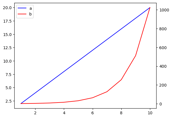
ちなみに色々調べてみるとこの様なコマンドを使う方法が多数出てきます。
h1, l1 = ax1.get_legend_handles_labels()
h2, l2 = ax2.get_legend_handles_labels()
ax1.legend(h1 + h2, l1 + l2)
こちらの方法でも凡例を表示できるのですが、どうやら古い方法のようです。
ちなみに試してみるとこんな感じです。
from matplotlib import pyplot as plt

x = [1, 2, 3, 4, 5, 6, 7, 8, 9, 10]
y1 = [2, 4, 6, 8, 10, 12, 14, 16, 18, 20]
y2 = [2, 4, 8, 16, 32, 64, 128, 256, 512, 1024]

fig = plt.figure()

ax1 = fig.subplots()
ax2 = ax1.twinx()

ax1.plot(x, y1, color="blue", label="a")
ax2.plot(x, y2, c="r", label="b")

h1, l1 = ax1.get_legend_handles_labels()
h2, l2 = ax2.get_legend_handles_labels()
ax1.legend(h1 + h2, l1 + l2)

plt.show()

実行結果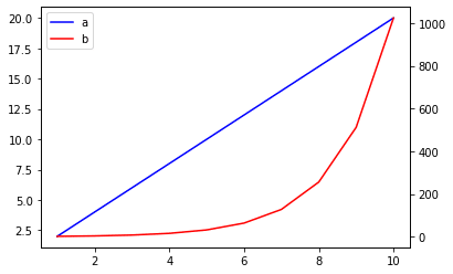
ちなみに凡例のサイズや位置は通常と同じ様に変更できますので、こちらの記事を参考にしてみてください。
多分、それぞれの凡例の相対的な位置をずらして表示していると思うのですが、正直よく分かりません。
とりあえず上のコマンドで2軸グラフの凡例は表示できるということで勘弁してください。
タイトルの表示
タイトルを表示するのは、普通のグラフと同じで「plt.title(“タイトル”)」です。
from matplotlib import pyplot as plt

x = [1, 2, 3, 4, 5, 6, 7, 8, 9, 10]
y1 = [2, 4, 6, 8, 10, 12, 14, 16, 18, 20]
y2 = [2, 4, 8, 16, 32, 64, 128, 256, 512, 1024]

fig = plt.figure()

ax1 = fig.subplots()
ax2 = ax1.twinx()

ax1.plot(x, y1, color="blue", label="a")
ax2.plot(x, y2, c="r", label="b")

plt.title("Title")
h1, l1 = ax1.get_legend_handles_labels()
h2, l2 = ax2.get_legend_handles_labels()
ax1.legend(h1 + h2, l1 + l2)

plt.show()

実行結果
ということで詳細はこちらの記事を参考にしてください。
X軸名の表示
次にX軸名を表示してみましょう。
普通のグラフでは「plt.xlabel(“X軸名”)」なので、まずはこれを試してみましょう。
from matplotlib import pyplot as plt

x = [1, 2, 3, 4, 5, 6, 7, 8, 9, 10]
y1 = [2, 4, 6, 8, 10, 12, 14, 16, 18, 20]
y2 = [2, 4, 8, 16, 32, 64, 128, 256, 512, 1024]

fig = plt.figure()

ax1 = fig.subplots()
ax2 = ax1.twinx()

ax1.plot(x, y1, color="blue", label="a")
ax2.plot(x, y2, c="r", label="b")

plt.title("Title")

plt.xlabel("X-axis")

h1, l1 = ax1.get_legend_handles_labels()
h2, l2 = ax2.get_legend_handles_labels()
ax1.legend(h1 + h2, l1 + l2)

plt.show()

実行結果
ん?X軸名が表示されません。
実は2軸グラフの場合は「グラフ名.set_xlabel(“X軸名”)」を用います。
今回はax1、ax2というグラフがありますので、「ax1.set_xlabel(“X軸名”)」となります。
from matplotlib import pyplot as plt

x = [1, 2, 3, 4, 5, 6, 7, 8, 9, 10]
y1 = [2, 4, 6, 8, 10, 12, 14, 16, 18, 20]
y2 = [2, 4, 8, 16, 32, 64, 128, 256, 512, 1024]

fig = plt.figure()

ax1 = fig.subplots()
ax2 = ax1.twinx()

ax1.plot(x, y1, color="blue", label="a")
ax2.plot(x, y2, c="r", label="b")

plt.title("Title")

ax1.set_xlabel("X-axis")

h1, l1 = ax1.get_legend_handles_labels()
h2, l2 = ax2.get_legend_handles_labels()
ax1.legend(h1 + h2, l1 + l2)

plt.show()

実行結果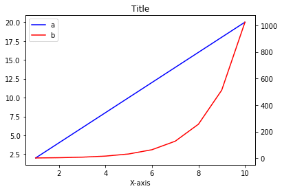
確かに表示されました。
ではax1でないといけないのでしょうか?ax2ではダメなのでしょうか?
ということで試してみましょう。
from matplotlib import pyplot as plt

x = [1, 2, 3, 4, 5, 6, 7, 8, 9, 10]
y1 = [2, 4, 6, 8, 10, 12, 14, 16, 18, 20]
y2 = [2, 4, 8, 16, 32, 64, 128, 256, 512, 1024]

fig = plt.figure()

ax1 = fig.subplots()
ax2 = ax1.twinx()

ax1.plot(x, y1, color="blue", label="a")
ax2.plot(x, y2, c="r", label="b")

plt.title("Title")

ax2.set_xlabel("X-axis")

h1, l1 = ax1.get_legend_handles_labels()
h2, l2 = ax2.get_legend_handles_labels()
ax1.legend(h1 + h2, l1 + l2)

plt.show()

実行結果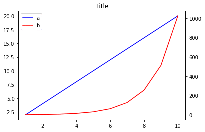
X軸名は表示されませんでした。
ax1、つまり「ax1 = fig.subplots()」のように作成したグラフでないとダメなようです。
もしX軸名が表示されなかったら、ここら辺のコマンドを見直すと良さそうです。
ちなみに文字の大きさを変えるのは、{“fontsize”: フォントサイズ}を追加することで変えることができます。
from matplotlib import pyplot as plt

x = [1, 2, 3, 4, 5, 6, 7, 8, 9, 10]
y1 = [2, 4, 6, 8, 10, 12, 14, 16, 18, 20]
y2 = [2, 4, 8, 16, 32, 64, 128, 256, 512, 1024]

fig = plt.figure()

ax1 = fig.subplots()
ax2 = ax1.twinx()

ax1.plot(x, y1, color="blue", label="a")
ax2.plot(x, y2, c="r", label="b")

plt.title("Title")

ax1.set_xlabel("X-axis", {"fontsize": 20})

h1, l1 = ax1.get_legend_handles_labels()
h2, l2 = ax2.get_legend_handles_labels()
ax1.legend(h1 + h2, l1 + l2)

plt.show()

実行結果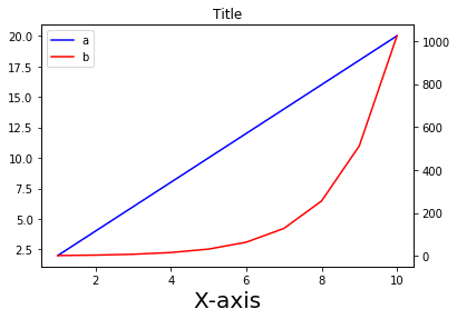
ちなみに「fontsize=フォントサイズ」でもいいようです。
from matplotlib import pyplot as plt

x = [1, 2, 3, 4, 5, 6, 7, 8, 9, 10]
y1 = [2, 4, 6, 8, 10, 12, 14, 16, 18, 20]
y2 = [2, 4, 8, 16, 32, 64, 128, 256, 512, 1024]

fig = plt.figure()

ax1 = fig.subplots()
ax2 = ax1.twinx()

ax1.plot(x, y1, color="blue", label="a")
ax2.plot(x, y2, c="r", label="b")

plt.title("Title")

ax1.set_xlabel("X-axis", fontsize=20)

h1, l1 = ax1.get_legend_handles_labels()
h2, l2 = ax2.get_legend_handles_labels()
ax1.legend(h1 + h2, l1 + l2)

plt.show()

実行結果
Y軸の表示
次にY軸を表示してみましょう。
X軸の時は、set_xlabel(“X軸名”)だったので、set_ylabel(“Y軸名”)なのかというとその通りです。
しかし問題はY軸は2本あるということです。それぞれax1とax2で試してみましょう。
まずはax1に追加ということで「ax1.set_ylabel(“Y1-axis”, fontsize=10)」を追加してみます。
from matplotlib import pyplot as plt

x = [1, 2, 3, 4, 5, 6, 7, 8, 9, 10]
y1 = [2, 4, 6, 8, 10, 12, 14, 16, 18, 20]
y2 = [2, 4, 8, 16, 32, 64, 128, 256, 512, 1024]

fig = plt.figure()

ax1 = fig.subplots()
ax2 = ax1.twinx()

ax1.plot(x, y1, color="blue", label="a")
ax2.plot(x, y2, c="r", label="b")

plt.title("Title")

ax1.set_xlabel("X-axis", fontsize=10)
ax1.set_ylabel("Y1-axis", fontsize=10)

h1, l1 = ax1.get_legend_handles_labels()
h2, l2 = ax2.get_legend_handles_labels()
ax1.legend(h1 + h2, l1 + l2)

plt.show()

実行結果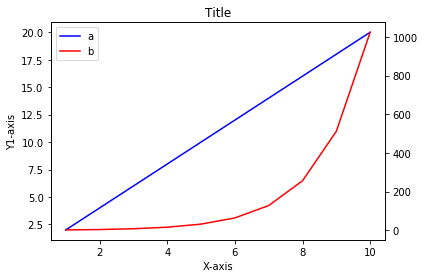
左側のY軸に名前が追加されました。
次に「ax2.set_ylabel(“Y2-axis”, fontsize=10)」に変えてみます。
from matplotlib import pyplot as plt

x = [1, 2, 3, 4, 5, 6, 7, 8, 9, 10]
y1 = [2, 4, 6, 8, 10, 12, 14, 16, 18, 20]
y2 = [2, 4, 8, 16, 32, 64, 128, 256, 512, 1024]

fig = plt.figure()

ax1 = fig.subplots()
ax2 = ax1.twinx()

ax1.plot(x, y1, color="blue", label="a")
ax2.plot(x, y2, c="r", label="b")

plt.title("Title")

ax1.set_xlabel("X-axis", fontsize=10)
ax2.set_ylabel("Y2-axis", fontsize=10)

h1, l1 = ax1.get_legend_handles_labels()
h2, l2 = ax2.get_legend_handles_labels()
ax1.legend(h1 + h2, l1 + l2)

plt.show()

実行結果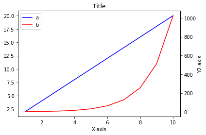
今度は右側のY軸に名前が追加されました。
もちろん両方のコードを追加したら、左右のY軸に追加されます。
from matplotlib import pyplot as plt

x = [1, 2, 3, 4, 5, 6, 7, 8, 9, 10]
y1 = [2, 4, 6, 8, 10, 12, 14, 16, 18, 20]
y2 = [2, 4, 8, 16, 32, 64, 128, 256, 512, 1024]

fig = plt.figure()

ax1 = fig.subplots()
ax2 = ax1.twinx()

ax1.plot(x, y1, color="blue", label="a")
ax2.plot(x, y2, c="r", label="b")

plt.title("Title")

ax1.set_xlabel("X-axis", fontsize=10)
ax1.set_ylabel("Y1-axis", fontsize=10)
ax2.set_ylabel("Y2-axis", fontsize=10)

h1, l1 = ax1.get_legend_handles_labels()
h2, l2 = ax2.get_legend_handles_labels()
ax1.legend(h1 + h2, l1 + l2)

plt.show()

実行結果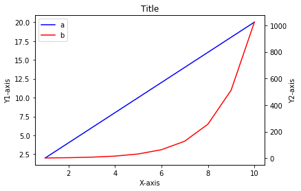
しれっと書いていますが、Y軸でも文字のサイズを変えるのは「fontsize = 文字のサイズ」で変更できます。
軸のフォントサイズの変更
タイトルや軸名のフォントサイズが変更できるのは分かりました。
では軸の数値のフォントサイズを変えるにはどうしたらいいでしょうか。
コードとしては「tick_params(labelsize=フォントサイズ)」です。
こちらもax1、ax2というそれぞれのグラフに対して行うことができます。
ということでまずは「ax1.tick_params(labelsize=20)」を追加してみましょう。
from matplotlib import pyplot as plt

x = [1, 2, 3, 4, 5, 6, 7, 8, 9, 10]
y1 = [2, 4, 6, 8, 10, 12, 14, 16, 18, 20]
y2 = [2, 4, 8, 16, 32, 64, 128, 256, 512, 1024]

fig = plt.figure()

ax1 = fig.subplots()
ax2 = ax1.twinx()

ax1.plot(x, y1, color="blue", label="a")
ax2.plot(x, y2, c="r", label="b")

plt.title("Title")

ax1.set_xlabel("X-axis", fontsize=10)
ax1.set_ylabel("Y1-axis", fontsize=10)
ax2.set_ylabel("Y2-axis", fontsize=10)

ax1.tick_params(labelsize=20)

h1, l1 = ax1.get_legend_handles_labels()
h2, l2 = ax2.get_legend_handles_labels()
ax1.legend(h1 + h2, l1 + l2)

plt.show()

実行結果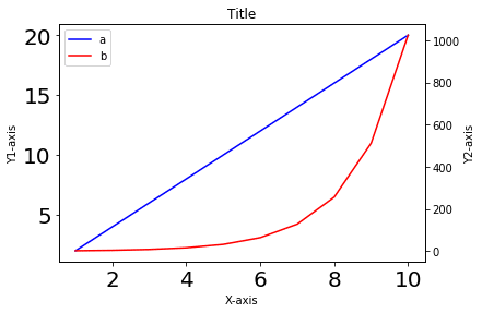
X軸と左側のY軸の数値のサイズが大きくなりました。
次に「ax2.tick_params(labelsize=20)」にしてみましょう。
from matplotlib import pyplot as plt

x = [1, 2, 3, 4, 5, 6, 7, 8, 9, 10]
y1 = [2, 4, 6, 8, 10, 12, 14, 16, 18, 20]
y2 = [2, 4, 8, 16, 32, 64, 128, 256, 512, 1024]

fig = plt.figure()

ax1 = fig.subplots()
ax2 = ax1.twinx()

ax1.plot(x, y1, color="blue", label="a")
ax2.plot(x, y2, c="r", label="b")

plt.title("Title")

ax1.set_xlabel("X-axis", fontsize=10)
ax1.set_ylabel("Y1-axis", fontsize=10)
ax2.set_ylabel("Y2-axis", fontsize=10)

ax2.tick_params(labelsize=20)

h1, l1 = ax1.get_legend_handles_labels()
h2, l2 = ax2.get_legend_handles_labels()
ax1.legend(h1 + h2, l1 + l2)

plt.show()

実行結果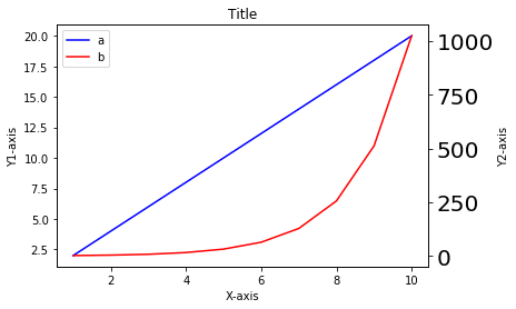
今度は右側のY軸のみフォントの大きさが変わりました。
もちろん両方追加すれば、全ての軸の数値のフォントサイズが変わります。
from matplotlib import pyplot as plt

x = [1, 2, 3, 4, 5, 6, 7, 8, 9, 10]
y1 = [2, 4, 6, 8, 10, 12, 14, 16, 18, 20]
y2 = [2, 4, 8, 16, 32, 64, 128, 256, 512, 1024]

fig = plt.figure()

ax1 = fig.subplots()
ax2 = ax1.twinx()

ax1.plot(x, y1, color="blue", label="a")
ax2.plot(x, y2, c="r", label="b")

plt.title("Title")

ax1.set_xlabel("X-axis", fontsize=10)
ax1.set_ylabel("Y1-axis", fontsize=10)
ax2.set_ylabel("Y2-axis", fontsize=10)

ax1.tick_params(labelsize=20)
ax2.tick_params(labelsize=20)

h1, l1 = ax1.get_legend_handles_labels()
h2, l2 = ax2.get_legend_handles_labels()
ax1.legend(h1 + h2, l1 + l2)

plt.show()

実行結果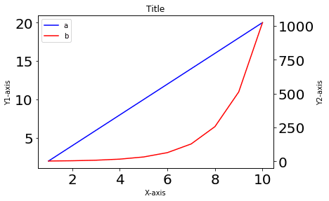
ということでこれで2軸グラフのことを大体はできる様になったかと思います。
X軸を2本にする意味
これまでY軸が2本のグラフを解説してきたのですが、2軸グラフというとX軸が2本だって良いわけです。
Y軸が2本のグラフは2つのデータ間で値が大幅に違う際に分かりやすく表示するということで利用価値が分かります。
しかしX軸が2本というのはどういう時に使われるのでしょうか?
個人的にはX軸が単なる数値であれば、2軸にしてまで表示する必要はないと思います。
しかしX軸が文字だったり、日付だったりした場合、一つの軸では表示できません。
そんな時に使うのかなと思います。
ということで試していきましょう。
X軸が2本のグラフの作成方法
まずはデータを準備します。
先ほど少しお話しした通り、X軸が2本の場合はX値は数値ではなく、文字のことが多いだろうということでx1は文字で1から10まで、x2はaからjまでをリストにしてみました。
Y値に関しては、y1は1から10まで増加させ、y2は逆は10から1まで減少させてみました。
x1 = ["1", "2", "3", "4", "5", "6", "7", "8", "9", "10"]
y1 = [1, 2, 3, 4, 5, 6, 7, 8, 9, 10]
x2 = ["a", "b", "c", "d", "e", "f", "g", "h", "i", "j"]
y2 = [10, 9, 8, 7, 6, 5, 4, 3, 2, 1]
このデータを表示させてみましょう。
前にY軸を2本にする際、用いたコマンドは「twinx()」でした。
ということはtwiny()にすればいいのではないかと推測されます。
from matplotlib import pyplot as plt

x1 = ["1", "2", "3", "4", "5", "6", "7", "8", "9", "10"]
y1 = [1, 2, 3, 4, 5, 6, 7, 8, 9, 10]
x2 = ["a", "b", "c", "d", "e", "f", "g", "h", "i", "j"]
y2 = [10, 9, 8, 7, 6, 5, 4, 3, 2, 1]

fig = plt.figure()

ay1 = fig.subplots()
ay2 = ay1.twiny()

ay1.plot(x1, y1)
ay2.plot(x2, y2)

plt.show()

実行結果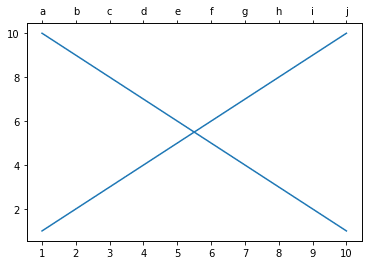
予想的中で、X軸が2本のグラフを表示することができました。
ちなみに線の色を変えたり、軸名の表示、フォントサイズなどは、X軸の場合と同じなので、解説は省略します。
一気に書くとこんな感じです。
from matplotlib import pyplot as plt

x1 = ["1", "2", "3", "4", "5", "6", "7", "8", "9", "10"]
y1 = [1, 2, 3, 4, 5, 6, 7, 8, 9, 10]
x2 = ["a", "b", "c", "d", "e", "f", "g", "h", "i", "j"]
y2 = [10, 9, 8, 7, 6, 5, 4, 3, 2, 1]

fig = plt.figure()

ay1 = fig.subplots()
ay2 = ay1.twiny()

ay1.plot(x1, y1, color="blue", label="x1")
ay2.plot(x2, y2, c="r", label="x2")

ay1.set_ylabel("y-axis", fontsize=15)
ay1.set_xlabel("x1-axis", fontsize=15)
ay2.set_xlabel("x2-axis", fontsize=15)

ay1.tick_params(labelsize=15)
ay2.tick_params(labelsize=15)

h1, l1 = ay1.get_legend_handles_labels()
h2, l2 = ay2.get_legend_handles_labels()
ay1.legend(h1 + h2, l1 + l2)

plt.show()

実行結果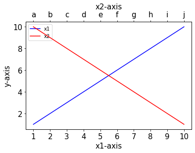
X軸もY軸も2本にするためのグラフの作成方法
さらにX軸もY軸も2本にする方法を試していきましょう。
ax1に対して、twiny()をしたグラフax2を作成し、さらにax2に対してtwinx()したグラフax3を作成します。
fig = plt.figure()

ax1 = fig.subplots()
ax2 = ax1.twiny()
ax3 = ax2.twinx()
ちなみに逆にax1をtwinx()したax2を作成し、ax2に対してtwiny()したax3を作成するという方法でも可能です。
fig = plt.figure()

ax1 = fig.subplots()
ax2 = ax1.twinx()
ax3 = ax2.twiny()
ただしこの場合、細かい点が変わってくるので、注意してください。
とりあえず解説としては、最初の「x1に対して、twiny()をしたグラフax2を作成し、さらにax2に対してtwinx()したグラフax3を作成」で解説します。
そして最後に逆のパターンのプログラムも掲載しておきますので、参考にしてください。
ということで現在、ax1、ax2、ax3と3つのグラフがあるのですが、プロットするのはax1とax3です。
ax1.plot(x1, y1, color="blue", label="x1")
ax3.plot(x2, y2, c="r", label="x2")
またプロットするグラフが変わっていますので、凡例の表示方法も変わります。
h1, l1 = ax1.get_legend_handles_labels()
h3, l3 = ax3.get_legend_handles_labels()
ax1.legend(h1 + h3, l1 + l3)
全体のプログラムとしてはこんな感じです。
from matplotlib import pyplot as plt

x1 = ["1", "2", "3", "4", "5", "6", "7", "8", "9", "10"]
y1 = [1, 2, 3, 4, 5, 6, 7, 8, 9, 10]
x2 = ["a", "b", "c", "d", "e", "f", "g", "h", "i", "j"]
y2 = [2, 4, 8, 16, 32, 64, 128, 256, 512, 1024]

fig = plt.figure()

ax1 = fig.subplots()
ax2 = ax1.twiny()
ax3 = ax2.twinx()

ax1.plot(x1, y1, color="blue", label="x1y1")
ax3.plot(x2, y2, c="r", label="x2y2")

h1, l1 = ax1.get_legend_handles_labels()
h3, l3 = ax3.get_legend_handles_labels()
ax1.legend(h1 + h3, l1 + l3)

plt.show()

実行結果
これでとりあえずX軸もY軸も2本になったグラフは表示できました。
X軸名、Y軸名の追加方法
問題はここからです。
次にそれぞれの軸名を追加してみます。
追加の仕方はこんな感じです。
ax1.set_xlabel("x1-axis", fontsize=15)
ax1.set_ylabel("y1-axis", fontsize=15)
ax2.set_xlabel("x2-axis", fontsize=15)
ax3.set_ylabel("y2-axis", fontsize=15)
上のX軸に対して軸名を追加するにはax2のグラフを指定します。
そして右側のY軸に軸名を追加するにはax3のグラフを指定します。
試してみましょう。
from matplotlib import pyplot as plt

x1 = ["1", "2", "3", "4", "5", "6", "7", "8", "9", "10"]
y1 = [1, 2, 3, 4, 5, 6, 7, 8, 9, 10]
x2 = ["a", "b", "c", "d", "e", "f", "g", "h", "i", "j"]
y2 = [2, 4, 8, 16, 32, 64, 128, 256, 512, 1024]

fig = plt.figure()

ax1 = fig.subplots()
ax2 = ax1.twiny()
ax3 = ax2.twinx()

ax1.plot(x1, y1, color="blue", label="x1y1")
ax3.plot(x2, y2, c="r", label="x2y2")

ax1.set_xlabel("x1-axis", fontsize=15)
ax1.set_ylabel("y1-axis", fontsize=15)
ax2.set_xlabel("x2-axis", fontsize=15)
ax3.set_ylabel("y2-axis", fontsize=15)

h1, l1 = ax1.get_legend_handles_labels()
h3, l3 = ax3.get_legend_handles_labels()
ax1.legend(h1 + h3, l1 + l3)

plt.show()

実行結果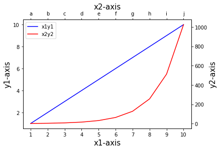
確かに追加できました。
ちなみに指定するグラフを間違えると、軸名が表示されません。
正解
ax2.set_xlabel("x2-axis", fontsize=15)
ax3.set_ylabel("y2-axis", fontsize=15)
不正解
ax3.set_xlabel("x2-axis", fontsize=15)
ax2.set_ylabel("y2-axis", fontsize=15)こちらも試してみましょう。
from matplotlib import pyplot as plt

x1 = ["1", "2", "3", "4", "5", "6", "7", "8", "9", "10"]
y1 = [1, 2, 3, 4, 5, 6, 7, 8, 9, 10]
x2 = ["a", "b", "c", "d", "e", "f", "g", "h", "i", "j"]
y2 = [2, 4, 8, 16, 32, 64, 128, 256, 512, 1024]

fig = plt.figure()

ax1 = fig.subplots()
ax2 = ax1.twiny()
ax3 = ax2.twinx()

ax1.plot(x1, y1, color="blue", label="x1y1")
ax3.plot(x2, y2, c="r", label="x2y2")

ax1.set_xlabel("x1-axis", fontsize=15)
ax1.set_ylabel("y1-axis", fontsize=15)
ax3.set_xlabel("x2-axis", fontsize=15)
ax2.set_ylabel("y2-axis", fontsize=15)

h1, l1 = ax1.get_legend_handles_labels()
h3, l3 = ax3.get_legend_handles_labels()
ax1.legend(h1 + h3, l1 + l3)

plt.show()

実行結果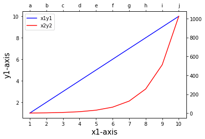
ちなみに最初にtwinx()、twiny()の順番を逆にした場合は、ラベルのセットの順番が変わりますので注意です。
X軸、Y軸のフォントサイズの操作方法
次にX軸、Y軸のフォントサイズを変更してみましょう。
グラフがax1、ax2、ax3と三つあるので、それぞれ指定する必要があります。
ax1.tick_params(labelsize=15)
ax2.tick_params(labelsize=15)
ax3.tick_params(labelsize=15)
ということでプログラム全体としてはこんな感じになります。
from matplotlib import pyplot as plt

x1 = ["1", "2", "3", "4", "5", "6", "7", "8", "9", "10"]
y1 = [1, 2, 3, 4, 5, 6, 7, 8, 9, 10]
x2 = ["a", "b", "c", "d", "e", "f", "g", "h", "i", "j"]
y2 = [2, 4, 8, 16, 32, 64, 128, 256, 512, 1024]

fig = plt.figure()

ax1 = fig.subplots()
ax2 = ax1.twiny()
ax3 = ax2.twinx()

ax1.plot(x1, y1, color="blue", label="x1y1")
ax3.plot(x2, y2, c="r", label="x2y2")

ax1.set_xlabel("x1-axis", fontsize=15)
ax1.set_ylabel("y1-axis", fontsize=15)
ax2.set_xlabel("x2-axis", fontsize=15)
ax3.set_ylabel("y2-axis", fontsize=15)

ax1.tick_params(labelsize=15)
ax2.tick_params(labelsize=15)
ax3.tick_params(labelsize=15)

h1, l1 = ax1.get_legend_handles_labels()
h3, l3 = ax3.get_legend_handles_labels()
ax1.legend(h1 + h3, l1 + l3)

plt.show()

実行結果
確かにフォントが大きくなりました。
ちなみに「ax1.tick_params(labelsize=15)」だけにすると、下のX軸と左のY軸のフォントサイズだけ変更されます。
from matplotlib import pyplot as plt

x1 = ["1", "2", "3", "4", "5", "6", "7", "8", "9", "10"]
y1 = [1, 2, 3, 4, 5, 6, 7, 8, 9, 10]
x2 = ["a", "b", "c", "d", "e", "f", "g", "h", "i", "j"]
y2 = [2, 4, 8, 16, 32, 64, 128, 256, 512, 1024]

fig = plt.figure()

ax1 = fig.subplots()
ax2 = ax1.twiny()
ax3 = ax2.twinx()

ax1.plot(x1, y1, color="blue", label="x1y1")
ax3.plot(x2, y2, c="r", label="x2y2")

ax1.set_xlabel("x1-axis", fontsize=15)
ax1.set_ylabel("y1-axis", fontsize=15)
ax2.set_xlabel("x2-axis", fontsize=15)
ax3.set_ylabel("y2-axis", fontsize=15)

ax1.tick_params(labelsize=15)

h1, l1 = ax1.get_legend_handles_labels()
h3, l3 = ax3.get_legend_handles_labels()
ax1.legend(h1 + h3, l1 + l3)

plt.show()

実行結果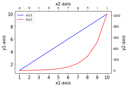
「ax2.tick_params(labelsize=15)」だけ指定するとこんな感じ。
from matplotlib import pyplot as plt

x1 = ["1", "2", "3", "4", "5", "6", "7", "8", "9", "10"]
y1 = [1, 2, 3, 4, 5, 6, 7, 8, 9, 10]
x2 = ["a", "b", "c", "d", "e", "f", "g", "h", "i", "j"]
y2 = [2, 4, 8, 16, 32, 64, 128, 256, 512, 1024]

fig = plt.figure()

ax1 = fig.subplots()
ax2 = ax1.twiny()
ax3 = ax2.twinx()

ax1.plot(x1, y1, color="blue", label="x1y1")
ax3.plot(x2, y2, c="r", label="x2y2")

ax1.set_xlabel("x1-axis", fontsize=15)
ax1.set_ylabel("y1-axis", fontsize=15)
ax2.set_xlabel("x2-axis", fontsize=15)
ax3.set_ylabel("y2-axis", fontsize=15)

ax2.tick_params(labelsize=15)

h1, l1 = ax1.get_legend_handles_labels()
h3, l3 = ax3.get_legend_handles_labels()
ax1.legend(h1 + h3, l1 + l3)

plt.show()

実行結果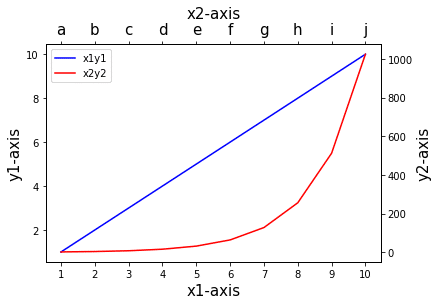
今度は上のX軸のみフォントサイズが変わりました。
最後に「ax3.tick_params(labelsize=15)」だけ指定してみます。
from matplotlib import pyplot as plt

x1 = ["1", "2", "3", "4", "5", "6", "7", "8", "9", "10"]
y1 = [1, 2, 3, 4, 5, 6, 7, 8, 9, 10]
x2 = ["a", "b", "c", "d", "e", "f", "g", "h", "i", "j"]
y2 = [2, 4, 8, 16, 32, 64, 128, 256, 512, 1024]

fig = plt.figure()

ax1 = fig.subplots()
ax2 = ax1.twiny()
ax3 = ax2.twinx()

ax1.plot(x1, y1, color="blue", label="x1y1")
ax3.plot(x2, y2, c="r", label="x2y2")

ax1.set_xlabel("x1-axis", fontsize=15)
ax1.set_ylabel("y1-axis", fontsize=15)
ax2.set_xlabel("x2-axis", fontsize=15)
ax3.set_ylabel("y2-axis", fontsize=15)

ax3.tick_params(labelsize=15)

h1, l1 = ax1.get_legend_handles_labels()
h3, l3 = ax3.get_legend_handles_labels()
ax1.legend(h1 + h3, l1 + l3)

plt.show()

実行結果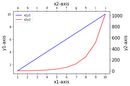
今度は右側のY軸のみフォントサイズが変わりました。
大体こんな感じで、それぞれの軸を操作できることが分かりました。
twinx()、twiny()の順番を逆にした場合
ということでまとめです。
プログラムをまとめてみると、こんな感じです。
from matplotlib import pyplot as plt

x1 = ["1", "2", "3", "4", "5", "6", "7", "8", "9", "10"]
y1 = [1, 2, 3, 4, 5, 6, 7, 8, 9, 10]
x2 = ["a", "b", "c", "d", "e", "f", "g", "h", "i", "j"]
y2 = [2, 4, 8, 16, 32, 64, 128, 256, 512, 1024]

fig = plt.figure()

ax1 = fig.subplots()
ax2 = ax1.twiny()
ax3 = ax2.twinx()

ax1.plot(x1, y1, color="blue", label="x1y1")
ax3.plot(x2, y2, c="r", label="x2y2")

ax1.set_xlabel("x1-axis", fontsize=15)
ax1.set_ylabel("y1-axis", fontsize=15)
ax2.set_xlabel("x2-axis", fontsize=15)
ax3.set_ylabel("y2-axis", fontsize=15)

ax1.tick_params(labelsize=15)
ax2.tick_params(labelsize=15)
ax3.tick_params(labelsize=15)

h1, l1 = ax1.get_legend_handles_labels()
h3, l3 = ax3.get_legend_handles_labels()
ax1.legend(h1 + h3, l1 + l3)

plt.show()

実行結果
次にtwinx()、twiny()の順番を逆にした場合のプログラムです。
from matplotlib import pyplot as plt

x1 = ["1", "2", "3", "4", "5", "6", "7", "8", "9", "10"]
y1 = [1, 2, 3, 4, 5, 6, 7, 8, 9, 10]
x2 = ["a", "b", "c", "d", "e", "f", "g", "h", "i", "j"]
y2 = [2, 4, 8, 16, 32, 64, 128, 256, 512, 1024]

fig = plt.figure()

ax1 = fig.subplots()
ax2 = ax1.twinx()
ax3 = ax2.twiny()

ax1.plot(x1, y1, color="blue", label="x1y1")
ax3.plot(x2, y2, c="r", label="x2y2")

ax1.set_xlabel("x1-axis", fontsize=15)
ax1.set_ylabel("y1-axis", fontsize=15)
ax3.set_xlabel("x2-axis", fontsize=15)
ax2.set_ylabel("y2-axis", fontsize=15)

ax1.tick_params(labelsize=15)
ax2.tick_params(labelsize=15)
ax3.tick_params(labelsize=15)

h1, l1 = ax1.get_legend_handles_labels()
h3, l3 = ax3.get_legend_handles_labels()
ax1.legend(h1 + h3, l1 + l3)

plt.show()

実行結果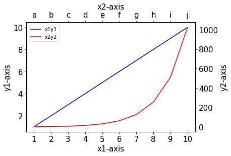
これでX軸、Y軸それぞれ2本の軸をもつグラフを作成できるようになりました。
結構同じ解説を繰り返してしまったところもある気がしますが、結構詳しく解説できたんじゃないかなと思います。
次回は2軸グラフを作成する際に出てきた「subplots」 というコマンドを用いて、複数のデータを一括に別々のグラフとして表示する方法を解説していきたいと思います。
ということで今回はこんな
コメント