目次
matplotlib
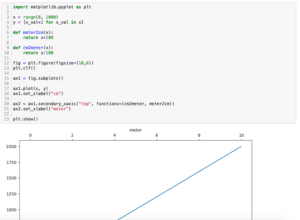
前回、Pythonのmatplotlibでお互いに関連づけられる単位をもつ2軸を作成する方法を紹介しました。
あわせて読みたい
【matplotlib】お互いに関連づけられる単位をもつ2軸を作成する方法[Python]
matplotlib 前回、Pythonのmatplotlibで年表を描く時に便利な不等な間隔をもつ線分を描く方法を紹介しました。 今回はmatplotlibでお互いに関連づけられる単位をもつ2軸…
今回はX軸を上に、Y軸を右に表示する方法を紹介します。
ただ実は前に「軸を任意の位置に動かす方法」を紹介しています。
あわせて読みたい
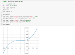
【matplotlib】軸を任意の位置に動かす方法[Python]
matplotlib 前回、Pythonのmatplotlibでグラフの原点(0, 0)に軸を配置する方法を紹介しました。 今回はmatplotlibで軸を任意の位置に動かす方法を紹介します。 まず前回…
単純にこの方法でX軸を上に、Y軸を右に動かせばいい…とはいかなかったので、その方法を残しておこうというのが今回の話の発端です。
とりあえず簡単なグラフを表示するこんな感じでのプログラムを準備してみました。
import matplotlib.pyplot as plt

x = range(0, 100)
y = [x_val*2 for x_val in x]

fig = plt.figure()
plt.clf()

plt.plot(x, y)

plt.xlabel("x values")
plt.ylabel("y values")

plt.show()

実行結果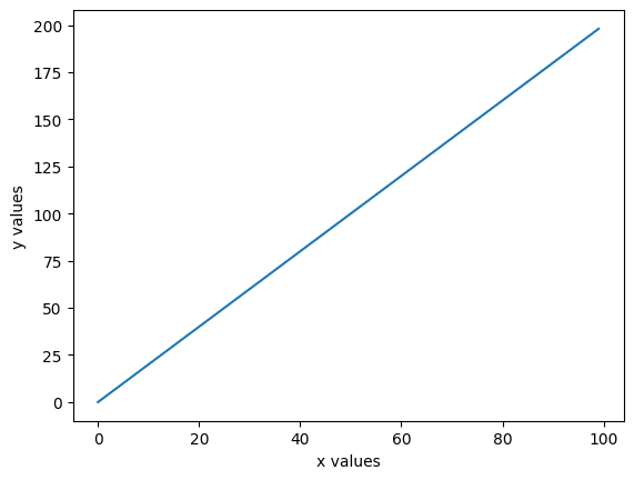
それでは始めていきましょう。
X軸を上に表示する方法
X軸を上に表示するには「plt.gca().xaxis.tick_top()」を用います。
import matplotlib.pyplot as plt

x = range(0, 100)
y = [x_val*2 for x_val in x]

fig = plt.figure()
plt.clf()

plt.plot(x, y)

plt.xlabel("x values")
plt.ylabel("y values")

plt.gca().xaxis.tick_top()

plt.show()

実行結果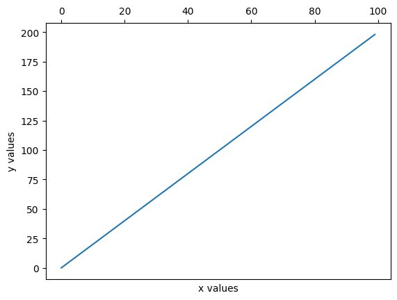
ただしご覧の通り、X軸名がそのまま下に残ってしまうので、これを別に動かしてやります。
X軸名を上に動かすには「plt.gca().xaxis.set_label_position(“top”)」を用います。
import matplotlib.pyplot as plt

x = range(0, 100)
y = [x_val*2 for x_val in x]

fig = plt.figure()
plt.clf()

plt.plot(x, y)

plt.xlabel("x values")
plt.ylabel("y values")

plt.gca().xaxis.tick_top()
plt.gca().xaxis.set_label_position("top")

plt.show()

実行結果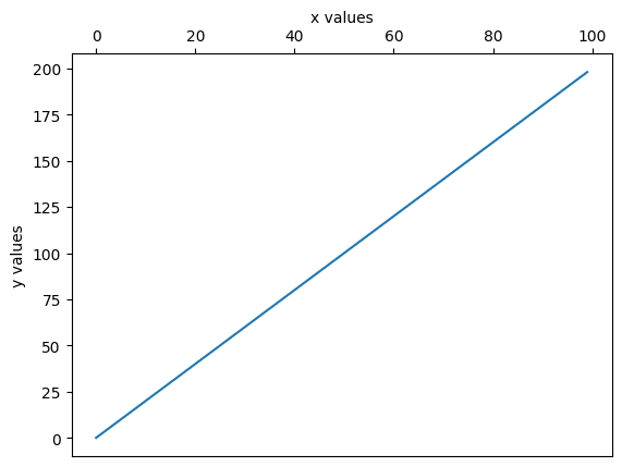
Y軸を右に表示する方法
同じようにしてY軸を右に表示することができます。
まず軸の移動は「plt.gca().yaxis.tick_right()」で、Y軸名の移動は「plt.gca().yaxis.set_label_position(“right”)」で行います。
import matplotlib.pyplot as plt

x = range(0, 100)
y = [x_val*2 for x_val in x]

fig = plt.figure()
plt.clf()

plt.plot(x, y)

plt.xlabel("x values")
plt.ylabel("y values")

plt.gca().yaxis.tick_right()
plt.gca().yaxis.set_label_position("right")

plt.show()

実行結果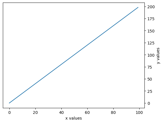
次回はリスト内の全ての数値に対して同じ値で足し算、引き算、掛け算、割り算する方法を紹介します。
あわせて読みたい
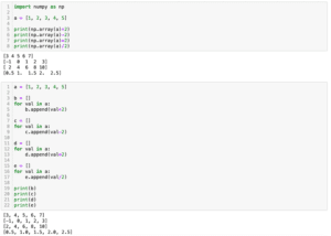
【Python基礎】リスト内の全ての数値に対して同じ値で足し算、引き算、掛け算、割り算する方法
リスト内の要素への四則演算 前回、PythonのmatplotlibでX軸を上に、Y軸を右に表示する方法を紹介しました。 今回はリスト内の全ての数値に対して同じ値で足し算、引き…
ではでは今回はこんな感じで。
コメント