matplotlib
前回、Pythonのmatplotlibでヒストグラムを表示するhist関数を紹介しました。
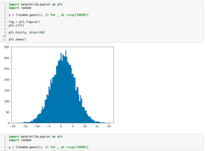
今回はmatplotlibのhist関数で複数のヒストグラムを表示する方法とコツを紹介します。
それでは始めていきましょう。
hist関数で複数のヒストグラムを表示する方法
まずはhist関数で複数のヒストグラムを表示する方法ですが、これは大きく分けて2つの方法があります。
一つ目は通常のグラフと同じく「plt.hist()」をそれぞれのグラフの分だけ実行する方法です。
import matplotlib.pyplot as plt
import random

y1 = [random.gauss(10, 5) for _ in range(10000)]
y2 = [random.gauss(20, 5) for _ in range(10000)]

fig = plt.figure()
plt.clf()

plt.hist(y1, bins=100)
plt.hist(y2, bins=100)

plt.show()

実行結果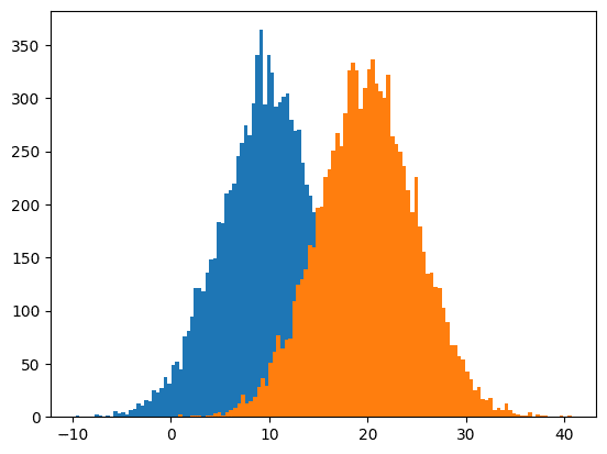
この方法ですと単純に2つのヒストグラムが表示されますが、今回の例のように重なってしまう場合、片方のグラフは重なった部分が見えなくなってしまいます。
二つ目の方法は「plt.hist((hist1, hist2))」の様にグラフの値のリストをタプルにまとめ渡す方法です。
import matplotlib.pyplot as plt
import random

y1 = [random.gauss(10, 5) for _ in range(10000)]
y2 = [random.gauss(20, 5) for _ in range(10000)]

fig = plt.figure()
plt.clf()

plt.hist((y1, y2), bins=100)

plt.show()

実行結果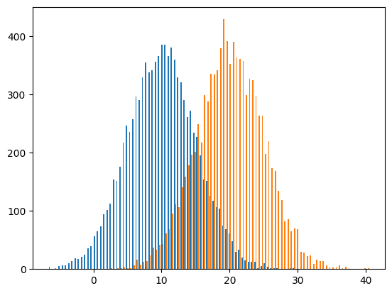
この方法だとそれぞれのヒストグラムの棒グラフが少し間を開けて表示されます。
その間のおかげでお互いのヒストグラムが重なる部分においても分布が表示できる様になっています。
ちなみに3つ以上のヒストグラムでも同様に表示することができます。
import matplotlib.pyplot as plt
import random

y1 = [random.gauss(10, 5) for _ in range(10000)]
y2 = [random.gauss(20, 5) for _ in range(10000)]
y3 = [random.gauss(30, 5) for _ in range(10000)]
y4 = [random.gauss(40, 5) for _ in range(10000)]
y5 = [random.gauss(50, 5) for _ in range(10000)]

fig = plt.figure()
plt.clf()

plt.hist((y1, y2, y3, y4, y5), bins=100)

plt.show()

実行結果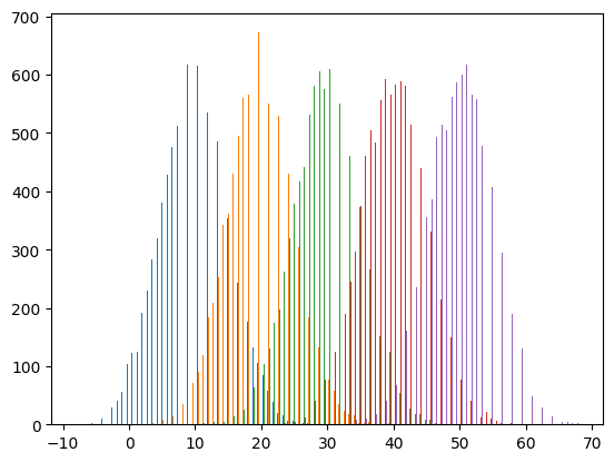
ただしご覧の通りそれぞれの棒グラフが細くなりがちで分布を把握しづらい面もあります。
グラフを半透明化する方法
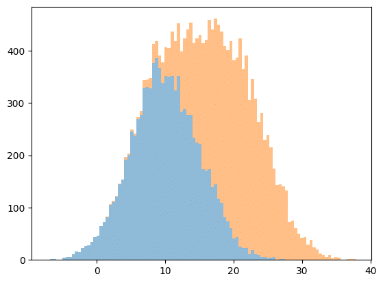
上記2つの方法では一長一短ありますが、一つ目の方法をに対してグラフを半透明化すると一つ目の方法で重なった部分を表示できないという点と二つ目の方法のグラフが細くなってしまう点を解決できます。
import matplotlib.pyplot as plt
import random

y1 = [random.gauss(10, 5) for _ in range(10000)]
y2 = [random.gauss(20, 5) for _ in range(10000)]

fig = plt.figure()
plt.clf()

plt.hist(y1, bins=100, alpha=0.5)
plt.hist(y2, bins=100, alpha=0.5)

plt.show()

実行結果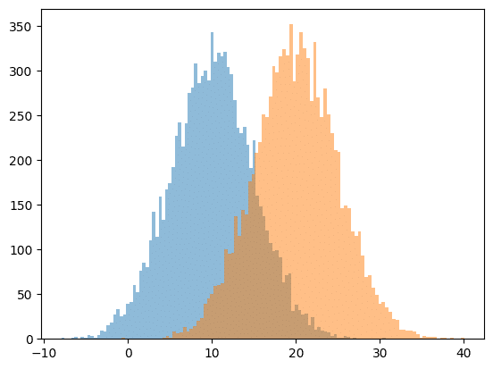
凡例を表示する方法
複数のヒストグラムを表示する場合、どちらのヒストグラムがどのデータによるものかを示すため凡例が必要になることもあるでしょう。
hist関数で凡例を表示するには他のグラフと同様、plt.hist()のオプションに「label=”ラベル”」を追加し、「plt.legend()」で表示します。
import matplotlib.pyplot as plt
import random

y1 = [random.gauss(10, 5) for _ in range(10000)]
y2 = [random.gauss(20, 5) for _ in range(10000)]

fig = plt.figure()
plt.clf()

plt.hist(y1, bins=100, alpha=0.5, label="y1")
plt.hist(y2, bins=100, alpha=0.5, label="y2")

plt.legend()
plt.show()

実行結果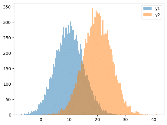
たし合わせたヒストグラムの表示
hist関数には複数のヒストグラムをたし合わせたヒストグラムを表示する機能もあります。
その場合「plt.hist((hist1, hist2), histtype=”barstacked”)」とします。
import matplotlib.pyplot as plt
import random

y1 = [random.gauss(10, 5) for _ in range(10000)]
y2 = [random.gauss(20, 5) for _ in range(10000)]

fig = plt.figure()
plt.clf()

plt.hist((y1, y2), histtype="barstacked", bins=100, alpha=0.5)

plt.show()

実行結果
この例では「y1」のヒストグラムと「y1+y2」のヒストグラムが表示されます。
もちろん3つ以上のヒストグラムでも表示することができ、「y1」、「y1+y2」、「y1+y2+y3」、「y1+y2+y3+y4」、「y1+y2+y3+y4+y5」のヒストグラムを表示する場合は次の例の様になります。
import matplotlib.pyplot as plt
import random

y1 = [random.gauss(10, 5) for _ in range(10000)]
y2 = [random.gauss(20, 5) for _ in range(10000)]
y3 = [random.gauss(30, 5) for _ in range(10000)]
y4 = [random.gauss(40, 5) for _ in range(10000)]
y5 = [random.gauss(50, 5) for _ in range(10000)]

fig = plt.figure()
plt.clf()

plt.hist((y1, y2, y3, y4, y5), histtype="barstacked", bins=100, alpha=0.5)

plt.show()

実行結果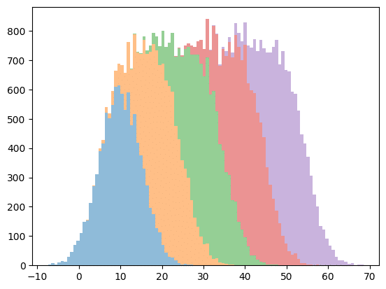
また順番を逆にすると、例えば「(y2, y1)」とすると「y2」と「y2+y1」のヒストグラムが表示されます。
import matplotlib.pyplot as plt
import random

y1 = [random.gauss(10, 5) for _ in range(10000)]
y2 = [random.gauss(20, 5) for _ in range(10000)]

fig = plt.figure()
plt.clf()

plt.hist((y2, y1), histtype="barstacked", bins=100, alpha=0.5)

plt.show()

実行結果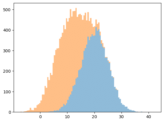
この方法の欠点としては2つ目以降のグラフの元の分布が分からないことです。
そのため2つ目以降のグラフを表示したい場合は、再度「plt.hist()」で表示することが必要になります。
import matplotlib.pyplot as plt
import random

y1 = [random.gauss(10, 5) for _ in range(10000)]
y2 = [random.gauss(20, 5) for _ in range(10000)]

fig = plt.figure()
plt.clf()

plt.hist((y1, y2), histtype="barstacked", bins=100, alpha=0.5)
plt.hist(y2, bins=100, alpha=0.5, histtype="stepfilled")

plt.show()

実行結果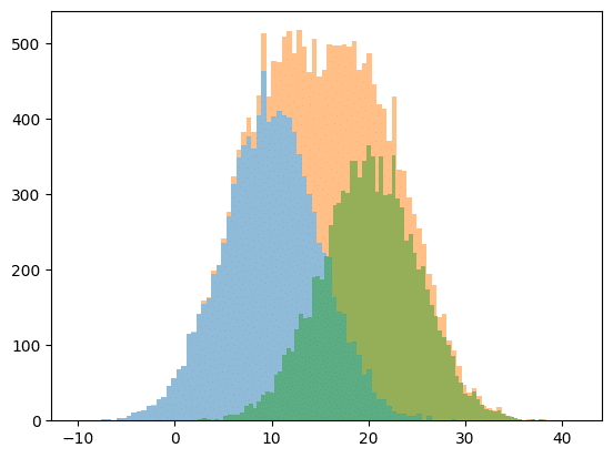
また「histtype=”barstacked”」ではなく、「stacked=True」とすることで足し合せのヒストグラムを表示することも可能です。
import matplotlib.pyplot as plt
import random

y1 = [random.gauss(10, 5) for _ in range(10000)]
y2 = [random.gauss(20, 5) for _ in range(10000)]

fig = plt.figure()
plt.clf()

plt.hist((y1, y2), stacked=True, bins=100, alpha=0.5)

plt.show()

実行結果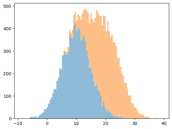
「stacked=True」とすると「hitsttype」のオプション引数が「barstacked」に占領されなくなるので、別の表示に変えることができます。
import matplotlib.pyplot as plt
import random

y1 = [random.gauss(10, 5) for _ in range(10000)]
y2 = [random.gauss(20, 5) for _ in range(10000)]

fig = plt.figure()
plt.clf()

plt.hist((y1, y2), stacked=True, histtype="step", bins=100, alpha=0.5)

plt.show()

実行結果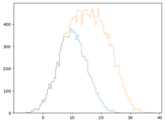
次回はScipyのfind_peaksとargrelmax、argrelminを使って極大値、極小値を取得する方法を紹介します。
ではでは今回はこんな感じで。
コメント