matplotlib
前回、matplotlibのspecgramを使って時間周波数解析をする方法を紹介しました。

今回はmatplotlibで積み上げの折れ線グラフを作成する方法(plt.stackplot)を紹介します。
matplotlibでグラフ表示する際よく使うのは「plt.plot」の折れ線グラフでしょう。
今回は折れ線グラフでこんなグラフをplt.stackplotを使って積み上げグラフにします。
import matplotlib.pyplot as plt

x = range(0, 10)
y1 = [x_val for x_val in x]
y2 = [x_val*2 for x_val in x]
y3 = [x_val*3 for x_val in x]

fig = plt.figure()
plt.clf()

plt.plot(x, y1, label="y1")
plt.plot(x, y2, label="y2")
plt.plot(x, y3, label="y3")

plt.legend()
plt.show()

実行結果
それでは始めていきましょう。
plt.stackplotの基本的な使い方
plt.stackplotの基本的な使い方としては「plt.stackplot(Xの値のリスト, Yの値のリスト1, Yの値のリスト2, Yの値のリスト3…)」です。
大体のグラフでは一つのXの値のリストと一つのYの値のリストだけを渡しますが、plt.stackplotでは複数のYの値のリストを渡すのが特徴です。
import matplotlib.pyplot as plt

x = range(0, 10)
y1 = [x_val for x_val in x]
y2 = [x_val*2 for x_val in x]
y3 = [x_val*3 for x_val in x]

fig = plt.figure()
plt.clf()

plt.stackplot(x, y1, y2, y3)

plt.show()

実行結果
凡例の表示
凡例を表示するには、凡例のラベルのリストを作成し、plt.stackplotのオプション引数「labels」に凡例のラベルのリストを渡します。
import matplotlib.pyplot as plt

x = range(0, 10)
y1 = [x_val for x_val in x]
y2 = [x_val*2 for x_val in x]
y3 = [x_val*3 for x_val in x]

labels = ["y1", "y2", "y3"]

fig = plt.figure()
plt.clf()

plt.stackplot(x, y1, y2, y3, labels=labels)

plt.legend()
plt.show()

実行結果
グラフの塗りつぶしの色の変更
グラフの塗りつぶしの色を変更するには、それぞれのグラフの塗りつぶす色のリストを作成し、plt.stackplotのオプション引数「colors」に色のリストを渡します。
import matplotlib.pyplot as plt

x = range(0, 10)
y1 = [x_val for x_val in x]
y2 = [x_val*2 for x_val in x]
y3 = [x_val*3 for x_val in x]

colors = ["tab:red", "tab:orange", "tab:purple"]

fig = plt.figure()
plt.clf()

plt.stackplot(x, y1, y2, y3, colors=colors)

plt.show()

実行結果
グラフの透明化
グラフを透明化するにはplt.stackplotのオプション引数「alpha」に透過率の値を0から1の間の数値で渡します。
import matplotlib.pyplot as plt

x = range(0, 10)
y1 = [x_val for x_val in x]
y2 = [x_val*2 for x_val in x]
y3 = [x_val*3 for x_val in x]

fig = plt.figure()
plt.clf()

plt.stackplot(x, y1, y2, y3, alpha=0.3)

plt.show()

実行結果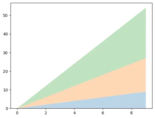
積み上げ基準の変更方法
積み上げ基準を変更するには、plt.stackplotのオプション引数「baseline」に「zero」(デフォルト)、「sym」、「wiggle」、「weighted_wiggle」のどれかを渡します。
symの場合はこの様なグラフになります。
import matplotlib.pyplot as plt

x = range(0, 10)
y1 = [x_val for x_val in x]
y2 = [x_val*2 for x_val in x]
y3 = [x_val*3 for x_val in x]

fig = plt.figure()
plt.clf()

plt.stackplot(x, y1, y2, y3, baseline="sym")

plt.show()

実行結果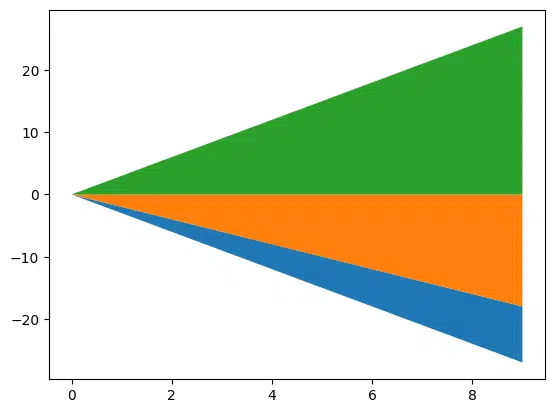
import matplotlib.pyplot as plt

x = range(0, 10)
y1 = [x_val for x_val in x]
y2 = [x_val*2 for x_val in x]
y3 = [x_val*3 for x_val in x]

fig = plt.figure()
plt.clf()

plt.stackplot(x, y1, y2, y3, baseline="wiggle")

plt.show()

実行結果
import matplotlib.pyplot as plt

x = range(0, 10)
y1 = [x_val for x_val in x]
y2 = [x_val*2 for x_val in x]
y3 = [x_val*3 for x_val in x]

fig = plt.figure()
plt.clf()

plt.stackplot(x, y1, y2, y3, baseline="weighted_wiggle")

plt.show()

実行結果

次回はPandasのgroupbyでキーによるグルーピングをして統計値を算出する方法を紹介します。
ではでは今回はこんな感じで。
コメント