matplotlib
前回、Stable Diffusionで画像から画像を生成するimg2imgを紹介しました。

今回はmatplotlibで表(テーブル)を表示するtable関数を紹介します。
それでは始めていきましょう。
table関数の使い方
table関数は「plt.table(データ)」とすると表を表示することができます。
import matplotlib.pyplot as plt

data = [[1, 2, 3], [2, 4, 6], [3, 6, 9]]

fig = plt.figure()
plt.clf()

plt.table(data)

plt.show()

実行結果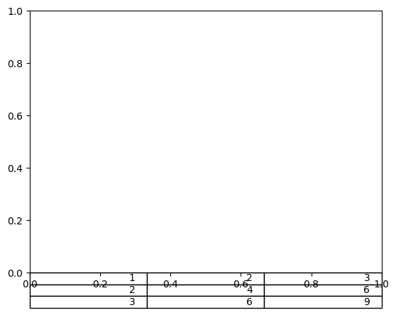
ただこのままではご覧の通りグラフの下の線やX軸のラベルと被ってしまい、表を読み取ることができません。
そのためまずは表をグラフエリアの中心に持っていく必要があります。
その場合は「loc=”center”」を追加します。
import matplotlib.pyplot as plt

data = [[1, 2, 3], [2, 4, 6], [3, 6, 9]]

fig = plt.figure()
plt.clf()

plt.table(data, loc="center")

plt.show()

実行結果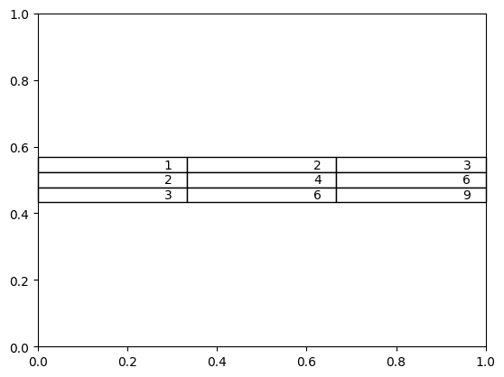
ちなみにグラフ凡例の場所を指定するように「upper right」とか「lower left」といった指定の仕方も可能です。
一覧にするとこんな感じです。
| 位置 | 文字列で指定 | 数値で指定 |
| 自動 | best | 0 |
| 下 | bottom | 17 |
| 左下 | bottom left | 12 |
| 右下 | bottom right | 13 |
| 中央 | center | 9 |
| 中央左 | center left | 5 |
| 中央右 | center right | 6 |
| 左 | left | 15 |
| 右 | right | 14 |
| 下中央 | lower center | 7 |
| 左下 | lower left | 3 |
| 右下 | lower right | 4 |
| 上 | top | 16 |
| 左上 | top left | 11 |
| 右上 | top right | 10 |
| 上中央 | upper center | 8 |
| 左上 | upper left | 2 |
| 右上 | upper right | 1 |
次に枠線を「plt.axis(“off”)」で消します。
import matplotlib.pyplot as plt

data = [[1, 2, 3], [2, 4, 6], [3, 6, 9]]

fig = plt.figure()
plt.clf()

plt.table(data, loc="center")
plt.axis("off")

plt.show()

実行結果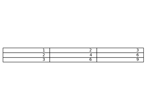
ちなみに枠線のある特定の場所や特定のラベルを消す方法はこちらの記事で紹介していますので、よかったらどうぞ。
これで何とか表として見られる形になりました。
列名と行名の追加
列名を追加するには「colLabels=列名のリスト」を、行名を追加するには「rowLabels=行名のリスト」を追加します。
import matplotlib.pyplot as plt
import numpy as np

columnnames = ["A", "B", "C"]
indexnames = ["X", "Y", "Z"]
data = [[1, 2, 3], [2, 4, 6], [3, 6, 9]]

fig = plt.figure()
plt.clf()

plt.table(data, colLabels=columnnames, rowLabels=indexnames, loc="center")
plt.axis("off")

plt.show()

実行結果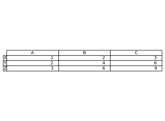
セル内の値の位置
セル内の値の位置を変更するには「cellLoc=位置」を追加します。
中央に配置する場合は「”center”」とします。
import matplotlib.pyplot as plt

columnnames = ["A", "B", "C"]
indexnames = ["X", "Y", "Z"]
data = [[1, 2, 3], [2, 4, 6], [3, 6, 9]]

fig = plt.figure()
plt.clf()

plt.table(data, colLabels=columnnames, rowLabels=indexnames, loc="center", cellLoc="center")
plt.axis("off")

plt.show()

実行結果
デフォルトは右寄せで「”right”」で明示できます。
また左寄せは「”left”」です。
import matplotlib.pyplot as plt

columnnames = ["A", "B", "C"]
indexnames = ["X", "Y", "Z"]
data = [[1, 2, 3], [2, 4, 6], [3, 6, 9]]

fig = plt.figure()
plt.clf()

plt.table(data, colLabels=columnnames, rowLabels=indexnames, loc="center", cellLoc="left")
plt.axis("off")

plt.show()

実行結果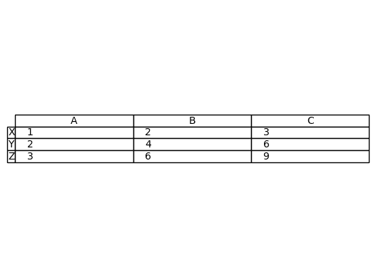
表の色の設定
列名のセルの色を変更するには「colColours=各列名セルの色のリスト」とします。
import matplotlib.pyplot as plt

columnnames = ["A", "B", "C"]
indexnames = ["X", "Y", "Z"]
data = [[1, 2, 3], [2, 4, 6], [3, 6, 9]]

fig = plt.figure()
plt.clf()

plt.table(data, colLabels=columnnames, rowLabels=indexnames, colColours=["gray", "white", "None"], loc="center", cellLoc="center")
plt.axis("off")

plt.show()

実行結果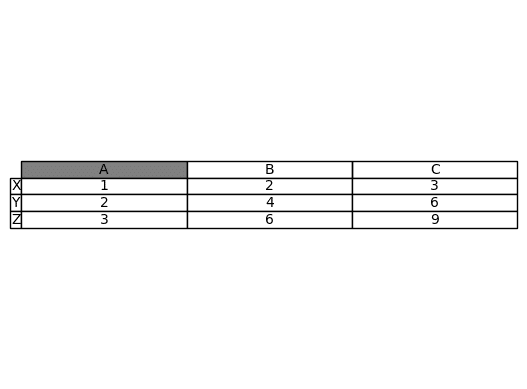
行名のセルの色を変更するには「rowColours=各行名セルの色のリスト」とします。
import matplotlib.pyplot as plt

columnnames = ["A", "B", "C"]
indexnames = ["X", "Y", "Z"]
data = [[1, 2, 3], [2, 4, 6], [3, 6, 9]]

fig = plt.figure()
plt.clf()

plt.table(data, colLabels=columnnames, rowLabels=indexnames, rowColours=["gray", "white", "None"], loc="center", cellLoc="center")
plt.axis("off")

plt.show()

実行結果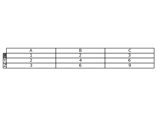
colColoursもrowColoursも列名、行名のセルだけしか色は変わらないので注意してください。
各セルの色を変える場合は「cellColours=各セルの色のリスト」とします。
import matplotlib.pyplot as plt

columnnames = ["A", "B", "C"]
indexnames = ["X", "Y", "Z"]
data = [[1, 2, 3], [2, 4, 6], [3, 6, 9]]

cellcol = [["red", "None", "None"], ["None", "Blue", "None"], ["None", "None", "Green"]]

fig = plt.figure()
plt.clf()

plt.table(data, colLabels=columnnames, rowLabels=indexnames, cellColours=cellcol, loc="center", cellLoc="center")
plt.axis("off")

plt.show()

実行結果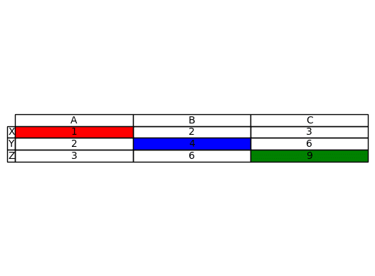
列の幅の調整
列の幅を調整するには「colWidths=各列の幅の比率のリスト」とします。
import matplotlib.pyplot as plt

columnnames = ["A", "B", "C"]
indexnames = ["X", "Y", "Z"]
data = [[1, 2, 3], [2, 4, 6], [3, 6, 9]]

fig = plt.figure()
plt.clf()

plt.table(data, colLabels=columnnames, rowLabels=indexnames, colWidths=[0.2, 0.6, 1], loc="center", cellLoc="center")
plt.axis("off")

plt.show()

実行結果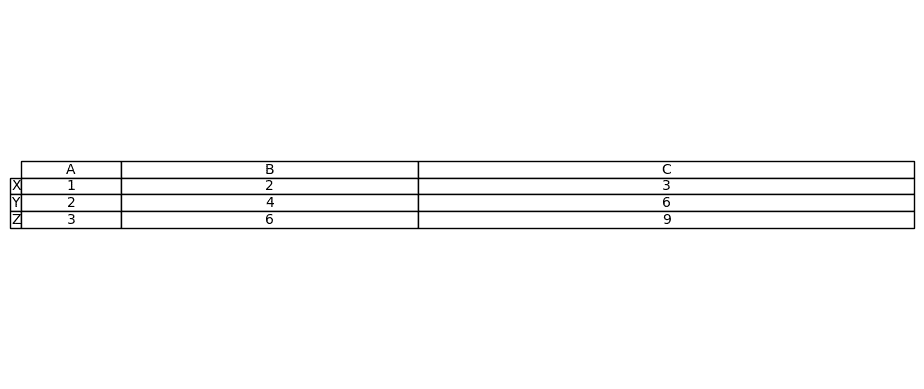
線の表示の調整
セルの線の表示を調整するには「edges=表示の方式」とします。
まず全ての線を非表示にするには「edges=”open”」とします。
import matplotlib.pyplot as plt

columnnames = ["A", "B", "C"]
indexnames = ["X", "Y", "Z"]
data = [[1, 2, 3], [2, 4, 6], [3, 6, 9]]

fig = plt.figure()
plt.clf()

plt.table(data, colLabels=columnnames, rowLabels=indexnames, edges="open", loc="center", cellLoc="center")
plt.axis("off")

plt.show()

実行結果
横線だけにするには「edges=”horizontal”」とします。
import matplotlib.pyplot as plt

columnnames = ["A", "B", "C"]
indexnames = ["X", "Y", "Z"]
data = [[1, 2, 3], [2, 4, 6], [3, 6, 9]]

fig = plt.figure()
plt.clf()

plt.table(data, colLabels=columnnames, rowLabels=indexnames, edges="horizontal", loc="center", cellLoc="center")
plt.axis("off")

plt.show()

実行結果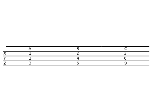
縦線だけにする場合は「edges=”vertical”」とします。
import matplotlib.pyplot as plt

columnnames = ["A", "B", "C"]
indexnames = ["X", "Y", "Z"]
data = [[1, 2, 3], [2, 4, 6], [3, 6, 9]]

fig = plt.figure()
plt.clf()

plt.table(data, colLabels=columnnames, rowLabels=indexnames, edges="vertical", loc="center", cellLoc="center")
plt.axis("off")

plt.show()

実行結果
また各セルの下の線、右の線、上の線、左の線はそれぞれ「B」、「R」、「T」、「L」と指定することもできます。
全てがある場合は全ての線が表示されます。
import matplotlib.pyplot as plt

columnnames = ["A", "B", "C"]
indexnames = ["X", "Y", "Z"]
data = [[1, 2, 3], [2, 4, 6], [3, 6, 9]]

fig = plt.figure()
plt.clf()

plt.table(data, colLabels=columnnames, rowLabels=indexnames, edges="BRTL", loc="center", cellLoc="center")
plt.axis("off")

plt.show()

実行結果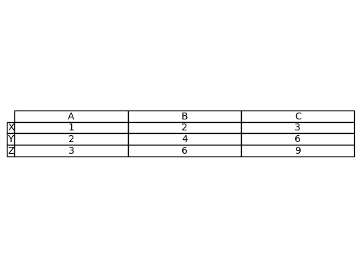
上下の線だけ表示したい、つまり先ほどの「horizontal」と同じ表にしたい場合は「BT」とします。
import matplotlib.pyplot as plt

columnnames = ["A", "B", "C"]
indexnames = ["X", "Y", "Z"]
data = [[1, 2, 3], [2, 4, 6], [3, 6, 9]]

fig = plt.figure()
plt.clf()

plt.table(data, colLabels=columnnames, rowLabels=indexnames, edges="BT", loc="center", cellLoc="center")
plt.axis("off")

plt.show()

実行結果
「B」だけだと各セルの下の線だけが表示されますので、一番上の線が表示されなくなります。
import matplotlib.pyplot as plt

columnnames = ["A", "B", "C"]
indexnames = ["X", "Y", "Z"]
data = [[1, 2, 3], [2, 4, 6], [3, 6, 9]]

fig = plt.figure()
plt.clf()

plt.table(data, colLabels=columnnames, rowLabels=indexnames, edges="B", loc="center", cellLoc="center")
plt.axis("off")

plt.show()

実行結果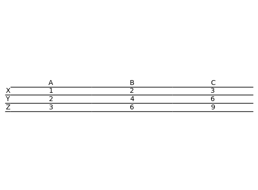
次回はmaplotlibのグラフの表示範囲の上限値、もしくは下限値だけ設定する方法を紹介します。
ではでは今回はこんな感じで。
コメント