matplotlib
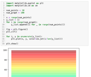
前回、matplotlibでカラーマップを使って複数のグラフの色を自動(グラデーションなど)で被らないように設定する方法を解説しました。
今回もmatplotlibの話題でY軸が3本の3軸グラフの作成方法を解説していきます。
実は前にY軸が2本の2軸グラフに関しては解説しています。
最近、さらにY軸を増やした3軸グラフを作成する機会があったので、こちらも記事にしておこうというのが今回の話の発端です。
ということでまずはY軸が1本のグラフ、そして2本の2軸グラフの作成方法のおさらいからいきましょう。
Y軸が1本のグラフ
まずは普通のグラフで、Y軸が一本のグラフからおさらいしていきます。
import matplotlib.pyplot as plt

num_points = 10

x = range(num_points)
y1 = [i for i in range(num_points)]
y2 = [i**2 for i in range(num_points)]

fig = plt.figure()
plt.clf()

plt.plot(x, y1)
plt.plot(x, y2)

plt.show()

実行結果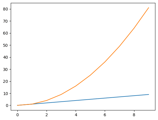
今回、Xの値は1から10までとし、一本目のグラフのYの値は同じく1から10、2本目のグラフはXの値の2乗としてみました。
これくらいの差ならわざわざ2軸グラフにする必要はありませんが、2本目のグラフがさらに大きくなるにつれて、一本目のグラフの見え方が平坦に見えるようになってしまいます。
このように複数のデータ間の差が大きい場合には、データ毎で軸をもつ方が分かりやすいことが多いです。
ということで次は2軸グラフのおさらいです。
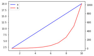
Y軸が2本の2軸グラフ
Y軸が2本の2軸グラフを作成するには、1軸目を「ax1 = fig.subplots()」、2軸目を「ax2 = ax1.twinx()」として2本の軸を作成します。
ちなみに今回はY軸を2本にしますが、X軸を2本にしたい場合はこちらの記事を参考にしてください。
ということでこんな感じです。
import matplotlib.pyplot as plt

num_points = 10

x = range(num_points)
y1 = [i for i in range(num_points)]
y2 = [i**2 for i in range(num_points)]

fig = plt.figure()
plt.clf()

ax1 = fig.subplots()
ax2 = ax1.twinx()

ax1.plot(x, y1)
ax2.plot(x, y2)

plt.show()

実行結果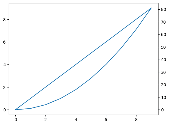
左のY軸は1本目のグラフのY軸に、右のY軸は2本目のグラフのY軸になりました。
ただこの場合、どちらのグラフもそれぞれの軸に対して1本目のグラフになってしまうので、色が同じ青色となってしまいます。
ということで色を変えてみたのがこちらです。
import matplotlib.pyplot as plt

num_points = 10

x = range(num_points)
y1 = [i for i in range(num_points)]
y2 = [i**2 for i in range(num_points)]
fig = plt.figure()
plt.clf()

ax1 = fig.subplots()
ax2 = ax1.twinx()

ax1.plot(x, y1)
ax2.plot(x, y2, color='tab:orange')

plt.show()

実行結果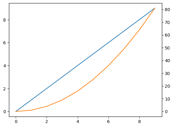
それでは今回の本題、Y軸が3本の3軸グラフを作成してみましょう。
Y軸が3本の3軸グラフ
3つ目のデータはXの値の3乗としてみます。
そして3軸目を追加するには、2軸目と同様「ax3 = ax1.twinx()」として、3軸目を作成します。
import matplotlib.pyplot as plt
import random
num_points = 10
x = range(num_points)
y1 = [i for i in range(num_points)]
y2 = [i**2 for i in range(num_points)]
y3 = [i**3 for i in range(num_points)]
fig = plt.figure()
plt.clf()
ax1 = fig.subplots()
ax2 = ax1.twinx()
ax3 = ax1.twinx()
ax1.plot(x, y1)
ax2.plot(x, y2, color='tab:orange')
ax3.plot(x, y3, color='tab:green')
plt.show()
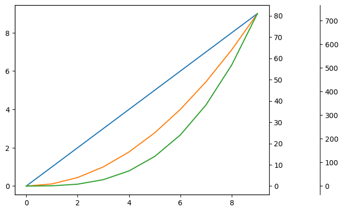
実行結果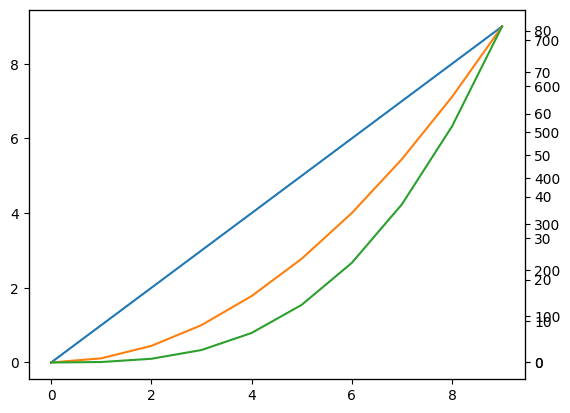
3軸目が追加されましたが、右のY軸の表示が2軸目と被ってしまっています。
そのため3軸目をずらしてやる必要がありますが、「ax3.spines[“right”].set_position((“axes”, ずらす比率))」というコマンドを追加してずらしてやります。
import matplotlib.pyplot as plt
import random

num_points = 10

x = range(num_points)
y1 = [i for i in range(num_points)]
y2 = [i**2 for i in range(num_points)]
y3 = [i**3 for i in range(num_points)]

fig = plt.figure()
plt.clf()

ax1 = fig.subplots()
ax2 = ax1.twinx()
ax3 = ax1.twinx()

ax1.plot(x, y1)
ax2.plot(x, y2, color='tab:orange')
ax3.plot(x, y3, color='tab:green')

ax3.spines["right"].set_position(("axes", 1.2))

plt.show()

実行結果
今回のグラフで軸をずらす比率としては「1.2」くらいがちょうどよかったですが、これはグラフによって調整してください。
ということで3軸グラフができあがりました。
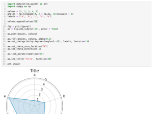
次回はmatplotlibでレーダーチャートの作成方法を紹介していきます。
ではでは今回はこんな感じで。
コメント