matplotlib
前回、日時のデータが入った列を丸ごとdatetime型に変更する方法(pd.to_datetime)とさらに秒数に変換する方法(.dt.total_seconds)を紹介しました。
今回は今まで何気なく使っていたmatplotlibのtight_layoutの挙動を確認してみようと思います。
ちなみにtight_layoutは画像エリアに対して、グラフをいい感じに配置してくれる機能です。
ただタイトル、X軸ラベル、Y軸ラベルのあるなしによって、挙動が異なるのが少し気になったので、今回確認してみようというわけです。
それでは始めていきましょう。
タイトル、X軸ラベル、Y軸ラベルなしの場合
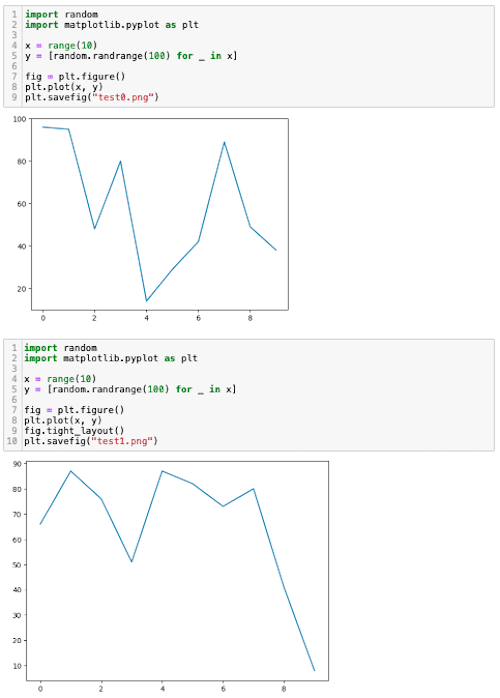
まずはタイトル、X軸ラベル、Y軸ラベルなしのパターンです。
randomモジュールを使ってランダムなデータを作成してグラフ化してみます。
import random
import matplotlib.pyplot as plt

x = range(10)
y = [random.randrange(100) for _ in x]

fig = plt.figure()
plt.plot(x, y)
plt.savefig("test0.png")
この場合は「tight_layout」がない場合です。
これで保存された画像はこんな感じになります。
今回は出力された画像のエリアが分かりやすいように枠をつけておきますが、これはmatplotlibで出力された枠ではないので、ご注意ください。
次にtight_layoutありの場合です。
import random
import matplotlib.pyplot as plt

x = range(10)
y = [random.randrange(100) for _ in x]

fig = plt.figure()
plt.plot(x, y)
fig.tight_layout()
plt.savefig("test1.png")

実行結果
「tight_layout」ありなしで比べてみると、tight_layoutありだと画像エリアのギリギリまでグラフが引き伸ばされていることが分かります。
ちなみに画像エリアとしてはどちらも「640 x 480」です。
またもう一つ気になるのはJupyter Notebook上での表示です。
結構、Jupyter Notebook上での表示と保存された画像の見た目が違っていることがあるので確認してみましょう。
tight_layoutなしの場合、保存されたグラフではグラフの周りに余白があったのですが、Jupyter Notebook上では余白は見えないという違いがあるように見えました。
タイトル、X軸ラベル、Y軸ラベルありの場合
次にタイトル、X軸ラベル、Y軸ラベルありの場合を見てみましょう。
まずはtight_layoutなしの場合です。
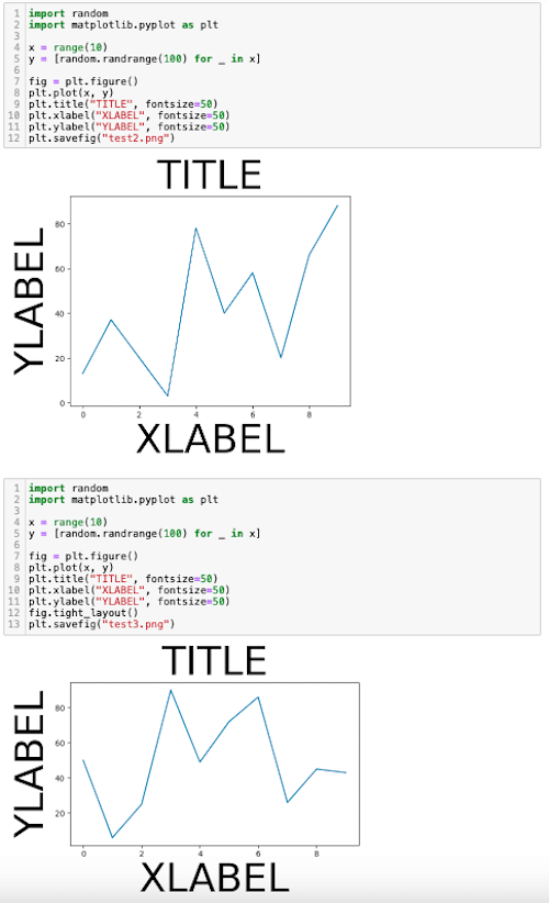
import random
import matplotlib.pyplot as plt

x = range(10)
y = [random.randrange(100) for _ in x]

fig = plt.figure()
plt.plot(x, y)
plt.title("TITLE", fontsize=50)
plt.xlabel("XLABEL", fontsize=50)
plt.ylabel("YLABEL", fontsize=50)
plt.savefig("test2.png")

実行結果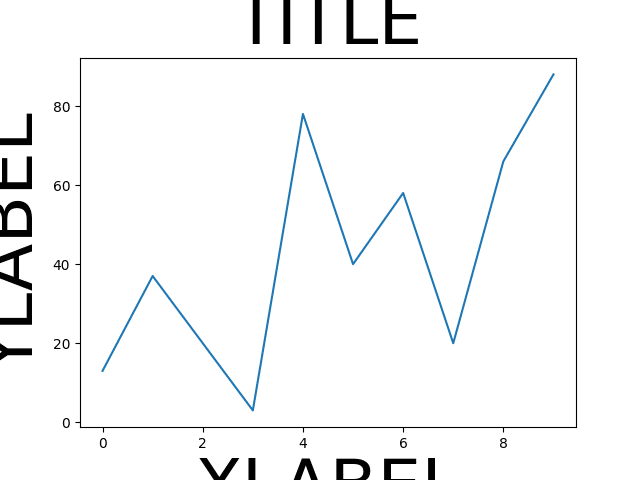
tight_layoutなしの場合、タイトルやX軸ラベル、Y軸ラベルが切れてしまいました。
次にtight_layoutありの場合です。
import random
import matplotlib.pyplot as plt

x = range(10)
y = [random.randrange(100) for _ in x]

fig = plt.figure()
plt.plot(x, y)
plt.title("TITLE", fontsize=50)
plt.xlabel("XLABEL", fontsize=50)
plt.ylabel("YLABEL", fontsize=50)
fig.tight_layout()
plt.savefig("test3.png")

実行結果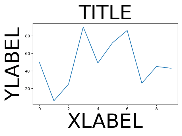
tight_layoutありの場合は全てが枠内に入るように画像が調整されました。
ただ無理やり画像エリアにグラフを入れていることからグラフエリアがラベルに圧迫されていることが分かります。
次にJupyter Notebook上での表示を見てみましょう。
tight_layoutなしの場合、保存された画像ではタイトルやX軸ラベル、Y軸ラベルは切れてしまっていたのですが、Jupyter Notebook上では切れずに表示されました。
このtight_layoutなしの場合の保存された画像とJupyter Notebook上の挙動がかなり異なることは注意すべき点です。
ということでtight_layoutありなしでの表示や保存されたグラフの挙動でした。
次回はPythonのウェブフレームワークであるFlaskをローカル環境、サーバー環境で使用する方法を紹介します。
ではでは今回はこんな感じで。
コメント