matplotlib
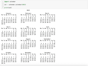
前回、Pythonでカレンダーを表示するcalenderモジュールを紹介しました。
今回はmatplotlibの話題でtight_layoutを使った際の余白の設定方法を紹介します。
事の発端はsubplotを使用して複数のグラフをまとめて表示した際に起きました。
複数のグラフをまとめて表示したため、共通のX軸ラベル、Y軸ラベルをplt.textで用意しました。
そしてtight_layoutを使わない状態では軸ラベルは軸の数値と被らなかったのですが、tight_layoutを使うとかぶってしまう現象に直面してしまったのです。
実際、やってみますが、tight_layoutを使っていない場合はこんな感じ。
import matplotlib.pyplot as plt
import random

x = range(100)
y1 = [random.randrange(0, 100) for _ in x]
y2 = [random.randrange(0, 100) for _ in x]

fig = plt.figure()

plt.subplot(2,1,1)
plt.plot(x, y1)

plt.subplot(2,1,2)
plt.plot(x, y2)

fig.text(0.5, 0.025, 'x common label', ha='center', va='center', fontsize=20)
fig.text(0.025, 0.5, 'y comonn label', ha='center', va='center', rotation='vertical', fontsize=20)

plt.show()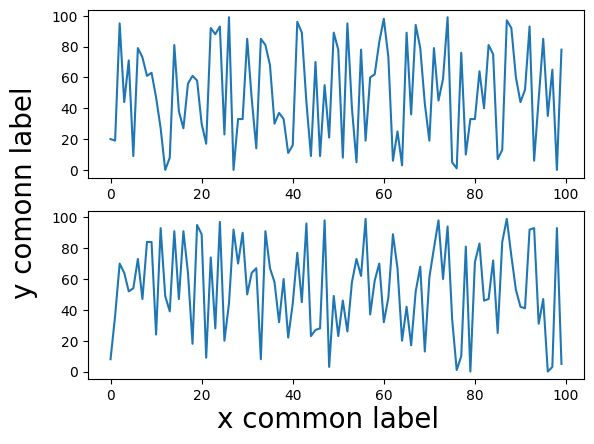
そしてtight_layoutを追加するとこんな感じです。
import matplotlib.pyplot as plt
import random

x = range(100)
y1 = [random.randrange(0, 100) for _ in x]
y2 = [random.randrange(0, 100) for _ in x]

fig = plt.figure()

plt.subplot(2,1,1)
plt.plot(x, y1)

plt.subplot(2,1,2)
plt.plot(x, y2)

fig.text(0.5, 0.025, 'x common label', ha='center', va='center', fontsize=20)
fig.text(0.025, 0.5, 'y comonn label', ha='center', va='center', rotation='vertical', fontsize=20)

plt.tight_layout()
plt.show()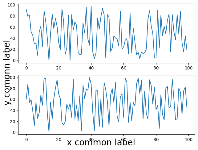
こんな感じでtight_layoutを使った時だけ軸ラベルが軸の数値に被ってしまっています。
かと言ってtight_layoutを使わないと全体のバランスが悪いので、なんとかしたいというところです。
tight_layoutで余白を設定する方法
tight_layoutを使った際に先ほどのように軸ラベルと軸の数値が被ってしまうということは、それぞれのオブジェクトにおける余白が十分に取れていないということが原因のようです。
そしてtight_layoutで余白を自分で設定するには、「pad」というオプションを使います。
ということでこんな感じ。
import matplotlib.pyplot as plt
import random

x = range(100)
y1 = [random.randrange(0, 100) for _ in x]
y2 = [random.randrange(0, 100) for _ in x]

fig = plt.figure()

plt.subplot(2,1,1)
plt.plot(x, y1)

plt.subplot(2,1,2)
plt.plot(x, y2)

fig.text(0.5, 0.025, 'x common label', ha='center', va='center', fontsize=20)
fig.text(0.025, 0.5, 'y comonn label', ha='center', va='center', rotation='vertical', fontsize=20)

plt.tight_layout(pad=2)
plt.show()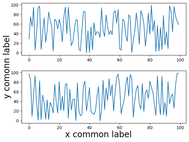
ちなみにこの「pad」の単位はよく分かりませんが、大きくなるにつれて余白も大きくなります。
import matplotlib.pyplot as plt
import random

x = range(100)
y1 = [random.randrange(0, 100) for _ in x]
y2 = [random.randrange(0, 100) for _ in x]

fig = plt.figure()

plt.subplot(2,1,1)
plt.plot(x, y1)

plt.subplot(2,1,2)
plt.plot(x, y2)

fig.text(0.5, 0.025, 'x common label', ha='center', va='center', fontsize=20)
fig.text(0.025, 0.5, 'y comonn label', ha='center', va='center', rotation='vertical', fontsize=20)

plt.tight_layout(pad=5)
plt.show()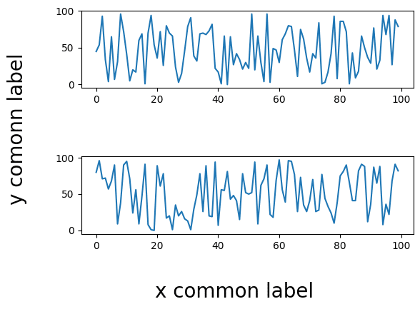
何度かtight_layoutを使うとレイアウトが崩れてラベルが重なってしまう場面に出会ったことがあるので、知っておくと便利なオプションだと思います。
次回はPythonのオブジェクトをそのまま保存したり、復元したりできるライブラリ「pickle」を使ってみます。
ではでは今回はこんな感じで。
コメント