目次
matplotlib
前回、Pythonのmatplotlibで軸を任意の位置に動かす方法を紹介しました。
あわせて読みたい
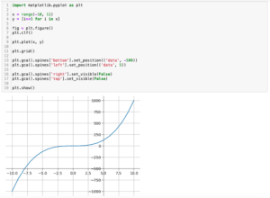
【matplotlib】軸を任意の位置に動かす方法[Python]
matplotlib 前回、Pythonのmatplotlibでグラフの原点(0, 0)に軸を配置する方法を紹介しました。 今回はmatplotlibで軸を任意の位置に動かす方法を紹介します。 まず前回…
今回はさらに2軸グラフの場合に軸を移動する方法を紹介します。
今回は2軸グラフということで、X軸もY軸も2本となるようにこんなグラフを作成してみました。
import matplotlib.pyplot as plt

x1 = range(-10, 11)
y1 = [i**3 for i in x1]

x2 = range(-100, 101)
y2 = [i**4 for i in x2]

fig = plt.figure()
plt.clf()

ax1 = fig.subplots()
ax2 = ax1.twinx()
ax3 = ax2.twiny()

ax1.plot(x1, y1, c="Blue")
ax3.plot(x2, y2, c="Red")

ax1.grid()

plt.show()

実行結果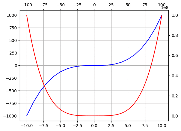
注意すべきは「ax2 = ax1.twinx()」、つまりax2でY軸を2軸に、「ax3 = ax2.twiny()」、つまりax3でX軸を2軸にしています。
実際は逆になることもあると思いますが、どちらがどちらの軸を増やしているのかを把握しておくことが重要です。
ちなみにこのようにX軸もY軸も2軸となるようなグラフの作成方法はこちらの記事で紹介していますので、よかったらどうぞ。
投稿が見つかりません。
それでは始めていきましょう。
1軸目(X軸:下、Y軸:左)を移動する方法
上記の設定の場合、1軸目はX軸もY軸も「ax1」ですので、下のX軸を動かす場合は「ax1.spines[‘bottom’].set_position((‘モード’, Yの値))」、左のY軸を動かす場合は「ax1.spines[‘left’].set_position((‘モード’, Xの値))」です。
import matplotlib.pyplot as plt

x1 = range(-10, 11)
y1 = [i**3 for i in x1]

x2 = range(-100, 101)
y2 = [i**4 for i in x2]

fig = plt.figure()
plt.clf()

ax1 = fig.subplots()
ax2 = ax1.twinx()
ax3 = ax2.twiny()

ax1.plot(x1, y1, c="Blue")
ax3.plot(x2, y2, c="Red")

ax1.grid()
ax1.spines['bottom'].set_position(('data', 500))
ax1.spines['left'].set_position(('data', -5))

plt.show()

実行結果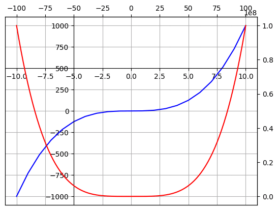
2軸目(X軸:上、Y軸:右)を移動する方法
上記の設定の場合、X軸の2軸目はax3、Y軸の2軸目はax2です。
そのため2軸目のX軸(上)を動かすには「ax3.spines[‘top’].set_position((‘モード’, Yの値))」、2軸目のY軸(右)を動かすには「ax2.spines[‘right’].set_position((‘モード’, Xの値))」とします。
import matplotlib.pyplot as plt

x1 = range(-10, 11)
y1 = [i**3 for i in x1]

x2 = range(-100, 101)
y2 = [i**4 for i in x2]

fig = plt.figure()
plt.clf()

ax1 = fig.subplots()
ax2 = ax1.twinx()
ax3 = ax2.twiny()

ax1.plot(x1, y1, c="Blue")
ax3.plot(x2, y2, c="Red")

ax1.grid()

ax3.spines['top'].set_position(('data', 25000000))
ax2.spines['right'].set_position(('data', 5))

plt.show()

実行結果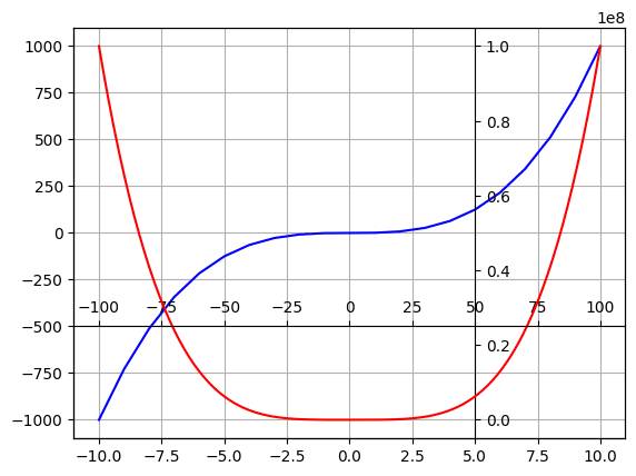
次回はmatplotlibでグラフ全体や外側を透明にする方法を紹介します。
あわせて読みたい
【matplotlib】グラフ全体や外側を透明にする方法[Python]
matplotlib 前回、Pythonのmatplotlibで2軸グラフで軸を移動する方法を紹介しました。 今回はmatplotlibでグラフ全体や外側を透明にする方法を紹介します。 まず適当に…
ではでは今回はこんな感じで。
コメント