matplotlib
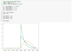
前回、PythonのSciPyでscipy.statsを使った色々な分布の描き方を紹介しました。
今回はmatplotlibで斜体(イタリック)文字、上付き文字、下付き文字を使う方法を紹介します。
まずはこんな感じでタイトル、X軸ラベル、Y軸ラベル、凡例をもったグラフを作成してみました。
import matplotlib.pyplot as plt

x = range(100)
y = [val**2 for val in x]

fig = plt.figure()
plt.clf()

plt.plot(x, y, label="Sample")

plt.title("Title")
plt.xlabel("X Label")
plt.ylabel("Y Label")
plt.legend()

plt.show()

実行結果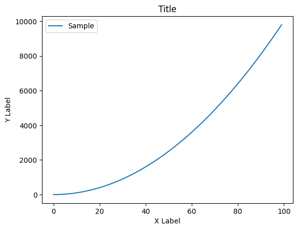
それでは始めていきましょう。
斜体にする方法1:fontstyle
まずは斜体にする方法で、fontstyleというオプション引数を使う方法です。
それぞれ斜体(イタリック)にしたいラベルに対して、「fontstyle=”oblique”」、もしくは「fontstyle=”italic”」を追加します。
import matplotlib.pyplot as plt

x = range(100)
y = [val**2 for val in x]

fig = plt.figure()
plt.clf()

plt.plot(x, y, label="Sample")

plt.title("Title", fontstyle="oblique")
plt.xlabel("X Label", fontstyle="oblique")
plt.ylabel("Y Label", fontstyle="oblique")
plt.legend()

plt.show()

実行結果
import matplotlib.pyplot as plt

x = range(100)
y = [val**2 for val in x]

fig = plt.figure()
plt.clf()

plt.plot(x, y, label="Sample")

plt.title("Title", fontstyle="italic")
plt.xlabel("X Label", fontstyle="italic")
plt.ylabel("Y Label", fontstyle="italic")
plt.legend()

plt.show()

実行結果
ただしこの方法は凡例には使えません。
import matplotlib.pyplot as plt

x = range(100)
y = [val**2 for val in x]

fig = plt.figure()
plt.clf()

plt.plot(x, y, label="Sample")

plt.title("Title", fontstyle="italic")
plt.xlabel("X Label", fontstyle="italic")
plt.ylabel("Y Label", fontstyle="italic")
plt.legend(fontstyle="italic")

plt.show()

実行結果
---------------------------------------------------------------------------
TypeError                                 Traceback (most recent call last)
Cell In[33], line 14
     12 plt.xlabel("X Label", fontstyle="italic")
     13 plt.ylabel("Y Label", fontstyle="italic")
---> 14 plt.legend(fontstyle="italic")
     16 plt.show()

(中略)

TypeError: Legend.__init__() got an unexpected keyword argument 'fontstyle'
またそれぞれのラベルの一部分だけ斜体にするといったこともできません。
斜体にする方法2:$\it{文字}$
斜体にするもう一つの方法は斜体にしたい文字を「$\it{文字}$」とする方法です。
import matplotlib.pyplot as plt

x = range(100)
y = [val**2 for val in x]

fig = plt.figure()
plt.clf()

plt.plot(x, y, label="$\it{Sample}$")

plt.title("$\it{Title}$")
plt.xlabel("X $\it{Label}$")
plt.ylabel("$\it{Y Label}$")
plt.legend()

plt.show()

実行結果
この場合、凡例にも使えますし、上記グラフのX軸ラベルの様に一部だけ(Labelの部分だけ)斜体にすることもできます。
ただし注意する点はY軸ラベルの様に「$\it{Y Label}$」とした場合、「Y」と「Label」の間のスペースは無視されてしまいます。
スペースを入れたい場合は「\ 」(バックスラッシュに続けてスペース)とします。
このバックスラッシュのことを「エスケープ文字」と言います。
import matplotlib.pyplot as plt

x = range(100)
y = [val**2 for val in x]

fig = plt.figure()
plt.clf()

plt.plot(x, y, label="$\it{Sample}$")

plt.title("$\it{Title}$")
plt.xlabel("X $\it{Label}$")
plt.ylabel("$\it{Y\ Label}$")
plt.legend()

plt.show()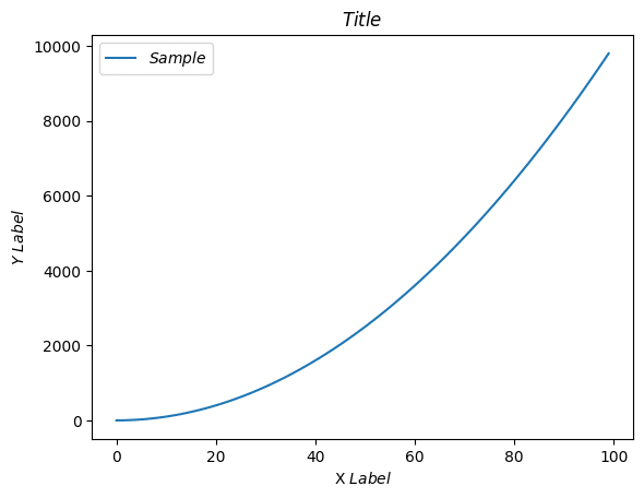
上付き文字、下付き文字を使う方法
次に上付き文字、下付き文字を使う方法です。
上付き文字の場合は「$^上付きにしたい文字$」、下付き文字にしたい場合は「$_下付き文字」とします。
import matplotlib.pyplot as plt

x = range(100)
y = [val**2 for val in x]

fig = plt.figure()
plt.clf()

plt.plot(x, y, label="Sample$^A$")

plt.title("Title$^B$")
plt.xlabel("X Label$^C$")
plt.ylabel("Y Label$^D$")
plt.legend()

plt.show()

実行結果
import matplotlib.pyplot as plt

x = range(100)
y = [val**2 for val in x]

fig = plt.figure()
plt.clf()

plt.plot(x, y, label="Sample$_A$")

plt.title("Title$_B$")
plt.xlabel("X Label$_C$")
plt.ylabel("Y Label$_D$")
plt.legend()

plt.show()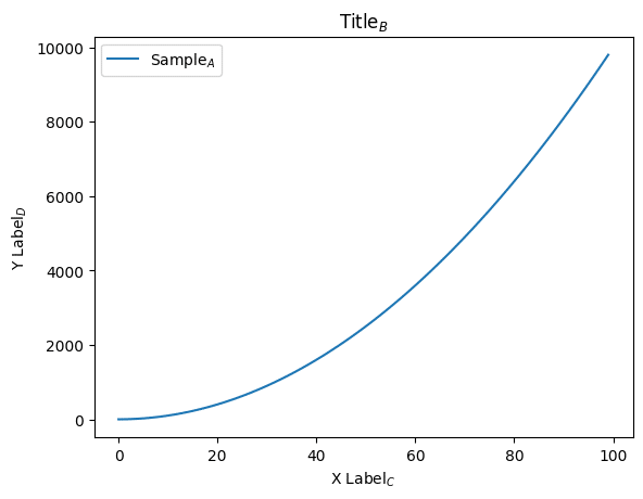
気をつける点は上付き文字の場合は「^」の直後の文字のみ上付き文字になり、下付き文字の場合は「_」の直後の文字のみ下付き文字になります。
import matplotlib.pyplot as plt

x = range(100)
y = [val**2 for val in x]

fig = plt.figure()
plt.clf()

plt.plot(x, y, label="Sample$^Aa$")

plt.title("Title$^Bb$")
plt.xlabel("X Label$^Cc$")
plt.ylabel("Y Label$^Dd$")
plt.legend()

plt.show()

実行結果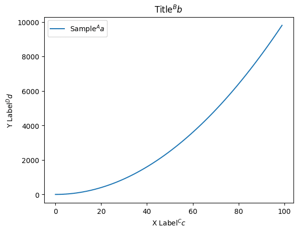
import matplotlib.pyplot as plt

x = range(100)
y = [val**2 for val in x]

fig = plt.figure()
plt.clf()

plt.plot(x, y, label="Sample$_Aa$")

plt.title("Title$_Bb$")
plt.xlabel("X Label$_Cc$")
plt.ylabel("Y Label$_Dd$")
plt.legend()

plt.show()

実行結果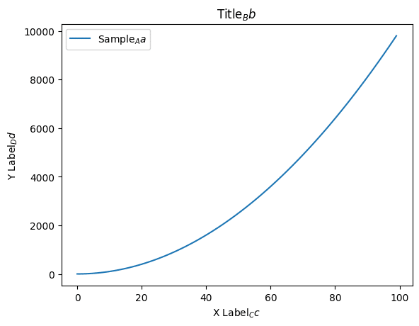
もし連続する複数の文字を上付き文字、下付き文字にしたい場合はそれぞれ「^{文字}」、「_{文字}」と上付き文字、下付き文字にしたい文字を波括弧({})でくくります。
import matplotlib.pyplot as plt

x = range(100)
y = [val**2 for val in x]

fig = plt.figure()
plt.clf()

plt.plot(x, y, label="Sample$^{Aa}$")

plt.title("Title$^{Bb}$")
plt.xlabel("X Label$^{Cc}$")
plt.ylabel("Y Label$^{Dd}$")
plt.legend()

plt.show()

実行結果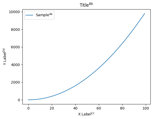
import matplotlib.pyplot as plt

x = range(100)
y = [val**2 for val in x]

fig = plt.figure()
plt.clf()

plt.plot(x, y, label="Sample$_{Aa}$")

plt.title("Title$_{Bb}$")
plt.xlabel("X Label$_{Cc}$")
plt.ylabel("Y Label$_{Dd}$")
plt.legend()

plt.show()

実行結果
$を使いたい場合
今回、文字を「$」でくくっている部分が特殊な文字を使うと認識されてしまうことから、そのままでは「$」は表示できません。
「$」を表示させたい場合はエスケープ文字であるバックスラッシュ(\)を使って、「\$」とします。
import matplotlib.pyplot as plt

x = range(100)
y = [val**2 for val in x]

fig = plt.figure()
plt.clf()

plt.plot(x, y, label="Sample$\$$")

plt.title("Title$\it{\$}$")
plt.xlabel("X Label$^\$$")
plt.ylabel("Y Lavel$_{\$\$}$")
plt.legend()

plt.show()

実行結果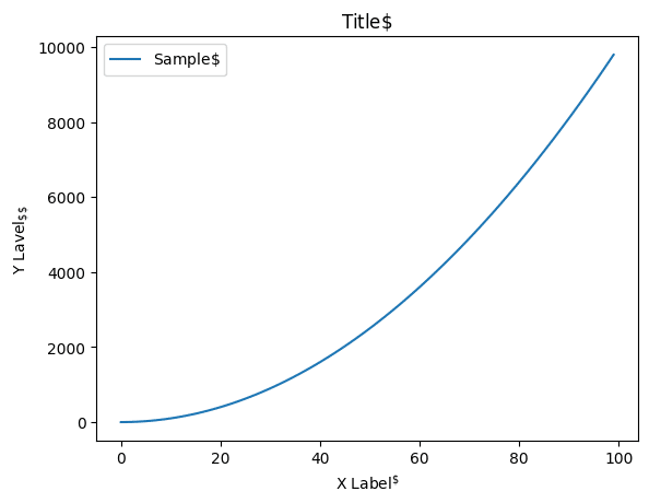
ここでの注意点は「$」を表示したい全ての「$」の前に「\(バックスラッシュ)」が必要なことです。
例えば「Sample$\$$」のバックスラッシュを無くし「Sample$$$」に、「Title$\it{\$}$」のバックスラッシュを無くし「Title$\it{$}$」に、「Y Lavel$_{\$\$}$」のバックスラッシュを一つ減らし「Y Lavel$_{\$$}$」にしてみました。
import matplotlib.pyplot as plt

x = range(100)
y = [val**2 for val in x]

fig = plt.figure()
plt.clf()

plt.plot(x, y, label="Sample$$$")

plt.title("Title$\it{$}$")
plt.xlabel("X Label$^\$$")
plt.ylabel("Y Lavel$_{\$$}$")
plt.legend()

plt.show()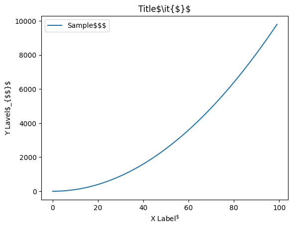
実行結果を見てみると変更した部分は「Sample$$$」、「Title$\it{$}$」、「Y Lavel$_{$$}$」と表示されており、意図した表示になっていないことがわかります。
ということでそれぞれ「$」を表示したいところには「\(バックスラッシュ)」を忘れない様にしましょう。
次回はmatplotlibでギリシャ文字を表示する方法を紹介します。
ではでは今回はこんな感じで。
コメント