matplotlib
前回、Pythonのmatplotlibで軸の値に特定の値を表示する方法、軸の値に文字列や日付を指定する方法を紹介しました。
今回はmatplotlibの2軸グラフで表示する軸の値を指定する方法と軸の値を回転させる方法を紹介します。
まずは基本となるグラフをY軸が左右に1本ずつある2軸グラフとして作成してみました。
import matplotlib.pyplot as plt
import random

x_list = range(0, 100)
y1_list = [i for i in x_list]
y2_list = [i**2 for i in x_list]

fig = plt.figure()
plt.clf()

ax1 = fig.subplots()
ax2 = plt.twinx()

ax1.plot(x_list, y1_list, c="tab:blue")
ax2.plot(x_list, y2_list, c="tab:orange")

plt.show()

実行結果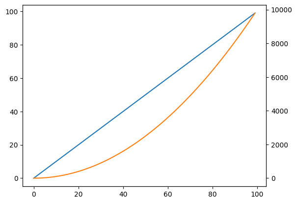
それでは始めていきましょう。
2軸グラフで表示する軸の値を指定する方法
まずは前回の2軸グラフバージョン、2軸グラフで表示する軸の値を指定する方法を紹介します。
2軸グラフでX軸の軸の値を設定するには「ax.set_xticks(値のリスト)」を使います。
import matplotlib.pyplot as plt
import random

x_list = range(0, 100)
y1_list = [i for i in x_list]
y2_list = [i**2 for i in x_list]

fig = plt.figure()
plt.clf()

ax1 = fig.subplots()
ax2 = plt.twinx()

ax1.plot(x_list, y1_list, c="tab:blue")
ax2.plot(x_list, y2_list, c="tab:orange")

ax1.set_xticks([0, 10, 20, 30, 40, 50, 60, 70, 80, 90, 100])

plt.show()

実行結果
設定なしの時には20刻みだったX軸の値が10刻みになりました。
今回はY軸が左右に1本ずつある2軸グラフで作成しています。
上の例では1軸目である「ax1」のX軸に対して「.set_xticks」を実行していますのが、2軸目である「ax2」に「.set_xticks」を使っても同じ結果になります。
import matplotlib.pyplot as plt
import random

x_list = range(0, 100)
y1_list = [i for i in x_list]
y2_list = [i**2 for i in x_list]

fig = plt.figure()
plt.clf()

ax1 = fig.subplots()
ax2 = plt.twinx()

ax1.plot(x_list, y1_list, c="tab:blue")
ax2.plot(x_list, y2_list, c="tab:orange")

ax2.set_xticks([0, 10, 20, 30, 40, 50, 60, 70, 80, 90, 100])

plt.show()

実行結果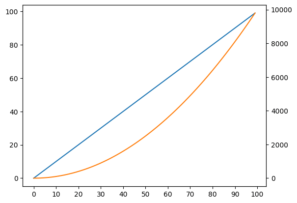
Y軸の値を設定するには「ax.set_yticks」を用います。
今回はY軸が左右に1本ずつある2軸グラフですので、ax1では左側のY軸の値を、ax2では右側のY軸の値を設定することになります。
import matplotlib.pyplot as plt
import random

x_list = range(0, 100)
y1_list = [i for i in x_list]
y2_list = [i**2 for i in x_list]

fig = plt.figure()
plt.clf()

ax1 = fig.subplots()
ax2 = plt.twinx()

ax1.plot(x_list, y1_list, c="tab:blue")
ax2.plot(x_list, y2_list, c="tab:orange")

ax1.set_yticks([0, 10, 20, 30, 40, 50, 60, 70, 80, 90, 100])

plt.show()

実行結果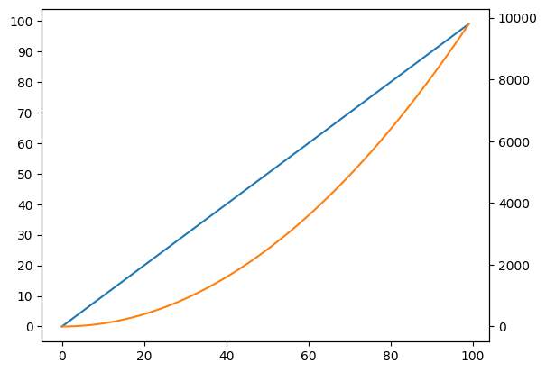
import matplotlib.pyplot as plt
import random

x_list = range(0, 100)
y1_list = [i for i in x_list]
y2_list = [i**2 for i in x_list]

fig = plt.figure()
plt.clf()

ax1 = fig.subplots()
ax2 = plt.twinx()

ax1.plot(x_list, y1_list, c="tab:blue")
ax2.plot(x_list, y2_list, c="tab:orange")

ax2.set_yticks([0, 1000, 2000, 3000, 4000, 5000, 6000, 7000, 8000, 9000, 10000])

plt.show()

実行結果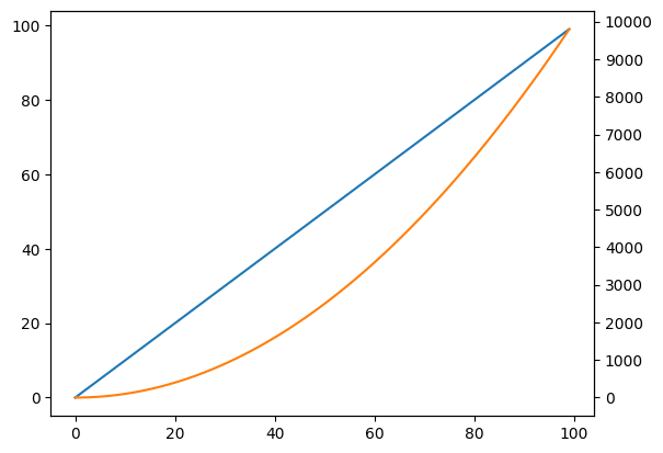
2軸グラフで軸の値を文字列とした場合の特定の値の表示方法
次に2軸グラフで軸の値を文字列とした場合の特定の値の表示方法を紹介します。
X軸の値を文字列とした2軸グラフをこんな感じで作成してみました。
import matplotlib.pyplot as plt
import random

x_list = ["a", "b", "c", "d", "e", "f", "g", "h", "i", "j", "k",
          "l", "m", "n", "o", "p", "q", "r", "s", "t", "u", "v",
          "w", "x", "y", "z"]

y1_list = [i for i in range(len(x_list))]
y2_list = [i**2 for i in range(len(x_list))]

fig = plt.figure()
plt.clf()

ax1 = fig.subplots()
ax2 = plt.twinx()

ax1.plot(x_list, y1_list, c="tab:blue")
ax2.plot(x_list, y2_list, c="tab:orange")

plt.show()

実行結果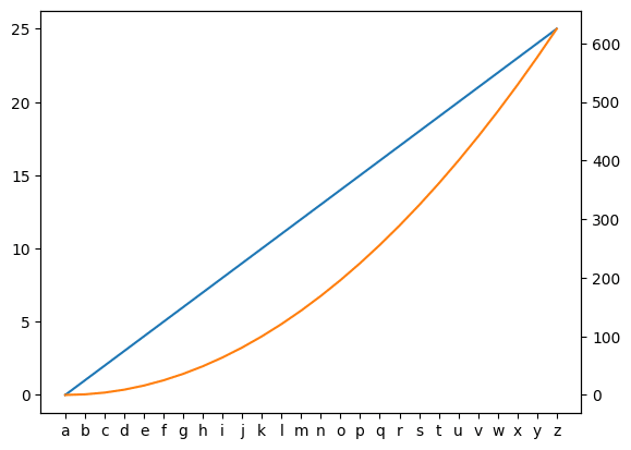
X軸の値に文字列を与えているため全ての値が表示されています。
ここで特定の値だけ表示させるには「ax.set_xticks()」に表示させたい値のインデックスを与えます。
今回はrange関数を使って一つ飛びで表示させてみます。
import matplotlib.pyplot as plt
import random

x_list = ["a", "b", "c", "d", "e", "f", "g", "h", "i", "j", "k",
          "l", "m", "n", "o", "p", "q", "r", "s", "t", "u", "v",
          "w", "x", "y", "z"]

y1_list = [i for i in range(len(x_list))]
y2_list = [i**2 for i in range(len(x_list))]

fig = plt.figure()
plt.clf()

ax1 = fig.subplots()
ax2 = plt.twinx()

ax1.plot(x_list, y1_list, c="tab:blue")
ax2.plot(x_list, y2_list, c="tab:orange")

ax1.set_xticks(range(0, len(x_list), 2))

plt.show()

実行結果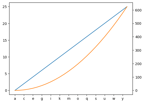
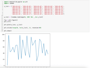
2軸グラフで軸の値を回転させる方法
次に2軸グラフで軸の値を回転させる方法を紹介します。
まずは回転させる前のグラフをこんな感じで作成してみました。
import matplotlib.pyplot as plt
import random

x_list = ['2024-01-01', '2024-01-02', '2024-01-03', '2024-01-04', '2024-01-05',
        '2024-01-06', '2024-01-07', '2024-01-08', '2024-01-09', '2024-01-10',
        '2024-01-11', '2024-01-12', '2024-01-13', '2024-01-14', '2024-01-15',
        '2024-01-16', '2024-01-17', '2024-01-18', '2024-01-19', '2024-01-20',
        '2024-01-21', '2024-01-22', '2024-01-23', '2024-01-24', '2024-01-25',
        '2024-01-26', '2024-01-27', '2024-01-28', '2024-01-29', '2024-01-30']

y1_list = [i for i in range(len(x_list))]
y2_list = [i**2 for i in range(len(x_list))]

fig = plt.figure()
plt.clf()

ax1 = fig.subplots()
ax2 = plt.twinx()

ax1.plot(x_list, y1_list, c="tab:blue")
ax2.plot(x_list, y2_list, c="tab:orange")

plt.show()

実行結果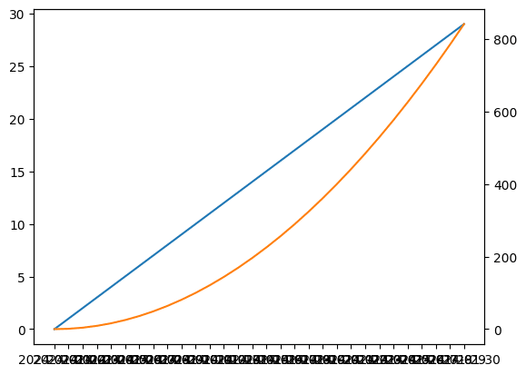
文字列をX軸の値に設定しているため全ての値が表示されてしまっているのと、日付の様な長い文字列であるため、大部分が隣と被ってしまい、値が読めなくなってしまいました。
この値を回転させるためには「ax.set_xticklabels(値のリスト, rotation=角度)」を追加します。
import matplotlib.pyplot as plt
import random

x_list = ['2024-01-01', '2024-01-02', '2024-01-03', '2024-01-04', '2024-01-05',
        '2024-01-06', '2024-01-07', '2024-01-08', '2024-01-09', '2024-01-10',
        '2024-01-11', '2024-01-12', '2024-01-13', '2024-01-14', '2024-01-15',
        '2024-01-16', '2024-01-17', '2024-01-18', '2024-01-19', '2024-01-20',
        '2024-01-21', '2024-01-22', '2024-01-23', '2024-01-24', '2024-01-25',
        '2024-01-26', '2024-01-27', '2024-01-28', '2024-01-29', '2024-01-30']

y1_list = [i for i in range(len(x_list))]
y2_list = [i**2 for i in range(len(x_list))]

fig = plt.figure()
plt.clf()

ax1 = fig.subplots()
ax2 = plt.twinx()

ax1.plot(x_list, y1_list, c="tab:blue")
ax2.plot(x_list, y2_list, c="tab:orange")

ax1.set_xticklabels(x_list, rotation=90)

plt.show()

実行結果
/var/folders/sp/hg7p80kx22s7vct7yb0zl5cm0000gn/T/ipykernel_2726/
3743213550.py:23: UserWarning: FixedFormatter should only be used
together with FixedLocator
  ax1.set_xticklabels(x_list, rotation=90)
「plt.xticks()」の場合は引数に「rotation=角度」を追加するだけで良かったのですが、「ax.xticklabels()」では値のリストも必須です。
値のリストを与えずに「rotation=角度」だけ与えるとエラーとなります。
import matplotlib.pyplot as plt
import random

x_list = ['2024-01-01', '2024-01-02', '2024-01-03', '2024-01-04', '2024-01-05',
        '2024-01-06', '2024-01-07', '2024-01-08', '2024-01-09', '2024-01-10',
        '2024-01-11', '2024-01-12', '2024-01-13', '2024-01-14', '2024-01-15',
        '2024-01-16', '2024-01-17', '2024-01-18', '2024-01-19', '2024-01-20',
        '2024-01-21', '2024-01-22', '2024-01-23', '2024-01-24', '2024-01-25',
        '2024-01-26', '2024-01-27', '2024-01-28', '2024-01-29', '2024-01-30']

y1_list = [i for i in range(len(x_list))]
y2_list = [i**2 for i in range(len(x_list))]

fig = plt.figure()
plt.clf()

ax1 = fig.subplots()
ax2 = plt.twinx()

ax1.plot(x_list, y1_list, c="tab:blue")
ax2.plot(x_list, y2_list, c="tab:orange")

ax1.set_xticklabels(rotation=90)

plt.show()

実行結果
---------------------------------------------------------------------------
TypeError                                 Traceback (most recent call last)
Cell In[15], line 24
     20 ax1.plot(x_list, y1_list, c="tab:blue")
     21 ax2.plot(x_list, y2_list, c="tab:orange")
---> 24 ax1.set_xticklabels(rotation=90)
     26 plt.show()

File /Library/Frameworks/Python.framework/Versions/3.10/lib/python3.10/site-packages/matplotlib/axes/_base.py:74, in _axis_method_wrapper.__set_name__.<locals>.wrapper(self, *args, **kwargs)
     73 def wrapper(self, *args, **kwargs):
---> 74     return get_method(self)(*args, **kwargs)

File /Library/Frameworks/Python.framework/Versions/3.10/lib/python3.10/site-packages/matplotlib/_api/deprecation.py:297, in rename_parameter.<locals>.wrapper(*args, **kwargs)
    292     warn_deprecated(
    293         since, message=f"The {old!r} parameter of {func.__name__}() "
    294         f"has been renamed {new!r} since Matplotlib {since}; support "
    295         f"for the old name will be dropped %(removal)s.")
    296     kwargs[new] = kwargs.pop(old)
--> 297 return func(*args, **kwargs)

TypeError: Axis.set_ticklabels() missing 1 required positional argument: 'labels'
また警告として「UserWarning: FixedFormatter should only be used together with FixedLocator」が出ています。
これを解消するにはX軸のラベルの場所を「set_xticks()」で与える必要があります。
今回の場合はX軸の値は文字列でリストとなっているので、その文字列のリストの長さとrange関数を使って位置のリストを作成しました。
import matplotlib.pyplot as plt
import random

x_list = ['2024-01-01', '2024-01-02', '2024-01-03', '2024-01-04', '2024-01-05',
        '2024-01-06', '2024-01-07', '2024-01-08', '2024-01-09', '2024-01-10',
        '2024-01-11', '2024-01-12', '2024-01-13', '2024-01-14', '2024-01-15',
        '2024-01-16', '2024-01-17', '2024-01-18', '2024-01-19', '2024-01-20',
        '2024-01-21', '2024-01-22', '2024-01-23', '2024-01-24', '2024-01-25',
        '2024-01-26', '2024-01-27', '2024-01-28', '2024-01-29', '2024-01-30']

y1_list = [i for i in range(len(x_list))]
y2_list = [i**2 for i in range(len(x_list))]

fig = plt.figure()
plt.clf()

ax1 = fig.subplots()
ax2 = plt.twinx()

ax1.plot(x_list, y1_list, c="tab:blue")
ax2.plot(x_list, y2_list, c="tab:orange")

ax1.set_xticks(range(len(x_list)))
ax1.set_xticklabels(x_list, rotation=90)

plt.show()

実行結果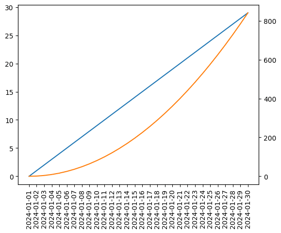
この回転させた状態でさらに特定の値だけ表示させてみましょう。
今回は先ほどやった様に一つ飛びで表示させてみることにします。
その場合、「ax.set_xticks()」に一つ飛びになるようにインデックスのリストを、さらに「ax.set_xticklabels()」の表示する値のリストを一つ飛びにします。
import matplotlib.pyplot as plt
import random

x_list = ['2024-01-01', '2024-01-02', '2024-01-03', '2024-01-04', '2024-01-05',
        '2024-01-06', '2024-01-07', '2024-01-08', '2024-01-09', '2024-01-10',
        '2024-01-11', '2024-01-12', '2024-01-13', '2024-01-14', '2024-01-15',
        '2024-01-16', '2024-01-17', '2024-01-18', '2024-01-19', '2024-01-20',
        '2024-01-21', '2024-01-22', '2024-01-23', '2024-01-24', '2024-01-25',
        '2024-01-26', '2024-01-27', '2024-01-28', '2024-01-29', '2024-01-30']

y1_list = [i for i in range(len(x_list))]
y2_list = [i**2 for i in range(len(x_list))]

fig = plt.figure()
plt.clf()

ax1 = fig.subplots()
ax2 = plt.twinx()

ax1.plot(x_list, y1_list, c="tab:blue")
ax2.plot(x_list, y2_list, c="tab:orange")

ax1.set_xticks(range(0, len(x_list), 2))
ax1.set_xticklabels(x_list[::2], rotation=90)

plt.show()

実行結果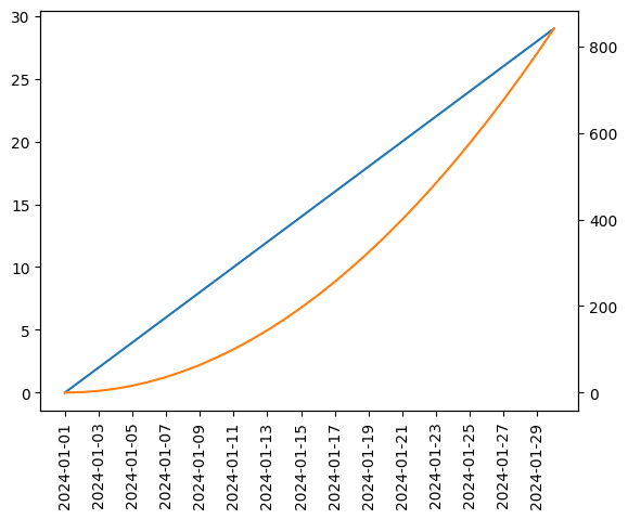
ちなみに「ax.xticks()」を与えないと軸の値自身は一つ飛びになりますが、表示される場所が一つ飛びとならずに、前から詰められた状態となります。
import matplotlib.pyplot as plt
import random

x_list = ['2024-01-01', '2024-01-02', '2024-01-03', '2024-01-04', '2024-01-05',
        '2024-01-06', '2024-01-07', '2024-01-08', '2024-01-09', '2024-01-10',
        '2024-01-11', '2024-01-12', '2024-01-13', '2024-01-14', '2024-01-15',
        '2024-01-16', '2024-01-17', '2024-01-18', '2024-01-19', '2024-01-20',
        '2024-01-21', '2024-01-22', '2024-01-23', '2024-01-24', '2024-01-25',
        '2024-01-26', '2024-01-27', '2024-01-28', '2024-01-29', '2024-01-30']

y1_list = [i for i in range(len(x_list))]
y2_list = [i**2 for i in range(len(x_list))]

fig = plt.figure()
plt.clf()

ax1 = fig.subplots()
ax2 = plt.twinx()

ax1.plot(x_list, y1_list, c="tab:blue")
ax2.plot(x_list, y2_list, c="tab:orange")

ax1.set_xticklabels(x_list[::2], rotation=90)

plt.show()

実行結果
/var/folders/sp/hg7p80kx22s7vct7yb0zl5cm0000gn/T/ipykernel_2726/
3469014434.py:23: UserWarning: FixedFormatter should only be used
together with FixedLocator
  ax1.set_xticklabels(x_list[::2], rotation=90)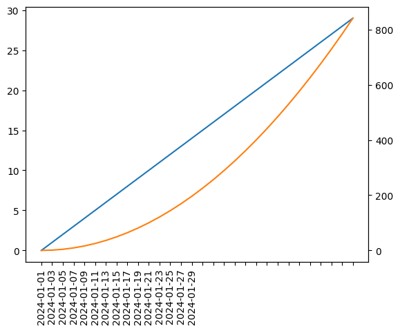
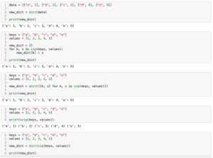
次回はリストから辞書を作成する方法を紹介します。
ではでは今回はこんな感じで。
コメント