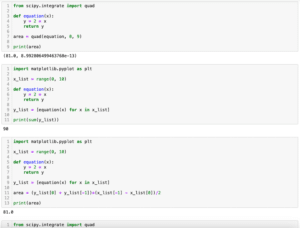
目次
Matplotlib
前回、PythonのSciPyでintegrate.quadを使って積分する方法を紹介しました。
あわせて読みたい
【SciPy】integrate.quadを使って積分する方法[Python]
SciPy 前回、RDkitでデータベースから化合物の構造情報を取得し描画する方法を紹介しました。 今回はSciPyのintegrate.quadを使って積分する方法を紹介します。 それで…
今回はpcolormeshのカラーバーの範囲を設定する方法と正規化(ノーマライズ)する方法を紹介します。
まずはpcolormeshのおさらいです。
pcolormeshはX軸のリストとY軸のリストを作成し、それぞれの交点の強度を2次元リストで作成し、それを「pcolormesh(X軸の値, Y軸の値, 強度)」とすることで2次元のカラーマップを作成することができます。
import matplotlib.pyplot as plt
import numpy as np

x_num = 5
y_num = 7
step = 0.5

x_list = np.arange(0, x_num, step)
y_list = np.arange(0, y_num, step)

z_list = []
for y_val in y_list:
    z_list_temp = []
    for x_val in x_list:
        z_list_temp.append(x_val*y_val)
    z_list.append(z_list_temp)

fig = plt.figure()
plt.clf()

plt.pcolormesh(x_list, y_list, z_list)

plt.colorbar()
plt.show()

実行結果
カラーバーの範囲を設定する方法
カラーバーの範囲を設定するには「pcolormesh」のオプション引数として「vmin」、「vmax」を設定します。
import matplotlib.pyplot as plt
import numpy as np

x_num = 5
y_num = 7
step = 0.5

x_list = np.arange(0, x_num, step)
y_list = np.arange(0, y_num, step)

z_list = []
for y_val in y_list:
    z_list_temp = []
    for x_val in x_list:
        z_list_temp.append(x_val*y_val)
    z_list.append(z_list_temp)

fig = plt.figure()
plt.clf()

plt.pcolormesh(x_list, y_list, z_list, vmin=10, vmax=20)

plt.colorbar()
plt.show()

実行結果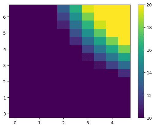
カラーバーの色を正規化する方法
次にカラーバーの色を正規化する方法を紹介します。
カラーバーの色を正規化するには「pcolormesh」のオプション引数に「norm」を追加します。
設定できる値としては「linear(デフォルト)」、「log」、「symlog」、「logit」があります。
・linearの場合
import matplotlib.pyplot as plt
import numpy as np
from matplotlib.colors import Normalize

x_num = 5
y_num = 7
step = 0.5

x_list = np.arange(0, x_num, step)
y_list = np.arange(0, y_num, step)

z_list = []
for y_val in y_list:
    z_list_temp = []
    for x_val in x_list:
        z_list_temp.append(x_val*y_val)
    z_list.append(z_list_temp)

fig = plt.figure()
plt.clf()

plt.pcolormesh(x_list, y_list, z_list, norm="linear")

plt.colorbar()
plt.show()

実行結果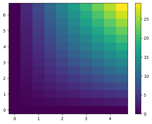
・logの場合
import matplotlib.pyplot as plt
import numpy as np
from matplotlib.colors import Normalize

x_num = 5
y_num = 7
step = 0.5

x_list = np.arange(0, x_num, step)
y_list = np.arange(0, y_num, step)

z_list = []
for y_val in y_list:
    z_list_temp = []
    for x_val in x_list:
        z_list_temp.append(x_val*y_val)
    z_list.append(z_list_temp)

fig = plt.figure()
plt.clf()

plt.pcolormesh(x_list, y_list, z_list, norm="log")

plt.colorbar()
plt.show()

実行結果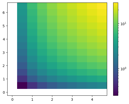
・symlogの場合
import matplotlib.pyplot as plt
import numpy as np
from matplotlib.colors import Normalize

x_num = 5
y_num = 7
step = 0.5

x_list = np.arange(0, x_num, step)
y_list = np.arange(0, y_num, step)

z_list = []
for y_val in y_list:
    z_list_temp = []
    for x_val in x_list:
        z_list_temp.append(x_val*y_val)
    z_list.append(z_list_temp)

fig = plt.figure()
plt.clf()

plt.pcolormesh(x_list, y_list, z_list, norm="symlog")

plt.colorbar()
plt.show()

実行結果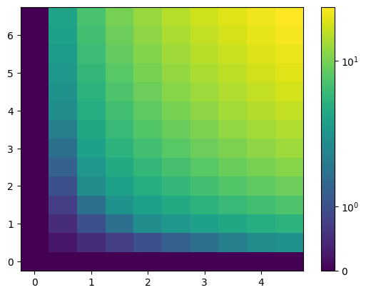
・logitの場合
import matplotlib.pyplot as plt
import numpy as np
from matplotlib.colors import Normalize

x_num = 5
y_num = 7
step = 0.5

x_list = np.arange(0, x_num, step)
y_list = np.arange(0, y_num, step)

z_list = []
for y_val in y_list:
    z_list_temp = []
    for x_val in x_list:
        z_list_temp.append(x_val*y_val)
    z_list.append(z_list_temp)

fig = plt.figure()
plt.clf()

plt.pcolormesh(x_list, y_list, z_list, norm="logit")

plt.colorbar()
plt.show()

実行結果
次回はmatplotlibで指数表記になってしまった軸のラベルを整数表記に戻す方法を紹介します。
ではでは今回はこんな感じで。
コメント