Matplotlib
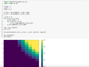
前回、PythonのMatplotlibでpcolormeshのカラーバーの範囲を設定する方法と正規化(ノーマライズ)する方法を紹介しました。
今回はMatplotlibで指数表記になってしまった軸のラベルを整数表記に戻す方法と逆に強制的に指数表記にする方法を紹介します。
それでは始めていきましょう。
軸の表記が指数になる条件
まずは軸の表記が指数になってしまう条件を見てみましょう。
例えばYの値を100,000刻みで1,000,000まで表示してみます。
import matplotlib.pyplot as plt
import numpy as np

order = 100000

x_list = np.arange(0, 10)
y_list = [x * order for x in x_list]

fig = plt.figure()
plt.clf()

plt.plot(x_list, y_list)

plt.show()

実行結果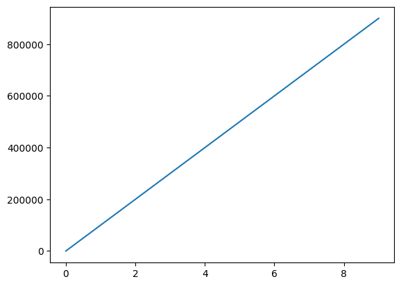
1,000,000までは整数表記となりました。
さらに一桁増やして最大値を10,000,000としてみます。
import matplotlib.pyplot as plt
import numpy as np

order = 1000000

x_list = np.arange(0, 10)
y_list = [x * order for x in x_list]

fig = plt.figure()
plt.clf()

plt.plot(x_list, y_list)

plt.show()

実行結果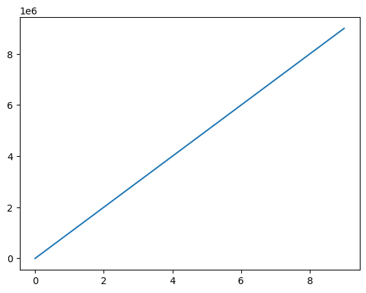
Y軸のラベルの表記が指数になりました。
しかし桁数が多くなっても整数表記にしたい場合もあることでしょう。
今回はその様な場合に整数表記に戻す方法を紹介します。
軸のラベルを整数表記にする方法
軸のラベルを整数表記にするには「plt.ticklabel_format(style=”plain”)」をプログラム上に追加します。
import matplotlib.pyplot as plt
import numpy as np

order = 1000000

x_list = np.arange(0, 10)
y_list = [x * order for x in x_list]

fig = plt.figure()
plt.clf()

plt.plot(x_list, y_list)

plt.ticklabel_format(style="plain")

plt.show()

実行結果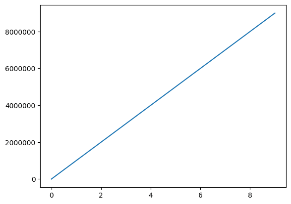
軸のラベルを指数表記にする方法
次に逆に軸のラベルを強制的に指数表記にする方法を紹介します。
その場合は「plt.ticklabel_format(style=”sci”, scilimits=[最小の指数, 最大の指数])」をプログラムに追加します。
「scilimits=[最小の指数, 最大の指数]」で指定した範囲の外側の数値が指数表記となります。
import matplotlib.pyplot as plt
import numpy as np

order = 10

x_list = np.arange(0, 10)
y_list = [x * order for x in x_list]

fig = plt.figure()
plt.clf()

plt.plot(x_list, y_list)

plt.ticklabel_format(style="sci", scilimits=[-1, 1])

plt.show()

実行結果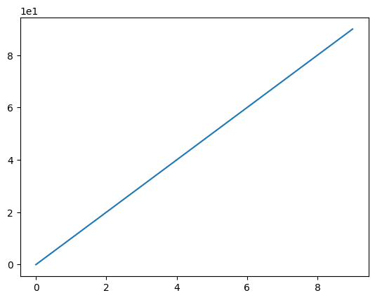
scilimitのデフォルトは[-5, 6]のため、scilimitのオプション引数を指定していない「plt.ticklabel_format(style=”sci”)」を追加しただけでは、指数表記にならない場合もあるので注意してください。
import matplotlib.pyplot as plt
import numpy as np

order = 100000

x_list = np.arange(0, 10)
y_list = [x * order for x in x_list]

fig = plt.figure()
plt.clf()

plt.plot(x_list, y_list)

plt.ticklabel_format(style="sci")

plt.show()

実行結果
全て指数表記にする場合は「scilimits=[0, 0]」とします。
import matplotlib.pyplot as plt
import numpy as np

order = 5

x_list = np.arange(0, 10)
y_list = [x * order for x in x_list]

fig = plt.figure()
plt.clf()

plt.plot(x_list, y_list)

plt.ticklabel_format(style="sci", scilimits=[0, 0])

plt.show()

実行結果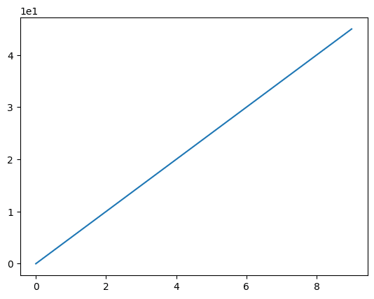
表記を変更する軸を指定する方法
ここまではY軸の表記を変更してきましたが、X軸のラベルの表記、もしくは両方の表記を指定したい場合もあることでしょう。
例えばX軸もY軸も指数に変更されてしまった例を見てみましょう。
import matplotlib.pyplot as plt
import numpy as np

order = 1000000

x_list = np.arange(0, 10) * order
y_list = [a * order for a in range(len(x_list))]

fig = plt.figure()
plt.clf()

plt.plot(x_list, y_list)

plt.show()

実行結果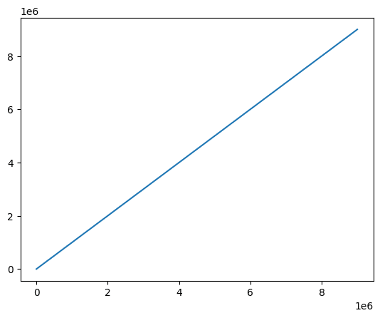
ここで「plt.ticklabel_format(style=”plain”)」を追加するとX軸もY軸も整数表記になります。
import matplotlib.pyplot as plt
import numpy as np

order = 1000000

x_list = np.arange(0, 10) * order
y_list = [a * order for a in range(len(x_list))]

fig = plt.figure()
plt.clf()

plt.plot(x_list, y_list)

plt.ticklabel_format(style="plain")

plt.show()

実行結果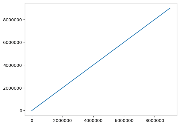
X軸だけ整数表記にする場合は「axis=”x”」を追加します。
import matplotlib.pyplot as plt
import numpy as np

order = 1000000

x_list = np.arange(0, 10) * order
y_list = [a * order for a in range(len(x_list))]

fig = plt.figure()
plt.clf()

plt.plot(x_list, y_list)

plt.ticklabel_format(style="plain", axis="x")

plt.show()

実行結果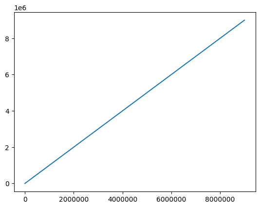
X軸だけ整数表記にする場合は「axis=”y”」を追加します。
import matplotlib.pyplot as plt
import numpy as np

order = 1000000

x_list = np.arange(0, 10) * order
y_list = [a * order for a in range(len(x_list))]

fig = plt.figure()
plt.clf()

plt.plot(x_list, y_list)

plt.ticklabel_format(style="plain", axis="y")

plt.show()

実行結果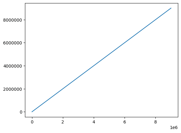
2軸グラフの各軸の表記を指定する方法
次に2軸グラフの各軸の表記を指定する方法を紹介します。
例えばこの様なY軸が2本の2軸グラフがあったとします。
import matplotlib.pyplot as plt
import numpy as np

order = 1000000

x_list = np.arange(0, 10) * order
y1_list = [a * order for a in range(len(x_list))]
y2_list = [a**2 * order for a in range(len(x_list))]

fig = plt.figure()
plt.clf()

ax1 = fig.subplots()
ax2 = ax1.twinx()

ax1.plot(x_list, y1_list, color="tab:blue")
ax2.plot(x_list, y2_list, color="tab:orange")

plt.show()

実行結果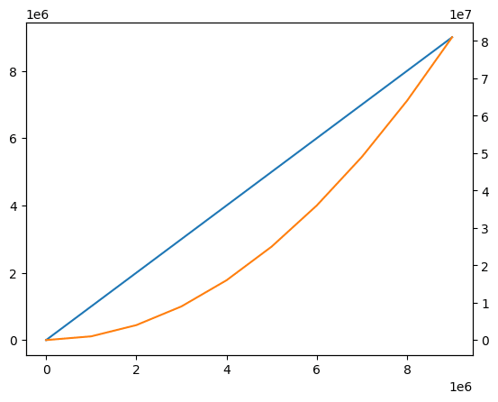
この場合、左側のY軸のラベルを整数表記にするには「ax1.ticklabel_format(style=”plain”, axis=”y”)」をプログラムに追加します。
import matplotlib.pyplot as plt
import numpy as np

order = 1000000

x_list = np.arange(0, 10) * order
y1_list = [a * order for a in range(len(x_list))]
y2_list = [a**2 * order for a in range(len(x_list))]

fig = plt.figure()
plt.clf()

ax1 = fig.subplots()
ax2 = ax1.twinx()

ax1.plot(x_list, y1_list, color="tab:blue")
ax2.plot(x_list, y2_list, color="tab:orange")

ax1.ticklabel_format(style="plain", axis="y")

plt.show()

実行結果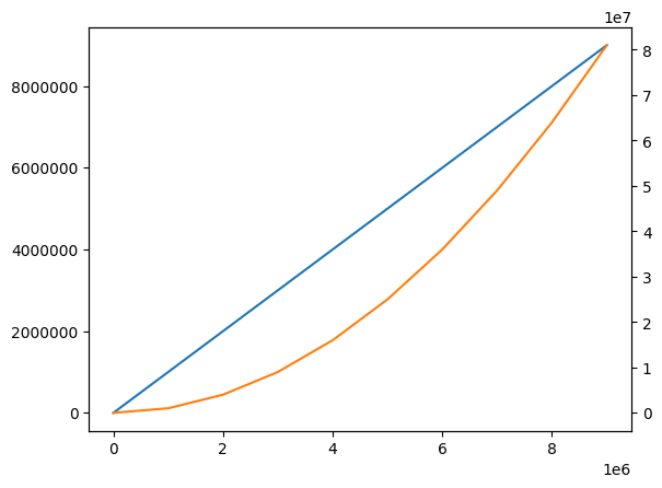
逆に右側のY軸のラベルを整数表記にするには「ax2.ticklabel_format(style=”plain”, axis=”y”)」をプログラムに追加します。
import matplotlib.pyplot as plt
import numpy as np

order = 1000000

x_list = np.arange(0, 10) * order
y1_list = [a * order for a in range(len(x_list))]
y2_list = [a**2 * order for a in range(len(x_list))]

fig = plt.figure()
plt.clf()

ax1 = fig.subplots()
ax2 = ax1.twinx()

ax1.plot(x_list, y1_list, color="tab:blue")
ax2.plot(x_list, y2_list, color="tab:orange")

ax2.ticklabel_format(style="plain", axis="y")

plt.show()

実行結果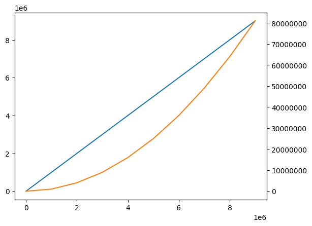
X軸は1本なので、X軸のラベルを整数表記にする場合は、「ax1.ticklabel_format(style=”plain”, axis=”x”)」でも、「ax2.ticklabel_format(style=”plain”, axis=”x”)」でも大丈夫です。
import matplotlib.pyplot as plt
import numpy as np

order = 1000000

x_list = np.arange(0, 10) * order
y1_list = [a * order for a in range(len(x_list))]
y2_list = [a**2 * order for a in range(len(x_list))]

fig = plt.figure()
plt.clf()

ax1 = fig.subplots()
ax2 = ax1.twinx()

ax1.plot(x_list, y1_list, color="tab:blue")
ax2.plot(x_list, y2_list, color="tab:orange")

ax1.ticklabel_format(style="plain", axis="x")

plt.show()

実行結果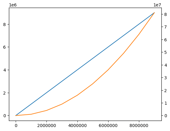
import matplotlib.pyplot as plt
import numpy as np

order = 1000000

x_list = np.arange(0, 10) * order
y1_list = [a * order for a in range(len(x_list))]
y2_list = [a**2 * order for a in range(len(x_list))]

fig = plt.figure()
plt.clf()

ax1 = fig.subplots()
ax2 = ax1.twinx()

ax1.plot(x_list, y1_list, color="tab:blue")
ax2.plot(x_list, y2_list, color="tab:orange")

ax2.ticklabel_format(style="plain", axis="x")

plt.show()

実行結果
add_subplotsで複数グラフを表示した場合に各軸の表記を指定する方法
「add_subplots」で複数のグラフを一括で表示した場合、各軸の表記を指定するには先ほどの2軸グラフと同様に「ax1.ticklabel_format(style=”plain”, axis=”x”)」や「ax2.ticklabel_format(style=”plain”, axis=”x”)」などを使います。
とりあえずこんな感じに2つのグラフを一括で表示してみました。
import matplotlib.pyplot as plt
import numpy as np

order = 1000000

x_list = np.arange(0, 10) * order
y1_list = [a * order for a in range(len(x_list))]
y2_list = [a**2 * order for a in range(len(x_list))]

fig = plt.figure()
plt.clf()

ax1 = fig.add_subplot(2, 1, 1)
ax1.plot(x_list, y1_list, color="tab:blue")

ax2 = fig.add_subplot(2, 1, 2)
ax2.plot(x_list, y2_list, color="tab:orange")

plt.show()

実行結果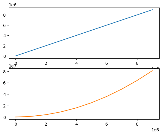
これでX軸のラベルを整数表記にする場合は「ax1.ticklabel_format(style=”plain”, axis=”x”)」や「ax2.ticklabel_format(style=”plain”, axis=”x”)」を追加します。
import matplotlib.pyplot as plt
import numpy as np

order = 1000000

x_list = np.arange(0, 10) * order
y1_list = [a * order for a in range(len(x_list))]
y2_list = [a**2 * order for a in range(len(x_list))]

fig = plt.figure()
plt.clf()

ax1 = fig.add_subplot(2, 1, 1)
ax1.plot(x_list, y1_list, color="tab:blue")

ax1.ticklabel_format(style="plain", axis="x")

ax2 = fig.add_subplot(2, 1, 2)
ax2.plot(x_list, y2_list, color="tab:orange")

ax2.ticklabel_format(style="plain", axis="x")

plt.show()

実行結果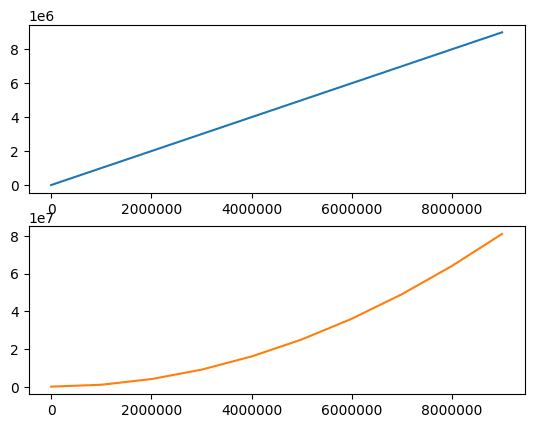
またY軸のラベルを整数表記にする場合は「ax1.ticklabel_format(style=”plain”, axis=”y”)」や「ax2.ticklabel_format(style=”plain”, axis=”y”)」を追加します。
import matplotlib.pyplot as plt
import numpy as np

order = 1000000

x_list = np.arange(0, 10) * order
y1_list = [a * order for a in range(len(x_list))]
y2_list = [a**2 * order for a in range(len(x_list))]

fig = plt.figure()
plt.clf()

ax1 = fig.add_subplot(2, 1, 1)
ax1.plot(x_list, y1_list, color="tab:blue")

ax1.ticklabel_format(style="plain", axis="y")

ax2 = fig.add_subplot(2, 1, 2)
ax2.plot(x_list, y2_list, color="tab:orange")

ax2.ticklabel_format(style="plain", axis="y")

plt.show()

実行結果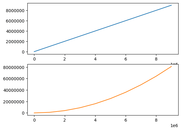
次回は今回でてきたmatplotlibのadd_subplotsを使って複数のグラフを一括で表示する方法を紹介します。
ではでは今回はこんな感じで。
コメント