Matplotlib
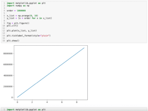
前回、PythonのMatplotlibで指数表記になってしまった軸のラベルを整数表記に戻す方法と強制的に指数表記にする方法を紹介しました。
今回はMatplotlibでadd_subplotを使って複数のグラフを一括で表示する方法を紹介します。
複数のグラフを一括で表示する方法としてはこれまでに「subplots」と「subplot」を使う方法を紹介していますので、よかったらどうぞ。
今回はそれらに変わる第三の方法として「add_subplot」を紹介していきます。
そのためにこんな感じで4つのグラフを準備しました。
import matplotlib.pyplot as plt
import numpy as np

x_list = np.arange(1, 100)
y_list1 = [x for x in x_list]
y_list2 = [x**2 for x in x_list]
y_list3 = [1/x for x in x_list]
y_list4 = [1/(x**2) for x in x_list]

fig = plt.figure()
plt.clf()

plt.plot(x_list, y_list1, label="1")
plt.plot(x_list, y_list2, label="2")
plt.plot(x_list, y_list3, label="3")
plt.plot(x_list, y_list4, label="4")

plt.show()

実行結果
今回はこの4つのグラフを別々のグラフとして表示してみましょう。
それでは始めていきましょう。
add_subplot
「add_subplot」の使い方としては「add_subplot(縦のグラフ総数, 横のグラフ総数, 位置)」とします。
例えば先ほどの4つのグラフを縦に並べる場合はこうなります。
import matplotlib.pyplot as plt
import numpy as np

x_list = np.arange(1, 100)
y_list1 = [x for x in x_list]
y_list2 = [x**2 for x in x_list]
y_list3 = [1/x for x in x_list]
y_list4 = [1/(x**2) for x in x_list]

fig = plt.figure()
plt.clf()

ax1 = fig.add_subplot(4, 1, 1)
ax2 = fig.add_subplot(4, 1, 2)
ax3 = fig.add_subplot(4, 1, 3)
ax4 = fig.add_subplot(4, 1, 4)

ax1.plot(x_list, y_list1, label="1")
ax2.plot(x_list, y_list2, label="2")
ax3.plot(x_list, y_list3, label="3")
ax4.plot(x_list, y_list4, label="4")

plt.show()

実行結果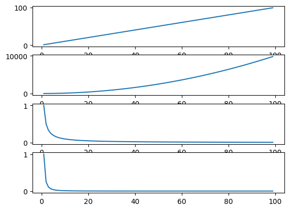
横に並べる場合はこんな感じです。
import matplotlib.pyplot as plt
import numpy as np

x_list = np.arange(1, 100)
y_list1 = [x for x in x_list]
y_list2 = [x**2 for x in x_list]
y_list3 = [1/x for x in x_list]
y_list4 = [1/(x**2) for x in x_list]

fig = plt.figure()
plt.clf()

ax1 = fig.add_subplot(1, 4, 1)
ax2 = fig.add_subplot(1, 4, 2)
ax3 = fig.add_subplot(1, 4, 3)
ax4 = fig.add_subplot(1, 4, 4)

ax1.plot(x_list, y_list1, label="1")
ax2.plot(x_list, y_list2, label="2")
ax3.plot(x_list, y_list3, label="3")
ax4.plot(x_list, y_list4, label="4")

plt.show()

実行結果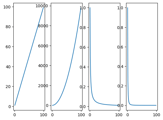
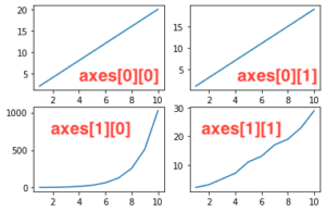
縦横それぞれに2つずつ並べるにはこんな感じです。
import matplotlib.pyplot as plt
import numpy as np

x_list = np.arange(1, 100)
y_list1 = [x for x in x_list]
y_list2 = [x**2 for x in x_list]
y_list3 = [1/x for x in x_list]
y_list4 = [1/(x**2) for x in x_list]

fig = plt.figure()
plt.clf()

ax1 = fig.add_subplot(2, 2, 1)
ax2 = fig.add_subplot(2, 2, 2)
ax3 = fig.add_subplot(2, 2, 3)
ax4 = fig.add_subplot(2, 2, 4)

ax1.plot(x_list, y_list1, label="1")
ax2.plot(x_list, y_list2, label="2")
ax3.plot(x_list, y_list3, label="3")
ax4.plot(x_list, y_list4, label="4")

plt.show()

実行結果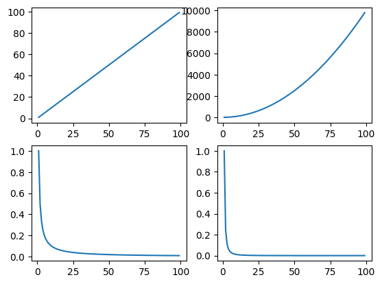
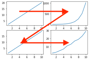
この様に縦横それぞれに複数のグラフを配置する場合、位置の番号は左上が1で右に向かって2、3、4…となっていきます。
そして1行目が終わると、下の段の一番左に移動し、続きの番号が振られていきます。
グラフ間の余白の調整
グラフ間の予約を調整するには横方向は「wspace=値」、「hspace=値」を「add_subplot」にオプション引数として追加します。
import matplotlib.pyplot as plt
import numpy as np

x_list = np.arange(1, 100)
y_list1 = [x for x in x_list]
y_list2 = [x**2 for x in x_list]
y_list3 = [1/x for x in x_list]
y_list4 = [1/(x**2) for x in x_list]

fig = plt.figure()
plt.clf()

ax1 = fig.add_subplot(2, 2, 1)
ax2 = fig.add_subplot(2, 2, 2)
ax3 = fig.add_subplot(2, 2, 3)
ax4 = fig.add_subplot(2, 2, 4)

ax1.plot(x_list, y_list1, label="1")
ax2.plot(x_list, y_list2, label="2")
ax3.plot(x_list, y_list3, label="3")
ax4.plot(x_list, y_list4, label="4")

plt.subplots_adjust(wspace=0.5, hspace=0.5)

plt.show()

実行結果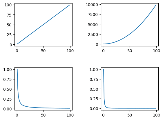
各グラフにタイトルを追加
各グラフにタイトルを追加するには「.set_title(“タイトル”)」を追加します。
import matplotlib.pyplot as plt
import numpy as np

x_list = np.arange(1, 100)
y_list1 = [x for x in x_list]
y_list2 = [x**2 for x in x_list]
y_list3 = [1/x for x in x_list]
y_list4 = [1/(x**2) for x in x_list]

fig = plt.figure()
plt.clf()

ax1 = fig.add_subplot(2, 2, 1)
ax2 = fig.add_subplot(2, 2, 2)
ax3 = fig.add_subplot(2, 2, 3)
ax4 = fig.add_subplot(2, 2, 4)

ax1.plot(x_list, y_list1, label="1")
ax2.plot(x_list, y_list2, label="2")
ax3.plot(x_list, y_list3, label="3")
ax4.plot(x_list, y_list4, label="4")

ax1.set_title("y_list1")
ax2.set_title("y_list2")
ax3.set_title("y_list3")
ax4.set_title("y_list4")

plt.subplots_adjust(wspace=0.5, hspace=0.5)

plt.show()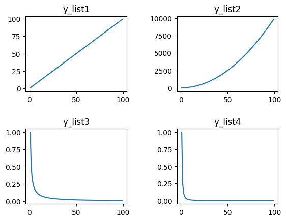
ちなみに全てのグラフのタイトルとして上部中央にタイトルを入れたい場合は「plt.suptitle(“タイトル”)」を用います。
import matplotlib.pyplot as plt
import numpy as np

x_list = np.arange(1, 100)
y_list1 = [x for x in x_list]
y_list2 = [x**2 for x in x_list]
y_list3 = [1/x for x in x_list]
y_list4 = [1/(x**2) for x in x_list]

fig = plt.figure()
plt.clf()

ax1 = fig.add_subplot(2, 2, 1)
ax2 = fig.add_subplot(2, 2, 2)
ax3 = fig.add_subplot(2, 2, 3)
ax4 = fig.add_subplot(2, 2, 4)

ax1.plot(x_list, y_list1, label="1")
ax2.plot(x_list, y_list2, label="2")
ax3.plot(x_list, y_list3, label="3")
ax4.plot(x_list, y_list4, label="4")

ax1.set_title("y_list1")
ax2.set_title("y_list2")
ax3.set_title("y_list3")
ax4.set_title("y_list4")

plt.suptitle("Title for all")

plt.subplots_adjust(wspace=0.5, hspace=0.5)

plt.show()

実行結果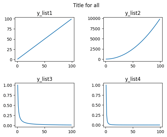
各グラフのX軸のラベル、Y軸のラベルの設定
各グラフのX軸のラベル、Y軸のラベルを設定するには「.set_xlabel(“X軸のラベル”)」、「.set_ylabel(“Y軸のラベル”)」を用います。
import matplotlib.pyplot as plt
import numpy as np

x_list = np.arange(1, 100)
y_list1 = [x for x in x_list]
y_list2 = [x**2 for x in x_list]
y_list3 = [1/x for x in x_list]
y_list4 = [1/(x**2) for x in x_list]

fig = plt.figure()
plt.clf()

ax1 = fig.add_subplot(2, 2, 1)
ax2 = fig.add_subplot(2, 2, 2)
ax3 = fig.add_subplot(2, 2, 3)
ax4 = fig.add_subplot(2, 2, 4)

ax1.plot(x_list, y_list1, label="1")
ax2.plot(x_list, y_list2, label="2")
ax3.plot(x_list, y_list3, label="3")
ax4.plot(x_list, y_list4, label="4")

ax1.set_xlabel("x1")
ax2.set_xlabel("x2")
ax3.set_xlabel("x3")
ax4.set_xlabel("x4")

ax1.set_ylabel("y1")
ax2.set_ylabel("y2")
ax3.set_ylabel("y3")
ax4.set_ylabel("y4")

plt.subplots_adjust(wspace=0.5, hspace=0.5)

plt.show()

実行結果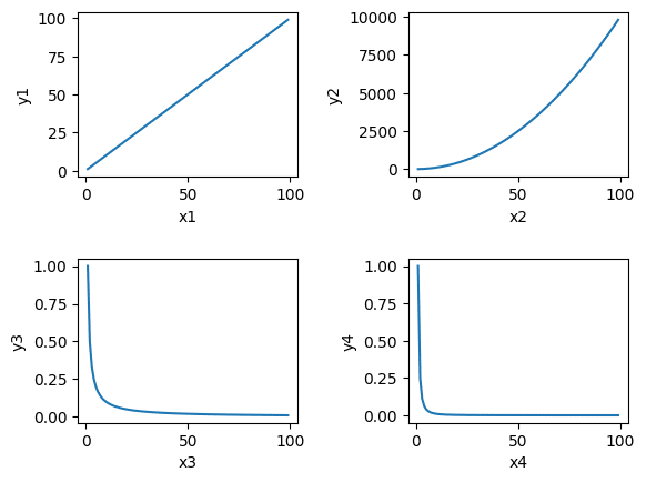
凡例の表示
凡例を表示するには「.legend()」を用います。
import matplotlib.pyplot as plt
import numpy as np

x_list = np.arange(1, 100)
y_list1 = [x for x in x_list]
y_list2 = [x**2 for x in x_list]
y_list3 = [1/x for x in x_list]
y_list4 = [1/(x**2) for x in x_list]

fig = plt.figure()
plt.clf()

ax1 = fig.add_subplot(2, 2, 1)
ax2 = fig.add_subplot(2, 2, 2)
ax3 = fig.add_subplot(2, 2, 3)
ax4 = fig.add_subplot(2, 2, 4)

ax1.plot(x_list, y_list1, label="1")
ax2.plot(x_list, y_list2, label="2")
ax3.plot(x_list, y_list3, label="3")
ax4.plot(x_list, y_list4, label="4")

ax1.legend()
ax2.legend()
ax3.legend()
ax4.legend()

plt.subplots_adjust(wspace=0.5, hspace=0.5)

plt.show()

実行結果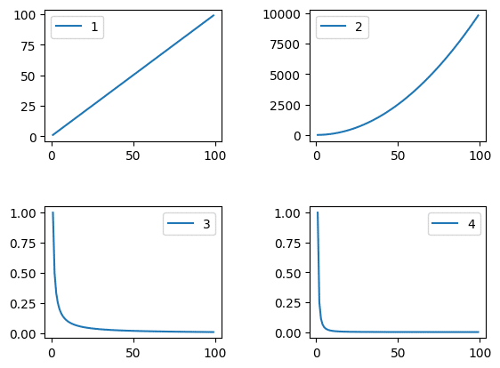
次回は再帰処理を使って面積を指定したガウス分布を作成する方法を紹介します。
ではでは今回はこんな感じで。
コメント