matplotlib
前回、PythonのPandasでデータをもつデータフレームを作成する方法を紹介しました。
今回はmatplotlibで「plt.axes()」という関数を使ったグラフの中に拡大図のような小さなグラフを表示する方法を紹介します。
そして次回はまた別の関数を使った方法を紹介します。
ということでまずは基本となるプログラムをこんな感じで作成してみました。
import matplotlib.pyplot as plt
import random

x = range(10000)
y = [xval + random.uniform(-1, 1) for xval in x]

fig = plt.figure()
plt.clf()

plt.plot(x, y)

plt.show()

実行結果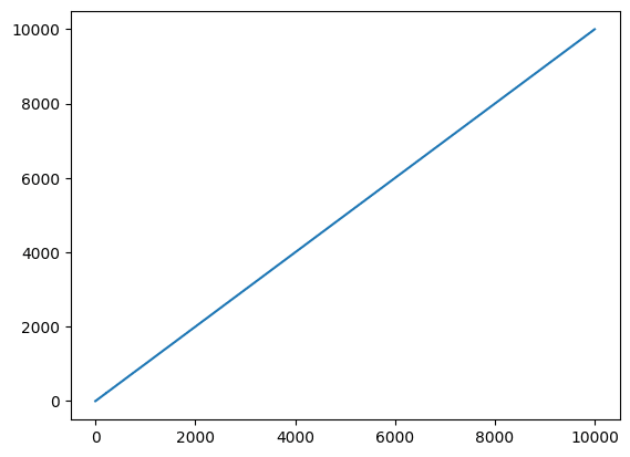
このグラフ、一見すると直線に見えますが、拡大すると実はガタガタだったりします。
import matplotlib.pyplot as plt
import random

x = range(10000)
y = [xval + random.uniform(-1, 1) for xval in x]

fig = plt.figure()
plt.clf()

plt.plot(x, y)

plt.xlim(0, 10)
plt.ylim(0, 10)

plt.show()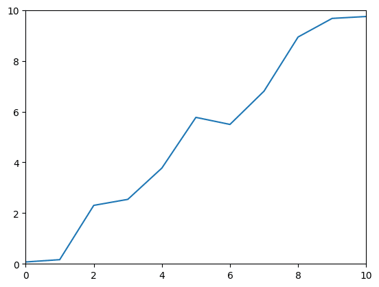
ということで全体を表示するグラフを作成し、その中に小さなグラフで拡大図を載せたいというわけです。
それでは始めていきましょう。
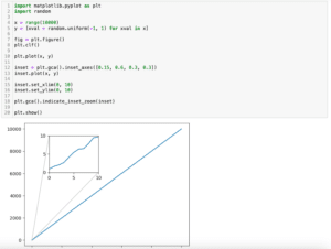
グラフの中に小さなグラフを表示する方法
グラフの中に小さなグラフを載せるには「plt.axes([左下のX軸方向の位置, 左下のY軸方向の位置, 幅, 高さ])」です。
また数値は元のグラフに対する比率で表します。
そして「plt.axes()」で小さなグラフエリアを作った後、再度「plt.plot()」などを使ってグラフを作成します。
import matplotlib.pyplot as plt
import random

x = range(10000)
y = [xval + random.uniform(-1, 1) for xval in x]

fig = plt.figure()
plt.clf()

plt.plot(x, y)

plt.axes([0.25, 0.6, 0.2, 0.2])
plt.plot(x, y)

plt.xlim(0, 10)
plt.ylim(0, 10)

plt.show()

実行結果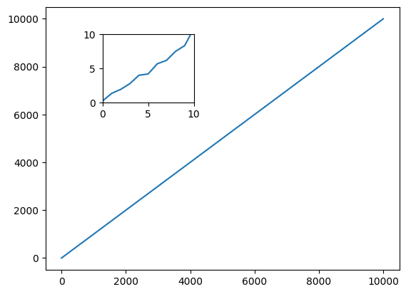
小さなグラフのX軸やY軸のラベルを設定するには、先ほどの「plt.axes()」で小さなグラフエリアを作成してから、いつも通り「plt.xlabel()」や「plt.ylabel()」を用います。
import matplotlib.pyplot as plt
import random

x = range(10000)
y = [xval + random.uniform(-1, 1) for xval in x]

fig = plt.figure()
plt.clf()

plt.plot(x, y)

plt.xlabel("xlabel_out")
plt.ylabel("ylabel_out")

plt.axes([0.25, 0.6, 0.2, 0.2])
plt.plot(x, y)

plt.xlim(0, 10)
plt.ylim(0, 10)

plt.xlabel("xlabel_in1")
plt.ylabel("ylabel_in1")

plt.show()

実行結果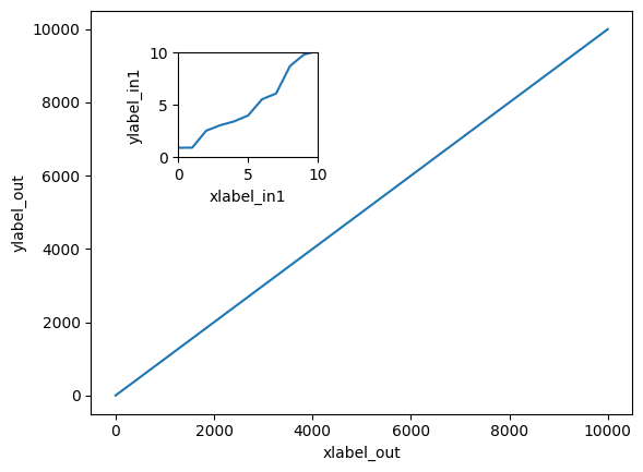
subplotsを使う方法
ただし全てを「plt.XXX()」で行うとどのコマンドがどのグラフに対するものなのか分かりにくくなります。
そんな時は「subplots()」を使って、それぞれのグラフエリアを完全に別物として扱うと分かりやすくなります。
その際、先ほどの「plt.axes()」は変数とつなげて「ax2 = plt.axes()」という形で用います。
import matplotlib.pyplot as plt
import random

x = range(10000)
y = [xval + random.uniform(-1, 1) for xval in x]

fig = plt.figure()
plt.clf()

ax1 = fig.subplots()

ax1.plot(x, y)

ax1.set_xlabel("xlabel_out")
ax1.set_ylabel("ylabel_out")

ax2 = plt.axes([0.25, 0.6, 0.2, 0.2])

ax2.plot(x, y)

ax2.set_xlim(0, 10)
ax2.set_ylim(0, 10)

ax2.set_xlabel("xlabel_in1")
ax2.set_ylabel("ylabel_in1")

plt.show()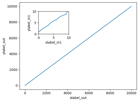
この小さなグラフエリアは一つだけでなく複数追加することも可能です。
import matplotlib.pyplot as plt
import random

x = range(10000)
y = [xval + random.uniform(-1, 1) for xval in x]

fig = plt.figure()
plt.clf()

ax1 = fig.subplots()

ax1.plot(x, y)

ax1.set_xlabel("xlabel_out")
ax1.set_ylabel("ylabel_out")

ax2 = plt.axes([0.25, 0.6, 0.2, 0.2])

ax2.plot(x, y)

ax2.set_xlim(0, 10)
ax2.set_ylim(0, 10)

ax2.set_xlabel("xlabel_in1")
ax2.set_ylabel("ylabel_in1")

ax3 = plt.axes([0.6, 0.25, 0.2, 0.2])

ax3.plot(x, y)

ax3.set_xlim(990, 1000)
ax3.set_ylim(990, 1000)

ax3.set_xlabel("xlabel_in2")
ax3.set_ylabel("ylabel_in2")

plt.show()

実行結果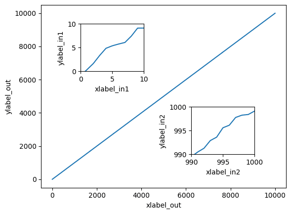
ただしこの「plt.axes()」を使った方法では小さなグラフがどこの位置の拡大なのかを示すことはできません。
実はどこの位置の拡大グラフを示すことができる関数が存在していますので、次回はその方法を紹介します。
ではでは今回はこんな感じで。
コメント