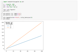
import matplotlib.pyplot as plt
x = range(0, 100)
y1 = [i for i in x]
y2 = [i*2 for i in x]
y3 = [i*3 for i in x]
fig = plt.figure()
plt.clf()
plt.plot(x, y1, label="y1")
plt.plot(x, y2, label="y2")
plt.plot(x, y3, label="y3")
plt.legend()
plt.show()
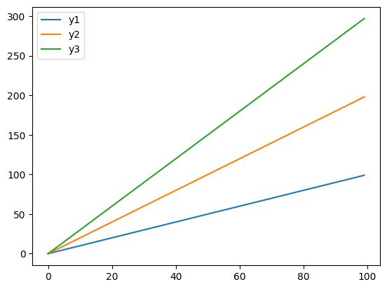
実行結果
「y1」 、「y2」、「y3」という3本の線があるグラフです。
デフォルトでは凡例は縦に並んでいます。
それでは始めていきましょう。
凡例を横に並べる方法
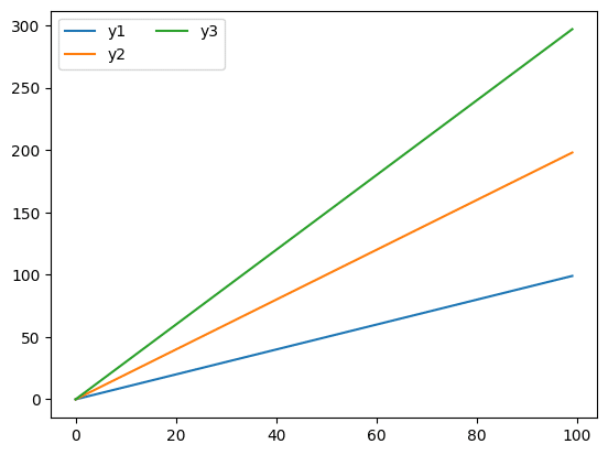
凡例を横に並べるには「plt.legend()」に「ncol=凡例の数」を追加します。
import matplotlib.pyplot as plt

x = range(0, 100)
y1 = [i for i in x]
y2 = [i*2 for i in x]
y3 = [i*3 for i in x]

fig = plt.figure()
plt.clf()

plt.plot(x, y1, label="y1")
plt.plot(x, y2, label="y2")
plt.plot(x, y3, label="y3")

plt.legend(ncol=3)
plt.show()

実行結果
注意すべきは「ncol」で指定する数値が凡例の数より少ない場合、完全には横並びにならないことです。
import matplotlib.pyplot as plt
x = range(0, 100)
y1 = [i for i in x]
y2 = [i*2 for i in x]
y3 = [i*3 for i in x]
fig = plt.figure()
plt.clf()
plt.plot(x, y1, label="y1")
plt.plot(x, y2, label="y2")
plt.plot(x, y3, label="y3")
plt.legend(ncol=2)
plt.show()
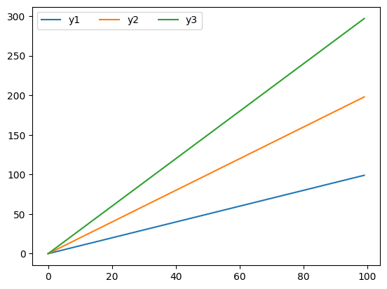
実行結果
ちなみにncolで指定した数値が、実際の凡例の数よりも多い場合は特に問題ありません。
import matplotlib.pyplot as plt

x = range(0, 100)
y1 = [i for i in x]
y2 = [i*2 for i in x]
y3 = [i*3 for i in x]

fig = plt.figure()
plt.clf()

plt.plot(x, y1, label="y1")
plt.plot(x, y2, label="y2")
plt.plot(x, y3, label="y3")

plt.legend(ncol=4)
plt.show()

実行結果

コメント