plotly
前回、HTML上でインタラクティブなグラフ描写ができるライブラリplotlyで軸ラベルの設定方法を解説しました。
今回は軸の目盛り数値のフォントの設定方法を紹介していきます。
ということでまずは基本となるプログラムから。
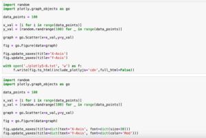
import random
import plotly.graph_objects as go

data_points = 100

x_val = [i for i in range(data_points)]
y_val = [random.randrange(100) for _ in range(data_points)]

graph = go.Scatter(x=x_val,y=y_val)

fig = go.Figure(data=graph)

with open('./plotly6-1.txt', 'w') as f:
     f.write(fig.to_html(include_plotlyjs='cdn',full_html=False))

実行結果
軸の値や目盛りの設定をするには前回やった「update_layout()」で設定する方法と「update_xaxes()、update_yaxes()」で設定する2つの方法があります。
そこで今回はそれぞれのやり方を解説していきます。
目盛り数字のフォント設定
その1:update_layout()、xaxis、yaxisの場合
update_layout()で設定する場合はオプションとして「xaxis」、または「yaxis」を追加し、さらにその中に「tickfont」でフォントサイズ(size)、色(color)、フォント(family)を設定します。
import random
import plotly.graph_objects as go

data_points = 100

x_val = [i for i in range(data_points)]
y_val = [random.randrange(100) for _ in range(data_points)]

graph = go.Scatter(x=x_val,y=y_val)

fig = go.Figure(data=graph)

fig.update_layout(xaxis=dict(title='X-Axis', tickfont=dict(size=30)),
                 yaxis=dict(title='Y-Axis', tickfont=dict(color='Red')))

with open('./plotly6-2.txt', 'w') as f:
     f.write(fig.to_html(include_plotlyjs='cdn',full_html=False))

実行結果
その2:update_xaxes()、update_yaxes()の場合
update_xaxes()、update_yaxes()を使う場合はそのオプションに「tickfont」を追加し、フォントサイズ(size)、色(color)、フォント(family)を設定します。
import random
import plotly.graph_objects as go

data_points = 100

x_val = [i for i in range(data_points)]
y_val = [random.randrange(100) for _ in range(data_points)]

graph = go.Scatter(x=x_val,y=y_val)

fig = go.Figure(data=graph)

fig.update_xaxes(title='X-Axis', tickfont=dict(size=30))
fig.update_yaxes(title='Y-Axis', tickfont=dict(color='Red'))

with open('./plotly6-3.txt', 'w') as f:
     f.write(fig.to_html(include_plotlyjs='cdn',full_html=False))

実行結果
軸の値を回転させる方法
軸の値によっては値を回転させた方が見やすい場合もあります。
軸の値を回転させるには「tickangle」を用います。
その1:update_layout()、xaxis、yaxisの場合
update_layout()を用いる場合は「xaxis」、「yaxis」を追加し、その中に「tickangle」を設定します。
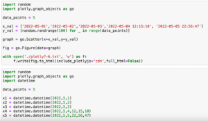
import random
import plotly.graph_objects as go

data_points = 100

x_val = [i for i in range(data_points)]
y_val = [random.randrange(100) for _ in range(data_points)]

graph = go.Scatter(x=x_val,y=y_val)

fig = go.Figure(data=graph)

fig.update_layout(xaxis=dict(title='X-Axis', tickangle=-45),
                 yaxis=dict(title='Y-Axis', tickangle=-90))

with open('./plotly6-4.txt', 'w') as f:
     f.write(fig.to_html(include_plotlyjs='cdn',full_html=False))

実行結果
その2:update_xaxes()、update_yaxes()の場合
update_xaxes()、update_yaxes()を使う場合はそのオプションに「tickangle」を設定します。
import random
import plotly.graph_objects as go

data_points = 100

x_val = [i for i in range(data_points)]
y_val = [random.randrange(100) for _ in range(data_points)]

graph = go.Scatter(x=x_val,y=y_val)

fig = go.Figure(data=graph)

fig.update_xaxes(title='X-Axis', tickangle=-45)
fig.update_yaxes(title='Y-Axis', tickangle=-90)

with open('./plotly6-5.txt', 'w') as f:
     f.write(fig.to_html(include_plotlyjs='cdn',full_html=False))

実行結果
目盛り線の設定
目盛り線の設定には、目盛り線の長さ(ticklen)、太さ(tickwidth)、色(tickcolor)、場所(ticks=’inside’)などがあります。
その1:update_layout()、xaxis、yaxisの場合
update_layout()を用いる場合は「xaxis」、「yaxis」を追加し、その中に「minor」という辞書を作成し、その中で目盛りの各項目を設定します。
import random
import plotly.graph_objects as go

data_points = 100

x_val = [i for i in range(data_points)]
y_val = [random.randrange(100) for _ in range(data_points)]

graph = go.Scatter(x=x_val,y=y_val)

fig = go.Figure(data=graph)

fig.update_layout(xaxis=dict(title='X-Axis', minor=dict(ticklen=10, tickwidth=5)),
                 yaxis=dict(title='Y-Axis', minor=dict(ticks='inside', tickcolor='Red')))

with open('./plotly6-6.txt', 'w') as f:
     f.write(fig.to_html(include_plotlyjs='cdn',full_html=False))

実行結果
ちなみに「ticks=’inside’」の逆の「outside」、つまり目盛り線を外側に表示する場合ですが、デフォルトが「outside」なので外側に表示したい場合は「ticks」を設定しなければ、外側に表示されます。
その2:update_xaxes()、update_yaxes()の場合
update_xaxes()、update_yaxes()を使う場合はそのオプションに「minor」という辞書を作成し、目盛りの各項目を設定します。
import random
import plotly.graph_objects as go

data_points = 100

x_val = [i for i in range(data_points)]
y_val = [random.randrange(100) for _ in range(data_points)]

graph = go.Scatter(x=x_val,y=y_val)

fig = go.Figure(data=graph)

fig.update_xaxes(title='X-Axis', minor=dict(ticklen=10, tickwidth=5))
fig.update_yaxes(title='Y-Axis', minor=dict(ticks='inside', tickcolor='Red'))

with open('./plotly6-7.txt', 'w') as f:
     f.write(fig.to_html(include_plotlyjs='cdn',full_html=False))

実行結果
ちなみに「ticks=’inside’」の逆の「outside」、つまり目盛り線を外側に表示する場合ですが、デフォルトが「outside」なので外側に表示したい場合は「ticks」を設定しなければ、外側に表示されます。
ということで目盛りのフォントや線に関して設定できるようになりました。
ただこれまでは入力した数値に従って、自動で軸の値が設定されています。
次回は軸の値を日付や文字列にしてみましょう。
ではでは今回はこんな感じで。
コメント