plotly
前回、HTML上でインタラクティブなグラフ描写ができるライブラリplotlyでタイトルの設定方法を紹介しました。
今回は軸ラベルの設定方法に関して解説していきます。
まずは基本となるプログラムからです。
import random
import plotly.graph_objects as go

data_points = 100

x_val = [i for i in range(data_points)]
y_val = [random.randrange(100) for _ in range(data_points)]

graph = go.Scatter(x=x_val,y=y_val)

fig = go.Figure(data=graph)

with open('./plotly5-1.txt', 'w') as f:
     f.write(fig.to_html(include_plotlyjs='cdn',full_html=False))

実行結果
それでは始めていきましょう。
X軸ラベル、Y軸ラベルの表示方法 その1:update_layout()、xaxis、yaxis
色々と調べてみると軸ラベルの設定方法は3つあるようなので、順に解説していきます。
まずは前回のグラフタイトルを追加した方法と同じで「fig.update_layout()」を使う方法です。
X軸、Y軸はそれぞれ「xaxis」、「yaxis」で設定でき、ラベルに関してはさらに辞書形式で「title」をそれぞれ設定します。
ということでこんな感じです。
import random
import plotly.graph_objects as go
data_points = 100
x_val = [i for i in range(data_points)]
y_val = [random.randrange(100) for _ in range(data_points)]
graph = go.Scatter(x=x_val,y=y_val)
fig = go.Figure(data=graph)
fig.update_layout(xaxis=dict(title='X-Axis'),
yaxis=dict(title='Y-Axis'))
with open('./plotly5-2.txt', 'w') as f:
f.write(fig.to_html(include_plotlyjs='cdn',full_html=False))
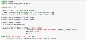
実行結果軸ラベルのフォントサイズや色などフォントに関することの設定の仕方は、タイトルを設定した時と同様で、「xaxis=dict(title=dict(text=’X軸ラベルの文字列’, font=dict(size=フォントサイズ, color=’色’))」のように、辞書を多層にして各項目を設定します。
 import random
import plotly.graph_objects as go

data_points = 100

x_val = [i for i in range(data_points)]
y_val = [random.randrange(100) for _ in range(data_points)]

graph = go.Scatter(x=x_val,y=y_val)

fig = go.Figure(data=graph)

fig.update_layout(xaxis=dict(title=dict(text='X-Axis', font=dict(size=30))),
                 yaxis=dict(title=dict(text='Y-Axis', font=dict(color='Red'))))

with open('./plotly5-3.txt', 'w') as f:
     f.write(fig.to_html(include_plotlyjs='cdn',full_html=False))

実行結果
ここでは試していませんが、フォントを変える場合は「family」を指定してやることで変更することができます。
X軸ラベル、Y軸ラベルの表示方法 その1:update_layout()、xaxis_title、yaxis_title
2つ目の方法は「update_layout()」を使うところまでは先ほどの方法と同じですが、その後「xaxis_title」、「yaxis_title」というように各軸ラベルを直接設定する方法です。
先ほどの「xaxis」、「yaxis」の場合は「X軸ラベル、Y軸ラベルの設定ではなく、X軸、Y軸の設定」であり、X軸やY軸の他の事に関しても設定できます。
そして今回の「xaxis_title」と「yaxis_title」はそれぞれX軸ラベル、Y軸ラベルの設定項目であるという点が違います。
import random
import plotly.graph_objects as go
data_points = 100
x_val = [i for i in range(data_points)]
y_val = [random.randrange(100) for _ in range(data_points)]
graph = go.Scatter(x=x_val,y=y_val)
fig = go.Figure(data=graph)
fig.update_layout(xaxis_title='X-Axis',
yaxis_title='Y-Axis')
with open('./plotly5-4.txt', 'w') as f:
f.write(fig.to_html(include_plotlyjs='cdn',full_html=False))
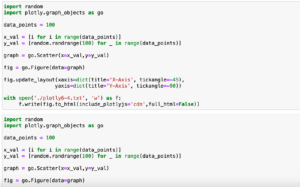
実行結果フォントに関する設定をする場合は「(xaxis_title=dict(text=’X軸ラベル’, font=dict(size=フォントサイズ, color=’色’))」というように書きます。
import random
import plotly.graph_objects as go

data_points = 100

x_val = [i for i in range(data_points)]
y_val = [random.randrange(100) for _ in range(data_points)]

graph = go.Scatter(x=x_val,y=y_val)

fig = go.Figure(data=graph)

fig.update_layout(xaxis_title=dict(text='X-Axis', font=dict(size=30)),
                 yaxis_title=dict(text='Y-Axis', font=dict(color='Red')))

with open('./plotly5-5.txt', 'w') as f:
     f.write(fig.to_html(include_plotlyjs='cdn',full_html=False))

実行結果
ここでは試していませんが、フォントを変える場合は「family」を指定してやることで変更することができます。
X軸ラベル、Y軸ラベルの表示方法 その3:update_xaxes()、update_yaxes()
もう一つの方法は「update_xaxes()」と「update_yaxes()」というX軸、Y軸専用のレイアウト変更の関数を使うことです。
ラベルを変更するには「upate_xaxes(title=’X軸のラベル’)」とします。
import random
import plotly.graph_objects as go

data_points = 100

x_val = [i for i in range(data_points)]
y_val = [random.randrange(100) for _ in range(data_points)]

graph = go.Scatter(x=x_val,y=y_val)

fig = go.Figure(data=graph)

fig.update_xaxes(title='X-Axis')
fig.update_yaxes(title='Y-Axis')

with open('./plotly5-6.txt', 'w') as f:
     f.write(fig.to_html(include_plotlyjs='cdn',full_html=False))

実行結果
フォントに関する設定をする場合は「fig.update_xaxes(title=dict(text=’X軸ラベル’, font=dict(size=フォントサイズ, color=’色’)))」というように書きます。
import random
import plotly.graph_objects as go

data_points = 100

x_val = [i for i in range(data_points)]
y_val = [random.randrange(100) for _ in range(data_points)]

graph = go.Scatter(x=x_val,y=y_val)

fig = go.Figure(data=graph)

fig.update_xaxes(title=dict(text='X-Axis', font=dict(size=30)))
fig.update_yaxes(title=dict(text='Y-Axis', font=dict(color='Red')))

with open('./plotly5-7.txt', 'w') as f:
     f.write(fig.to_html(include_plotlyjs='cdn',full_html=False))

実行結果
ここでは試していませんが、フォントを変える場合は「family」を指定してやることで変更することができます。
三つもあると流石に覚えるのも面倒になってきますが、やれることは変わらないのでどれか一つを覚えておけばいいと思います。
次回は軸の数値の設定をしてみましょう。
ではでは今回はこんな感じで。
コメント