複数のグラフを一括表示した場合のX軸、Y軸の表示範囲指定
前にsubplots、もしくはsubplotを使って複数のグラフを一括表示する方法を解説しました。
今回はこの複数のグラフそれぞれのX軸、Y軸の表示範囲を変更する方法を解説していきます。
subplots、subplotのどちらを使ったかによって表示範囲の指定方法が変わりますので、注意してください。
まずはsubplotを使った場合を解説していきましょう。
subplotsを使った場合の表示範囲指定の方法
まずはおさらいからです。
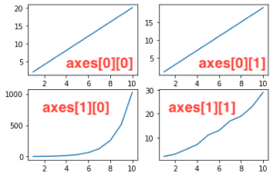
subplotsを使った場合、複数のグラフを表示する方法はこんな感じでした。
from matplotlib import pyplot as plt

x = [1, 2, 3, 4, 5, 6, 7, 8, 9, 10]
y1 = [2, 4, 6, 8, 10, 12, 14, 16, 18, 20]
y2 = [2, 4, 8, 16, 32, 64, 128, 256, 512, 1024]
y3 = [1, 3, 5, 7, 9, 11, 13, 15, 17, 19]
y4 = [2, 3, 5, 7, 11, 13, 17, 19, 23, 29]

fig = plt.figure()
axes= fig.subplots(2, 2)

axes[0][0].plot(x, y1)
axes[1][0].plot(x, y2)
axes[0][1].plot(x, y3)
axes[1][1].plot(x, y4)

plt.show()

実行結果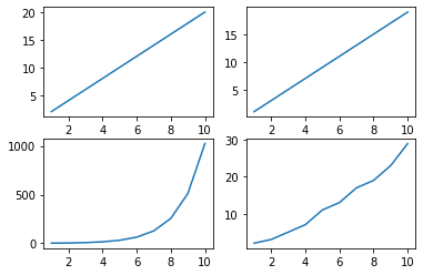
subplotsの場合、X軸、Y軸の表示範囲を指定するには、2軸グラフのX軸、Y軸の表示範囲を指定したのと同様にset_xlim(最大値, 最小値)を用います。
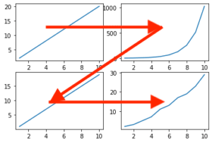
先ほどの4つのグラフのうち、左上と右下のグラフの表示範囲を変えてみましょう。
その場合、左上のグラフの場所がaxes[0][0]で、右下のグラフの場所がaxes[1][1]なので、表示範囲を指定するために追加するコマンドはこうなります。
axes[0][0].set_xlim(最大値,最小値)
axes[0][0].set_ylim(最大値,最小値)

axes[1][1].set_xlim(最大値,最小値)
axes[1][1].set_ylim(最大値,最小値)
最大値と最小値を適当に指定して、試してみましょう。
from matplotlib import pyplot as plt
x = [1, 2, 3, 4, 5, 6, 7, 8, 9, 10]
y1 = [2, 4, 6, 8, 10, 12, 14, 16, 18, 20]
y2 = [2, 4, 8, 16, 32, 64, 128, 256, 512, 1024]
y3 = [1, 3, 5, 7, 9, 11, 13, 15, 17, 19]
y4 = [2, 3, 5, 7, 11, 13, 17, 19, 23, 29]
fig = plt.figure()
axes= fig.subplots(2, 2)
axes[0][0].plot(x, y1)
axes[1][0].plot(x, y2)
axes[0][1].plot(x, y3)
axes[1][1].plot(x, y4)
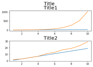
axes[0][0].set_xlim(2,5)
axes[0][0].set_ylim(0,10)
axes[1][1].set_xlim(5,8)
axes[1][1].set_ylim(10,20)
plt.show()
実行結果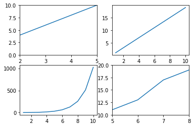
表示範囲を変更することができました。
subplotを使った場合の表示範囲指定の方法
次にsubplotを使った場合の表示範囲の指定方法を解説していきます。
まずはおさらいから。
from matplotlib import pyplot as plt

x = [1, 2, 3, 4, 5, 6, 7, 8, 9, 10]
y1 = [2, 4, 6, 8, 10, 12, 14, 16, 18, 20]
y2 = [2, 4, 8, 16, 32, 64, 128, 256, 512, 1024]
y3 = [1, 3, 5, 7, 9, 11, 13, 15, 17, 19]
y4 = [2, 3, 5, 7, 11, 13, 17, 19, 23, 29]

fig = plt.figure()

plt.subplot(2,2,1)
plt.plot(x, y1)

plt.subplot(2,2,2)
plt.plot(x, y2)

plt.subplot(2,2,3)
plt.plot(x, y3)

plt.subplot(2,2,4)
plt.plot(x, y4)

plt.show()

実行結果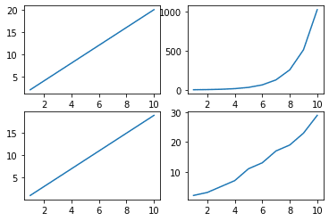
subplotを使った場合は、xlim(最小値, 最大値)、ylim(最小値, 最大値)を使って表示範囲を指定します。
ただし重要なのがxlim、ylimを書く”場所”です。
例えば左上のグラフの表示範囲を制限したい場合は、左上のグラフのデータをプロットした後に書きます。
分かりにくいと思うので、ちょっと詳しく書いていきます。
それぞれのグラフをプロットしているのはプログラムのこの部分になります。
plt.subplot(2,2,1)
plt.plot(x, y1)

plt.subplot(2,2,2)
plt.plot(x, y2)

plt.subplot(2,2,3)
plt.plot(x, y3)

plt.subplot(2,2,4)
plt.plot(x, y4)
上から左上、右上、左下、右下です。
分かりやすい様、コメントアウトして書き込んでおきます。
左上:upper left、右上:upper right、左下:lower left、右下:lower right
#upper left
plt.subplot(2,2,1)
plt.plot(x, y1)

#upper right
plt.subplot(2,2,2)
plt.plot(x, y2)

#lower left
plt.subplot(2,2,3)
plt.plot(x, y3)

#lower right
plt.subplot(2,2,4)
plt.plot(x, y4)
左上のグラフの表示範囲を指定したい場合は、この位置にxlim、ylimを書きます。
#upper left
plt.subplot(2,2,1)
plt.plot(x, y1)

plt.xlim(最小値, 最大値)
plt.ylim(最小値, 最大値)

#upper right
plt.subplot(2,2,2)
plt.plot(x, y2)

#lower left
plt.subplot(2,2,3)
plt.plot(x, y3)

#lower right
plt.subplot(2,2,4)
plt.plot(x, y4)
最小値、最大値を適当に入れて試してみましょう。
from matplotlib import pyplot as plt

x = [1, 2, 3, 4, 5, 6, 7, 8, 9, 10]
y1 = [2, 4, 6, 8, 10, 12, 14, 16, 18, 20]
y2 = [2, 4, 8, 16, 32, 64, 128, 256, 512, 1024]
y3 = [1, 3, 5, 7, 9, 11, 13, 15, 17, 19]
y4 = [2, 3, 5, 7, 11, 13, 17, 19, 23, 29]

fig = plt.figure()

plt.subplot(2,2,1)
plt.plot(x, y1)

plt.xlim(2,5)
plt.ylim(0,10)

plt.subplot(2,2,2)
plt.plot(x, y2)

plt.subplot(2,2,3)
plt.plot(x, y3)

plt.subplot(2,2,4)
plt.plot(x, y4)

plt.show()

実行結果
左上のグラフの表示範囲が変わりました。
では今度はさらに右下のグラフの表示範囲を変えてみましょう。
ということで今度はこの位置にxlim、ylimを追加します。
#upper left
plt.subplot(2,2,1)
plt.plot(x, y1)

#upper right
plt.subplot(2,2,2)
plt.plot(x, y2)

#lower left
plt.subplot(2,2,3)
plt.plot(x, y3)

#lower right
plt.subplot(2,2,4)
plt.plot(x, y4)

plt.xlim(最小値, 最大値)
plt.ylim(最小値, 最大値)
先ほどの左上の範囲指定と合わせて、全体のプログラムとしてはこうなります。
from matplotlib import pyplot as plt

x = [1, 2, 3, 4, 5, 6, 7, 8, 9, 10]
y1 = [2, 4, 6, 8, 10, 12, 14, 16, 18, 20]
y2 = [2, 4, 8, 16, 32, 64, 128, 256, 512, 1024]
y3 = [1, 3, 5, 7, 9, 11, 13, 15, 17, 19]
y4 = [2, 3, 5, 7, 11, 13, 17, 19, 23, 29]

fig = plt.figure()

plt.subplot(2,2,1)
plt.plot(x, y1)

plt.xlim(2,5)
plt.ylim(0,10)

plt.subplot(2,2,2)
plt.plot(x, y2)

plt.subplot(2,2,3)
plt.plot(x, y3)

plt.subplot(2,2,4)
plt.plot(x, y4)

plt.xlim(5,8)
plt.ylim(10,20)

plt.show()

実行結果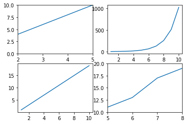
今度は右下のグラフの表示範囲が変わりました。
この場合、コマンド自体はplt.xlim(最大値, 最小値)、もしくはplt.ylim(最大値, 最小値)とコマンドは同じであり、コマンドを書き込む場所により表示範囲を指定するグラフが変わることに注意してください。
まとめ
今回は複数のグラフを一括表示した際のX軸、Y軸の表示範囲の変更方法を解説しました。
複数のグラフを一括表示するには、subplotsとsubplotという二つの方法があることを前に紹介していますが、それぞれ表示範囲を指定する方法は異なります。
subplotsの場合、X軸の表示範囲の指定はset_xlim(最大値, 最小値)、Y軸の表示範囲の指定はset_ylim(最大値, 最小値)で行います。
ただXX.set_xlim(最大値, 最小値)の様に書き、XXの場所に範囲を指定するグラフそのものを指定します。
subplotの場合、X軸の表示範囲の指定はxlim(最大値, 最小値)、Y軸の表示範囲の指定はylim(最大値, 最小値)で行います。
この場合、表示範囲を指定したいプロットのすぐ後に書くことによって、表示範囲を指定するグラフを指定します。
どちらも一長一短あるでしょうし、ご自分のプログラムの書き方があると思うので、どっちがいいというよりもスタイルに合った方を選べばいいのかなと思います。
次回はsubplotsを使った際のタイトルの表示方法を解説していきます。
ということで今回はこんな感じで。
コメント