matplotlib
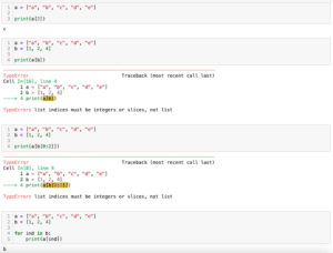
前回、PythonのNumPyのndarrayではインデックスをまとめたリストで直接要素を取得可能であることを紹介しました。
今回はmatplotlibのpcolormeshで二次元カラープロットを表示する方法を紹介します。
それでは始めていきましょう。
pcolormeshで二次元カラープロットを表示
pcolormeshで二次元カラープロットを表示するには二次元リストを準備する必要があります。
今回はまず「np.arange()」を使って、X軸方向の値、Y軸方向の値を0からそれぞれ特定の値まで、特定の間隔となるリストを作成しました。
その後、それぞれX軸方向、Y軸方向となる様に配置し、それぞれを掛け合わせてプロット用の2次元リストを作成しました。
import numpy as np

x_num = 5
y_num = 7
step = 0.5

x_list = np.arange(0, x_num, step)
y_list = np.arange(0, y_num, step)

z_list = []
for y_val in y_list:
    z_list_temp = []
    for x_val in x_list:
        z_list_temp.append(x_val*y_val)
    z_list.append(z_list_temp)

print(np.array(z_list))

実行結果
[[ 0.    0.    0.    0.    0.    0.    0.    0.    0.    0.  ]
 [ 0.    0.25  0.5   0.75  1.    1.25  1.5   1.75  2.    2.25]
 [ 0.    0.5   1.    1.5   2.    2.5   3.    3.5   4.    4.5 ]
 [ 0.    0.75  1.5   2.25  3.    3.75  4.5   5.25  6.    6.75]
 [ 0.    1.    2.    3.    4.    5.    6.    7.    8.    9.  ]
 [ 0.    1.25  2.5   3.75  5.    6.25  7.5   8.75 10.   11.25]
 [ 0.    1.5   3.    4.5   6.    7.5   9.   10.5  12.   13.5 ]
 [ 0.    1.75  3.5   5.25  7.    8.75 10.5  12.25 14.   15.75]
 [ 0.    2.    4.    6.    8.   10.   12.   14.   16.   18.  ]
 [ 0.    2.25  4.5   6.75  9.   11.25 13.5  15.75 18.   20.25]
 [ 0.    2.5   5.    7.5  10.   12.5  15.   17.5  20.   22.5 ]
 [ 0.    2.75  5.5   8.25 11.   13.75 16.5  19.25 22.   24.75]
 [ 0.    3.    6.    9.   12.   15.   18.   21.   24.   27.  ]
 [ 0.    3.25  6.5   9.75 13.   16.25 19.5  22.75 26.   29.25]]
最後にNumPyのndarrayにしていますが、これは見やすくするためにしているだけで、今後の処理には通常のリストのままで大丈夫です。
二次元リストができたら、「plt.pcolormesh(二次元リスト)」とすると二次元プロットを作成することができます。
import matplotlib.pyplot as plt
import numpy as np

x_num = 5
y_num = 7
step = 0.5

x_list = np.arange(0, x_num, step)
y_list = np.arange(0, y_num, step)

z_list = []
for y_val in y_list:
    z_list_temp = []
    for x_val in x_list:
        z_list_temp.append(x_val*y_val)
    z_list.append(z_list_temp)

fig = plt.figure()
plt.clf()

plt.pcolormesh(z_list)

plt.show()

実行結果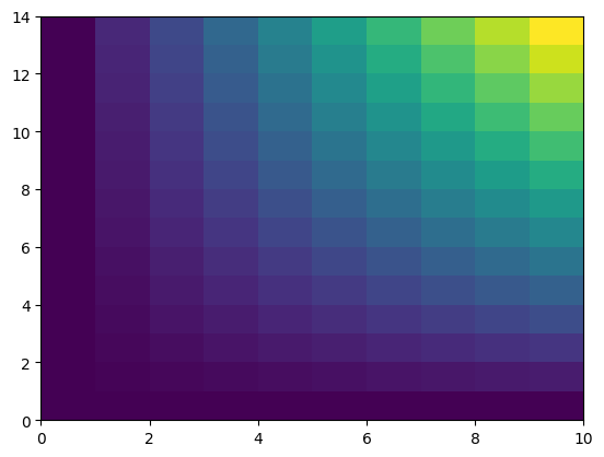
この状態だとX軸、Y軸の値はそれぞれのインデックスの値になります。
これを修正する場合は「pcolormesh(X軸のリスト, Y軸のリスト, 二次元リスト)」とします。
import matplotlib.pyplot as plt
import numpy as np

x_num = 5
y_num = 7
step = 0.5

x_list = np.arange(0, x_num, step)
y_list = np.arange(0, y_num, step)

z_list = []
for y_val in y_list:
    z_list_temp = []
    for x_val in x_list:
        z_list_temp.append(x_val*y_val)
    z_list.append(z_list_temp)

fig = plt.figure()
plt.clf()

plt.pcolormesh(x_list, y_list, z_list)

plt.show()

実行結果
カラープロットの表示方法
pcolormeshでカラープロットを表示する方法として「nearest」、「flat」、「gouraud」の3種類(+自動選択の「auto」)が用意されています。
表示方法を変更するには「pcolormesh」のオプションに「shading=”方法”」を追加します。
それぞれを表示させてみましょう。
まずは「nearest」です。
import matplotlib.pyplot as plt
import numpy as np

x_num = 5
y_num = 7
step = 0.5

x_list = np.arange(0, x_num, step)
y_list = np.arange(0, y_num, step)

z_list = []
for y_val in y_list:
    z_list_temp = []
    for x_val in x_list:
        z_list_temp.append(x_val*y_val)
    z_list.append(z_list_temp)

fig = plt.figure()
plt.clf()

plt.pcolormesh(x_list, y_list, z_list, shading="nearest")

plt.show()

実行結果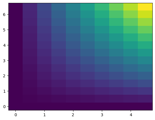
次に「flat」ですが、単純に「shading=”flat”」とするとエラーとなります。
import matplotlib.pyplot as plt
import numpy as np

x_num = 5
y_num = 7
step = 0.5

x_list = np.arange(0, x_num, step)
y_list = np.arange(0, y_num, step)

z_list = []
for y_val in y_list:
    z_list_temp = []
    for x_val in x_list:
        z_list_temp.append(x_val*y_val)
    z_list.append(z_list_temp)

fig = plt.figure()
plt.clf()

plt.pcolormesh(x_list, y_list, z_list, shading="flat")

plt.show()

実行結果
---------------------------------------------------------------------------
TypeError                                 Traceback (most recent call last)
Cell In[7], line 21
     18 fig = plt.figure()
     19 plt.clf()
---> 21 plt.pcolormesh(x_list, y_list, z_list, shading="flat")
     23 plt.show()

TypeError: Dimensions of C (14, 10) should be one smaller than
X(10) and Y(14) while using shading='flat' see help(pcolormesh)
「shading=”flat”」の場合は二次元リストの縦横を1つずつ無くす必要があります。
import matplotlib.pyplot as plt
import numpy as np

x_num = 5
y_num = 7
step = 0.5

x_list = np.arange(0, x_num, step)
y_list = np.arange(0, y_num, step)

z_list = []

#----------この部分を変更----------
for y_val in y_list[1:]:
    z_list_temp = []
    for x_val in x_list[1:]:
        z_list_temp.append(x_val*y_val)
    z_list.append(z_list_temp)
#----------この部分を変更----------

fig = plt.figure()
plt.clf()

plt.pcolormesh(x_list, y_list, z_list, shading="flat")

plt.show()

実行結果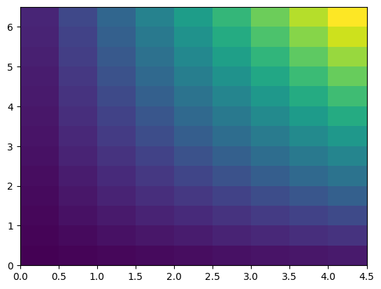
「gouraud」は「nearest」同様、X軸の値数、Y軸の値数と二次元リストの縦横の数が一致している状態で使用できます。
import matplotlib.pyplot as plt
import numpy as np

x_num = 5
y_num = 7
step = 0.5

x_list = np.arange(0, x_num, step)
y_list = np.arange(0, y_num, step)

z_list = []
for y_val in y_list:
    z_list_temp = []
    for x_val in x_list:
        z_list_temp.append(x_val*y_val)
    z_list.append(z_list_temp)

fig = plt.figure()
plt.clf()

plt.pcolormesh(x_list, y_list, z_list, shading="gouraud")

plt.show()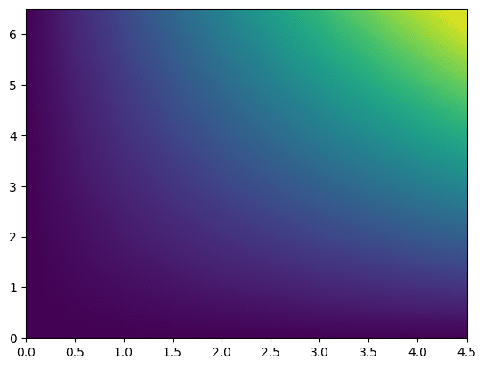
最後の「gouraud」が滑らかに色が変化していて2次元プロットとしては分かりやすいと思います。
プロットの色の変更
プロットの色を変える場合は「plt.pcolormesh()」のオプションに「cmap=”カラーマップ”」を追加します。
使用できるカラーマップに関してはこちらのページをご覧ください。
import matplotlib.pyplot as plt
import numpy as np

x_num = 5
y_num = 7
step = 0.5

x_list = np.arange(0, x_num, step)
y_list = np.arange(0, y_num, step)

z_list = []
for y_val in y_list:
    z_list_temp = []
    for x_val in x_list:
        z_list_temp.append(x_val*y_val)
    z_list.append(z_list_temp)

fig = plt.figure()
plt.clf()

plt.pcolormesh(x_list, y_list, z_list, cmap="Reds")

plt.show()

実行結果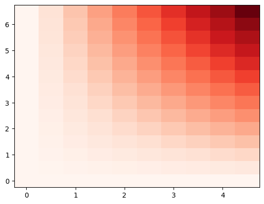
カラーバーの表示
カラーバーを表示するにはプログラム中に「plt.colorbar()」を追加します。
import matplotlib.pyplot as plt
import numpy as np

x_num = 5
y_num = 7
step = 0.5

x_list = np.arange(0, x_num, step)
y_list = np.arange(0, y_num, step)

z_list = []
for y_val in y_list:
    z_list_temp = []
    for x_val in x_list:
        z_list_temp.append(x_val*y_val)
    z_list.append(z_list_temp)

fig = plt.figure()
plt.clf()

plt.pcolormesh(x_list, y_list, z_list)

plt.colorbar()

plt.show()

実行結果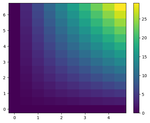
カラーバーの最小値、最大値を設定する場合は「vmin」、「vmax」を指定します。
import matplotlib.pyplot as plt
import numpy as np

x_num = 5
y_num = 7
step = 0.5

x_list = np.arange(0, x_num, step)
y_list = np.arange(0, y_num, step)

z_list = []
for y_val in y_list:
    z_list_temp = []
    for x_val in x_list:
        z_list_temp.append(x_val*y_val)
    z_list.append(z_list_temp)

fig = plt.figure()
plt.clf()

plt.pcolormesh(x_list, y_list, z_list, vmin=10, vmax=20)

plt.colorbar()
plt.show()

実行結果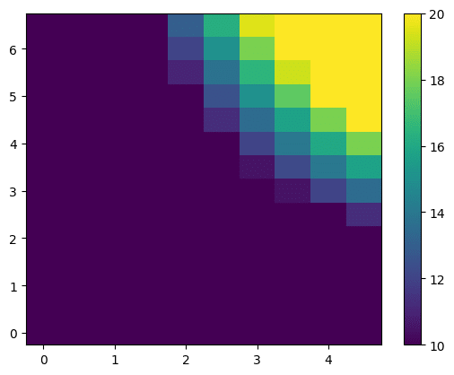
カラーバーの細かい設定方法に関してはこちらの記事で紹介していますので、よかったらご覧ください。
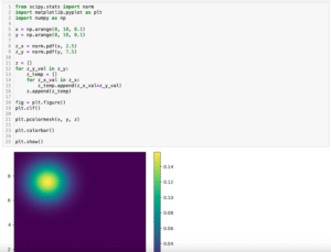
次回はmatplotlibで正規分布(ガウス分布)をpcolormeshを使って2次元プロットする方法を紹介します。
ではでは今回はこんな感じで。
コメント