前回のおさらい:データの変換と格納
前回は温度・湿度ロガーのデータを分析するため、CSVファイルを読み込み、データをグラフ表示できる形に変換、そしてリストへ格納しました。

まずはここまでのおさらいです。
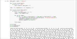
まずはフォルダ構造を整えるプログラムがこちら。
import os
import shutil

def dir_check(dirname, dirlist):
    if dirname not in dirlist:
        os.mkdir(dirname)
    elif dirname in dirlist:
        shutil.rmtree(dirname)
        os.mkdir(dirname)

path = os.getcwd()

# print(path)

dirnames = []

for f in os.listdir(path):
    if os.path.isdir(f) == True:
        dirnames.append(f)

# print(dirnames)

dir_check("Data", dirnames)
dir_check("Graph", dirnames)
CSVファイルを読み込み、データをグラフに使用できる形に変換、リストに格納するプログラムがこちら。
import os
import shutil
import csv
import datetime

def is_float(val):
    try:
        float(val)
    except:
        return False
    else:
        return True

path = os.getcwd()

data_path = path + "//Data//"

for f in os.listdir(path):
    if f[-4:] == ".csv":
        shutil.move(f, data_path + f)

time = []; temperature = []; humidity = []

for f in os.listdir(data_path):
    if f[-4:] == ".csv":
        file = open(data_path + f, "r")
        reader = csv.reader(file)

        for row in reader:
            if row != [] and is_float(row[1]) == True and is_float(row[2]) == True:
                time.append(datetime.datetime.strptime(row[0], "%Y-%m-%d %H:%M:%S"))
                temperature.append(float(row[1]))
                humidity.append(float(row[2]))

        file.close()

# print(time)
# print(temperature)
# print(humidity)
ここからは最後のステップ。
データをグラフとして表示するところのプログラムをしていきます。
グラフ表示
グラフ表示に関しては、matplotlibというモジュールを用います。
matplotlibに関しても前に解説を行なっていますので、良かったらこちらの記事もご覧ください。

何にせよ必要なのがmatplotlibのインポートです。
from matplotlib import pyplot as pltmatplotlibのうち、pyplotをインポートしますが、この際「as plt」としておくことにより、pltと書いた時に、pyplotと書いたのと同じ意味と指定しておきます。
まずは数値をグラフにするため、plt.plot(X, Y)としてデータを読み込みます。
最後にplt.show()とすることでグラフを表示させます。
from matplotlib import pyplot as plt

plt.plot(time, temperature)
plt.plot(time, humidity)

plt.show()

実行結果
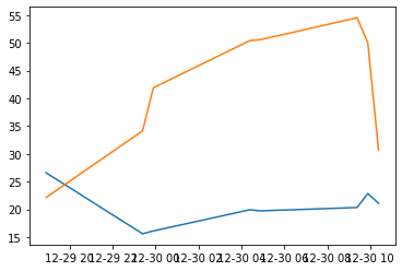
とりあえずグラフが表示できました。
温度と湿度の二軸にする
温度と湿度は違う値ないので、左を温度の軸、右を湿度の軸、そして下を時間軸としましょう。
このように左右が違う軸、下が共通の軸とする場合、次のようなプログラムをplt.plot()の前に追加します。
fig = plt.figure()

ax1 = fig.subplots()
ax2 = ax1.twinx()
ということでプログラム全体としてはこうなります。
from matplotlib import pyplot as plt

fig = plt.figure()

ax1 = fig.subplots()
ax2 = ax1.twinx()

ax1.plot(time, temperature)
ax2.plot(time, humidity)

plt.show()

実行結果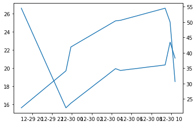
確かに2軸になりました。
ただ同じ色で分かりにくいので、色を変えて、凡例を入れてみましょう。
まず色と凡例を表示させるため、ax1.plot()とax2.plot()の中を書き足します。
ax1.plot(time, temperature, color="red", label="Temperature")
ax2.plot(time, humidity, color="blue", label="Humidity")
color=”色”が線の色、label=”凡例名”が表示する凡例になります。
また二軸グラフの時、凡例表示には以下のプログラムが必要になります。
h1, l1 = ax1.get_legend_handles_labels()
h2, l2 = ax2.get_legend_handles_labels()
ax1.legend(h1 + h2, l1 + l2)
2軸グラフに関してはまた解説ページを作りたいと思っているので、今回はこういうもんだと思っておいてください。
これらを組み合わせるとこうなります。
from matplotlib import pyplot as plt

fig = plt.figure()

ax1 = fig.subplots()
ax2 = ax1.twinx()

ax1.plot(time, temperature, color="red", label="Temperature")
ax2.plot(time, humidity, color="blue", label="Humidity")

h1, l1 = ax1.get_legend_handles_labels()
h2, l2 = ax2.get_legend_handles_labels()
ax1.legend(h1 + h2, l1 + l2, loc="lower right")

plt.show()

実行結果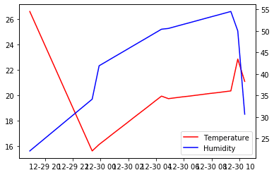
ちなみに凡例がグラフにかぶってしまったので、ax1.legend(h1 + h2, l1 + l2, loc=”lower right”)というようにloc=”lower right”と凡例の場所を右下に固定しています。
全体をデコレーションしていく
ここから少しずつ綺麗なグラフにしていきます。
まずはそれぞれの軸名を入れていきましょう。
2軸グラフの場合、前に解説したplt.xlabel()は使えません。
今回は軸をax1、ax2としたので、この場合はax1.set_ylabel(“軸名”)というふうに書きます。
ax2も同様にax2.set_ylabel(“軸名”)とします。
またx軸に関しては共通なので、どちらかだけ書けば大丈夫です(例えばax1.set_xlabel(“軸名”))。
ということでこんな感じのプログラムが追加されます。
ax1.set_ylabel("Temperature(degrees)")
ax2.set_ylabel("Relative humidity(%)")
ax1.set_xlabel("Time")
ということで追加してみます。
from matplotlib import pyplot as plt

fig = plt.figure()

ax1 = fig.subplots()
ax2 = ax1.twinx()

ax1.plot(time, temperature, color="red", label="Temperature")
ax2.plot(time, humidity, color="blue", label="Humidity")

ax1.set_ylabel("Temperature(degrees)")
ax2.set_ylabel("Relative humidity(%)")
ax1.set_xlabel("Time")

h1, l1 = ax1.get_legend_handles_labels()
h2, l2 = ax2.get_legend_handles_labels()
ax1.legend(h1 + h2, l1 + l2, loc="lower right")

plt.show()

実行結果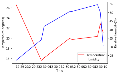
次にX軸が重なってしまっているので、90度回転させます。
その場合はax1.tick_params(axis=”軸”, rotation=角度)を追加します。
今回はX軸を90度回転させたいのでこうなります。
ax1.tick_params(axis="x", rotation=90)ということで追加します。
from matplotlib import pyplot as plt

fig = plt.figure()

ax1 = fig.subplots()
ax2 = ax1.twinx()

ax1.plot(time, temperature, color="red", label="Temperature")
ax2.plot(time, humidity, color="blue", label="Humidity")

ax1.set_ylabel("Temperature(degrees)")
ax2.set_ylabel("Relative humidity(%)")
ax1.set_xlabel("Time")

ax1.tick_params(axis="x", rotation=90)

h1, l1 = ax1.get_legend_handles_labels()
h2, l2 = ax2.get_legend_handles_labels()
ax1.legend(h1 + h2, l1 + l2, loc="lower right")

plt.show()

実行結果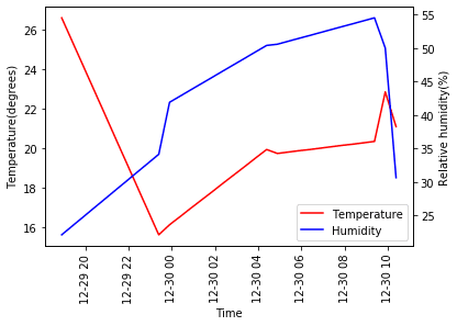
グラフの自動保存
最後にグラフを自動保存するようにします。
自動保存するにはこのプログラムを追加します。
fig.savefig("ファイル名")またグラフ用フォルダのパスもまとめておきましょう。
graph_path = path + "//Graph//"ということでこうなります。
from matplotlib import pyplot as plt

fig = plt.figure()

ax1 = fig.subplots()
ax2 = ax1.twinx()

ax1.plot(time, temperature, color="red", label="Temperature")
ax2.plot(time, humidity, color="blue", label="Humidity")

ax1.set_ylabel("Temperature(degrees)")
ax2.set_ylabel("Relative humidity(%)")
ax1.set_xlabel("Time")

ax1.tick_params(axis="x", rotation=90)

h1, l1 = ax1.get_legend_handles_labels()
h2, l2 = ax2.get_legend_handles_labels()
ax1.legend(h1 + h2, l1 + l2, loc="lower right")

graph_path = path + "//Graph//"

plt.savefig(graph_path + "graph.png")

plt.show()

実行結果
自動保存されたグラフは下が切れてしまっています。
これはグラフのサイズが合っていないことで起きる現象です。
ということで、「fig = plt.figure()」にfigsizeを追加します。
fig = plt.figure(figsize=(8,8))ということでこうなります。
from matplotlib import pyplot as plt

fig = plt.figure(figsize=(8,8))

ax1 = fig.subplots()
ax2 = ax1.twinx()

ax1.plot(time, temperature, color="red", label="Temperature")
ax2.plot(time, humidity, color="blue", label="Humidity")

ax1.set_ylabel("Temperature(degrees)")
ax2.set_ylabel("Relative humidity(%)")
ax1.set_xlabel("Time")

ax1.tick_params(axis="x", rotation=90)

h1, l1 = ax1.get_legend_handles_labels()
h2, l2 = ax2.get_legend_handles_labels()
ax1.legend(h1 + h2, l1 + l2, loc="lower right")

graph_path = path + "//Graph//"

plt.savefig(graph_path + "graph.png")

plt.show()

実行結果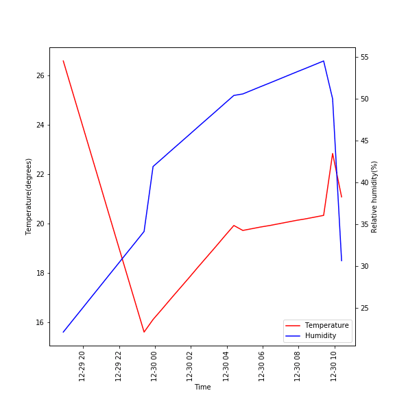
これで大体のプログラムができました。
次回は全体を統合していきましょう。
ということで今回はこんな感じで。
コメント