Matplotlibで円グラフを表示
前回まで機械学習ライブラリScikit-learnの糖尿病患者のデータベースを色々といじってきました。
その中で円グラフを使う場面があったのですが、とりあえず最低限の使い方だけ紹介して、詳しい解説を後回しにしていました。
とりあえず糖尿病患者のデータベースは色々といじったので、今回は休憩ということで、円グラフの表示方法の解説をしていきたいと思います。
ただし結構長くなりそうなので、今回は円グラフの表示の基本とラベルの表示に関して解説をします。
まずは前にも出てきた基本の形から。
何はともあれmatplotlibを使うので、いつも通りインポートとjupyter notebookで表示するためのマジックコマンドを書きましょう。
from matplotlib import pyplot as plt
%matplotlib inline
次にグラフエリアの準備ととりあえず一度クリアをしておきます。
fig = plt.figure()
plt.clf()
円グラフを表示するのに最低限必要なのは、数値のリストです。
円グラフなので、とりあえず合計値が100となるように数値のリストを作ってみました。
x = [5, 10, 15, 25, 45]これで円グラフを表示するには「plt.pie(x)」とするだけです。
from matplotlib import pyplot as plt
%matplotlib inline

fig = plt.figure()
plt.clf()

x = [5, 10, 15, 25, 45]

plt.pie(x)

実行結果
([<matplotlib.patches.Wedge at 0x7fa60d142f10>,
  <matplotlib.patches.Wedge at 0x7fa60d152250>,
  <matplotlib.patches.Wedge at 0x7fa60d1525d0>,
  <matplotlib.patches.Wedge at 0x7fa60d152b90>,
  <matplotlib.patches.Wedge at 0x7fa60d15a810>],
 [Text(1.0864571742518743, 0.1720779140872905, ''),
  Text(0.8899186877588753, 0.6465637858537406, ''),
  Text(0.1720778759417422, 1.086457180293535, ''),
  Text(-0.9801072023231266, 0.4993894992431598, ''),
  Text(0.17207792680247347, -1.086457172237987, '')])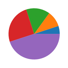
無事、円グラフが表示されました。
出力としてテキストも何やら出てきていますが、色々な計算結果のようなので気にしないでいいでしょう。
ちなみにリスト内の数値の合計が100でない場合はどうなるのでしょうか?
from matplotlib import pyplot as plt
%matplotlib inline

fig = plt.figure()
plt.clf()

x = [5, 20, 45, 85, 125]

plt.pie(x)

実行結果
([<matplotlib.patches.Wedge at 0x7fa60ad86d50>,
  <matplotlib.patches.Wedge at 0x7fa60ad95090>,
  <matplotlib.patches.Wedge at 0x7fa60ad95410>,
  <matplotlib.patches.Wedge at 0x7fa60ad959d0>,
  <matplotlib.patches.Wedge at 0x7fa60ad9f650>],
 [Text(1.0982694963649198, 0.061677494715216635, ''),
  Text(1.0382716578724671, 0.3633069837737209, ''),
  Text(0.5320907581099353, 0.9627457738852945, ''),
  Text(-0.8971169718186758, 0.636538403299353, ''),
  Text(0.18425687283189648, -1.0844581157491564, '')])
こちらも無事表示されました。
ということは特にリストの数値の合計が100にならなくても自動で円グラフとなるように計算してくれるということですね。
ラベルの表示:labels
次にラベルを表示していきますが、そのラベル用のリストが必要となります。
現在、数値のリストxの要素数が5なので、5つの名前が入ったリストが必要です。
ということで単純にnameというリストにAからEまでのアルファベットを格納してみました。
x = [5, 10, 15, 25, 45]
name = ["A", "B", "C", "D", "E"]
ラベルを表示するには、plt.pieのオプションに「labels=ラベルのリスト名」とします。
from matplotlib import pyplot as plt
%matplotlib inline

fig = plt.figure()
plt.clf()

x = [5, 10, 15, 25, 45]
name = ["A", "B", "C", "D", "E"]

plt.pie(x, labels=name)

実行結果
([<matplotlib.patches.Wedge at 0x7fa60df7bf50>,
  <matplotlib.patches.Wedge at 0x7fa60df27390>,
  <matplotlib.patches.Wedge at 0x7fa60e06b5d0>,
  <matplotlib.patches.Wedge at 0x7fa60e06bb90>,
  <matplotlib.patches.Wedge at 0x7fa60e074810>],
 [Text(1.0864571742518743, 0.1720779140872905, 'A'),
  Text(0.8899186877588753, 0.6465637858537406, 'B'),
  Text(0.1720778759417422, 1.086457180293535, 'C'),
  Text(-0.9801072023231266, 0.4993894992431598, 'D'),
  Text(0.17207792680247347, -1.086457172237987, 'E')])
ラベルが表示されました。
ラベルの中心からの距離:labeldistance
ラベルの位置を決めるには「labeldistance」のオプションを使います。
円グラフなので、中心からの距離として指定をします。
例えば0.5、つまり円グラフの直径の半分を指定してみるとこうなります。
from matplotlib import pyplot as plt
%matplotlib inline

fig = plt.figure()
plt.clf()

x = [5, 10, 15, 25, 45]
name = ["A", "B", "C", "D", "E"]

plt.pie(x, labels=name, labeldistance=0.5)

実行結果
([<matplotlib.patches.Wedge at 0x7fa60d48fb10>,
  <matplotlib.patches.Wedge at 0x7fa60d48fe10>,
  <matplotlib.patches.Wedge at 0x7fa60d4de1d0>,
  <matplotlib.patches.Wedge at 0x7fa60d4de790>,
  <matplotlib.patches.Wedge at 0x7fa60d4eb410>],
 [Text(0.4938441701144882, 0.07821723367604114, 'A'),
  Text(0.40450849443585235, 0.29389262993351845, 'B'),
  Text(0.07821721633715555, 0.49384417286069765, 'C'),
  Text(-0.44550327378323934, 0.22699522692870897, 'D'),
  Text(0.07821723945566975, -0.4938441691990849, 'E')])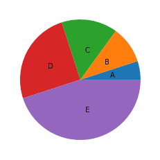
もちろん初期値よりももっと遠くに設定することも可能です。
labeldistanceを1.5として円グラフの直径の1.5倍の位置に表示させてみましょう。
from matplotlib import pyplot as plt
%matplotlib inline

fig = plt.figure()
plt.clf()

x = [5, 10, 15, 25, 45]
name = ["A", "B", "C", "D", "E"]

plt.pie(x, labels=name, labeldistance=1.5)

実行結果
([<matplotlib.patches.Wedge at 0x7fa60e0fe810>,
  <matplotlib.patches.Wedge at 0x7fa60e0feb10>,
  <matplotlib.patches.Wedge at 0x7fa60e0fee90>,
  <matplotlib.patches.Wedge at 0x7fa60e109490>,
  <matplotlib.patches.Wedge at 0x7fa60e114110>],
 [Text(1.4815325103434647, 0.2346517010281234, 'A'),
  Text(1.213525483307557, 0.8816778898005553, 'B'),
  Text(0.23465164901146662, 1.481532518582093, 'C'),
  Text(-1.336509821349718, 0.6809856807861269, 'D'),
  Text(0.23465171836700924, -1.4815325075972547, 'E')])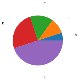
確かに遠くに表示されました。
比率を表示:autopct
円グラフのそれぞれの領域の比率を表示させるには「autopct」を用います。
この際、表示の方法を指定する必要があり、例えば小数点以下1桁まで表示し、最後に%を表示させる場合、「%.1f%%」となります。
この表記の場合、最初の%と.1fが一かたまり、%%が一かたまりと考えると分かりやすいです。
最初の「%.1f」が小数点以下1桁までを示し、「%%」が%を表示します。
ちなみに「%.5f」とすると小数点以下5桁まで表示します。
とりあえず小数点以下1桁で試してみましょう。
from matplotlib import pyplot as plt
%matplotlib inline

fig = plt.figure()
plt.clf()

x = [5, 10, 15, 25, 45]

plt.pie(x, autopct='%.1f%%')

実行結果
([<matplotlib.patches.Wedge at 0x7fa60e486890>,
  <matplotlib.patches.Wedge at 0x7fa60e486f10>,
  <matplotlib.patches.Wedge at 0x7fa60e4927d0>,
  <matplotlib.patches.Wedge at 0x7fa60e60a090>,
  <matplotlib.patches.Wedge at 0x7fa60e60ac90>],
 [Text(1.0864571742518743, 0.1720779140872905, ''),
  Text(0.8899186877588753, 0.6465637858537406, ''),
  Text(0.1720778759417422, 1.086457180293535, ''),
  Text(-0.9801072023231266, 0.4993894992431598, ''),
  Text(0.17207792680247347, -1.086457172237987, '')],
 [Text(0.5926130041373858, 0.09386068041124936, '5.0%'),
  Text(0.4854101933230228, 0.35267115592022213, '10.0%'),
  Text(0.09386065960458666, 0.5926130074328372, '15.0%'),
  Text(-0.5346039285398871, 0.27239427231445074, '25.0%'),
  Text(0.0938606873468037, -0.5926130030389019, '45.0%')])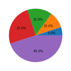
ちなみに小数点以下5桁にしてみるとこんな感じです。
from matplotlib import pyplot as plt
%matplotlib inline

fig = plt.figure()
plt.clf()

x = [5, 10, 15, 25, 45]

plt.pie(x, autopct='%.5f%%')

実行結果
([<matplotlib.patches.Wedge at 0x7fa60e6f04d0>,
  <matplotlib.patches.Wedge at 0x7fa60e6f0b50>,
  <matplotlib.patches.Wedge at 0x7fa60e730410>,
  <matplotlib.patches.Wedge at 0x7fa60e730c90>,
  <matplotlib.patches.Wedge at 0x7fa60e73c8d0>],
 [Text(1.0864571742518743, 0.1720779140872905, ''),
  Text(0.8899186877588753, 0.6465637858537406, ''),
  Text(0.1720778759417422, 1.086457180293535, ''),
  Text(-0.9801072023231266, 0.4993894992431598, ''),
  Text(0.17207792680247347, -1.086457172237987, '')],
 [Text(0.5926130041373858, 0.09386068041124936, '5.00000%'),
  Text(0.4854101933230228, 0.35267115592022213, '10.00000%'),
  Text(0.09386065960458666, 0.5926130074328372, '15.00000%'),
  Text(-0.5346039285398871, 0.27239427231445074, '25.00000%'),
  Text(0.0938606873468037, -0.5926130030389019, '45.00000%')])
ちゃんと小数点以下5桁まで表示されるようになりました。
比率表示の中心からの距離:pctdistance
先ほどのラベル同様、比率の表示も位置を変更することができます。
その際、やはり中心からの距離を「pctdistance」で指定することによって、場所を制御します。
比率はデフォルトでは円グラフの内側に表示されていますので、「pictdistance = 1.2」として外側に表示させてみましょう。
from matplotlib import pyplot as plt
%matplotlib inline

fig = plt.figure()
plt.clf()

x = [5, 10, 15, 25, 45]

plt.pie(x, autopct='%.1f%%', pctdistance=1.2)

実行結果
([<matplotlib.patches.Wedge at 0x7fa60e7cab50>,
  <matplotlib.patches.Wedge at 0x7fa60e7d6210>,
  <matplotlib.patches.Wedge at 0x7fa60e7d6a90>,
  <matplotlib.patches.Wedge at 0x7fa60e7e0350>,
  <matplotlib.patches.Wedge at 0x7fa60e7e0f50>],
 [Text(1.0864571742518743, 0.1720779140872905, ''),
  Text(0.8899186877588753, 0.6465637858537406, ''),
  Text(0.1720778759417422, 1.086457180293535, ''),
  Text(-0.9801072023231266, 0.4993894992431598, ''),
  Text(0.17207792680247347, -1.086457172237987, '')],
 [Text(1.1852260082747716, 0.1877213608224987, '5.0%'),
  Text(0.9708203866460456, 0.7053423118404443, '10.0%'),
  Text(0.18772131920917332, 1.1852260148656744, '15.0%'),
  Text(-1.0692078570797743, 0.5447885446289015, '25.0%'),
  Text(0.1877213746936074, -1.1852260060778037, '45.0%')])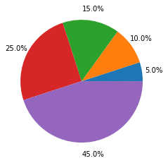
フォントの設定:textprops
ラベルや比率のフォントを変更するには、「textprops」を使います。
ただ「textprops」に関しては、さらに何の設定をするのか指定をする必要があります。
例えばフォントサイズを20にして、色を赤にする場合は「textprops = {“fontsize”:20, “color”: “red”})」となります。
まずはこれでラベルのフォントが変わるのか試してみましょう。
from matplotlib import pyplot as plt
%matplotlib inline

fig = plt.figure()
plt.clf()

x = [5, 10, 15, 25, 45]
name = ["A", "B", "C", "D", "E"]

plt.pie(x, labels=name, textprops = {"fontsize":20, "color": "red"})

実行結果
([<matplotlib.patches.Wedge at 0x7fa60ea7e910>,
  <matplotlib.patches.Wedge at 0x7fa60e9cc7d0>,
  <matplotlib.patches.Wedge at 0x7fa60ea7ef50>,
  <matplotlib.patches.Wedge at 0x7fa60eadc550>,
  <matplotlib.patches.Wedge at 0x7fa60eae7150>],
 [Text(1.0864571742518743, 0.1720779140872905, 'A'),
  Text(0.8899186877588753, 0.6465637858537406, 'B'),
  Text(0.1720778759417422, 1.086457180293535, 'C'),
  Text(-0.9801072023231266, 0.4993894992431598, 'D'),
  Text(0.17207792680247347, -1.086457172237987, 'E')])
フォントが大きくなり、色が赤になりました。
この「textprops」は比率の表示にも適応されます。
from matplotlib import pyplot as plt
%matplotlib inline

fig = plt.figure()
plt.clf()

x = [5, 10, 15, 25, 45]

plt.pie(x, autopct='%.1f%%',textprops = {"fontsize":20, "color": "red"})

実行結果
([<matplotlib.patches.Wedge at 0x7fa60eb65f10>,
  <matplotlib.patches.Wedge at 0x7fa60eb755d0>,
  <matplotlib.patches.Wedge at 0x7fa60eb75e50>,
  <matplotlib.patches.Wedge at 0x7fa60eb7e710>,
  <matplotlib.patches.Wedge at 0x7fa60eb872d0>],
 [Text(1.0864571742518743, 0.1720779140872905, ''),
  Text(0.8899186877588753, 0.6465637858537406, ''),
  Text(0.1720778759417422, 1.086457180293535, ''),
  Text(-0.9801072023231266, 0.4993894992431598, ''),
  Text(0.17207792680247347, -1.086457172237987, '')],
 [Text(0.5926130041373858, 0.09386068041124936, '5.0%'),
  Text(0.4854101933230228, 0.35267115592022213, '10.0%'),
  Text(0.09386065960458666, 0.5926130074328372, '15.0%'),
  Text(-0.5346039285398871, 0.27239427231445074, '25.0%'),
  Text(0.0938606873468037, -0.5926130030389019, '45.0%')])
ラベルを円グラフに沿って回転:rotatelabels
ラベルの表記を円グラフに沿って回転させるには「rotatelabels」を使います。
from matplotlib import pyplot as plt
%matplotlib inline

fig = plt.figure()
plt.clf()

x = [5, 10, 15, 25, 45]
name = ["A", "B", "C", "D", "E"]

plt.pie(x, labels=name, rotatelabels=True)

実行結果
([<matplotlib.patches.Wedge at 0x7fa60d7e2510>,
  <matplotlib.patches.Wedge at 0x7fa60d7e2810>,
  <matplotlib.patches.Wedge at 0x7fa60d7e2b90>,
  <matplotlib.patches.Wedge at 0x7fa60d7ec150>,
  <matplotlib.patches.Wedge at 0x7fa60d7ecd90>],
 [Text(1.0864571742518743, 0.1720779140872905, 'A'),
  Text(0.8899186877588753, 0.6465637858537406, 'B'),
  Text(0.1720778759417422, 1.086457180293535, 'C'),
  Text(-0.9801072023231266, 0.4993894992431598, 'D'),
  Text(0.17207792680247347, -1.086457172237987, 'E')])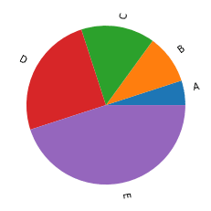
円グラフを離して表示:explode
これまで円グラフは各グラフ領域がくっついて、まん丸な円となって表示されていました。
しかし時にはどれかのグラフ領域や各グラフ領域を目立たせたいなんて時があると思います。
その時、グラフ領域を離して表示することができるオプションが「explode」です。
explodeの値はリストとしてそれぞれのグラフ領域の位置を指定します。
from matplotlib import pyplot as plt
%matplotlib inline

fig = plt.figure()
plt.clf()

x = [5, 10, 15, 25, 45]

plt.pie(x, explode=[0.1, 0.1, 0.1, 0.1, 0.1])

実行結果
([<matplotlib.patches.Wedge at 0x7fa60d1e66d0>,
  <matplotlib.patches.Wedge at 0x7fa60d1e69d0>,
  <matplotlib.patches.Wedge at 0x7fa60d1e6d50>,
  <matplotlib.patches.Wedge at 0x7fa60d1f1350>,
  <matplotlib.patches.Wedge at 0x7fa60d1f1f90>],
 [Text(1.1852260082747719, 0.18772136082249874, ''),
  Text(0.9708203866460458, 0.7053423118404443, ''),
  Text(0.18772131920917332, 1.1852260148656746, ''),
  Text(-1.0692078570797745, 0.5447885446289016, ''),
  Text(0.18772137469360742, -1.185226006077804, '')])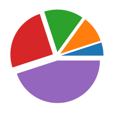
上の例では全部同じ比率で離していますが、注目させたいところだけさらに離すということも可能です。
from matplotlib import pyplot as plt
%matplotlib inline

fig = plt.figure()
plt.clf()

x = [5, 10, 15, 25, 45]

plt.pie(x, explode=[1, 0.1, 0.1, 0.1, 0.1])

実行結果
([<matplotlib.patches.Wedge at 0x7fa60d38bbd0>,
  <matplotlib.patches.Wedge at 0x7fa60d38bed0>,
  <matplotlib.patches.Wedge at 0x7fa60d399290>,
  <matplotlib.patches.Wedge at 0x7fa60d399850>,
  <matplotlib.patches.Wedge at 0x7fa60d3a24d0>],
 [Text(2.0741455144808505, 0.3285123814393728, ''),
  Text(0.9708203866460458, 0.7053423118404443, ''),
  Text(0.18772131920917332, 1.1852260148656746, ''),
  Text(-1.0692078570797745, 0.5447885446289016, ''),
  Text(0.18772137469360742, -1.185226006077804, '')])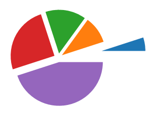
ちなみにグラフ領域のリストの要素数とexplodeのリストの要素数が違うとエラーになります。
from matplotlib import pyplot as plt
%matplotlib inline

fig = plt.figure()
plt.clf()

x = [5, 10, 15, 25, 45]

plt.pie(x, explode=[0.2])

実行結果
---------------------------------------------------------------------------
ValueError                                Traceback (most recent call last)
<ipython-input-103-748a16cbb4f6> in <module>
      7 x = [5, 10, 15, 25, 45]
      8
----> 9 plt.pie(x, explode=[0.2])

/opt/anaconda3/lib/python3.7/site-packages/matplotlib/pyplot.py in pie(x, explode, labels, colors, autopct, pctdistance, shadow, labeldistance, startangle, radius, counterclock, wedgeprops, textprops, center, frame, rotatelabels, data)
   2753         wedgeprops=wedgeprops, textprops=textprops, center=center,
   2754         frame=frame, rotatelabels=rotatelabels, **({"data": data} if
-> 2755         data is not None else {}))
   2756
   2757

/opt/anaconda3/lib/python3.7/site-packages/matplotlib/__init__.py in inner(ax, data, *args, **kwargs)
   1563     def inner(ax, *args, data=None, **kwargs):
   1564         if data is None:
-> 1565             return func(ax, *map(sanitize_sequence, args), **kwargs)
   1566
   1567         bound = new_sig.bind(ax, *args, **kwargs)

/opt/anaconda3/lib/python3.7/site-packages/matplotlib/axes/_axes.py in pie(self, x, explode, labels, colors, autopct, pctdistance, shadow, labeldistance, startangle, radius, counterclock, wedgeprops, textprops, center, frame, rotatelabels)
   2929             raise ValueError("'label' must be of length 'x'")
   2930         if len(x) != len(explode):
-> 2931             raise ValueError("'explode' must be of length 'x'")
   2932         if colors is None:
   2933             get_next_color = self._get_patches_for_fill.get_next_color

ValueError: 'explode' must be of length 'x'
各グラフ領域の色を指定:colors
グラフ領域の色を指定する場合にはcolorsのオプションを用います。
その際、各グラフ領域の色を指定したリストを引数とします。
from matplotlib import pyplot as plt
%matplotlib inline

fig = plt.figure()
plt.clf()

x = [5, 10, 15, 25, 45]

plt.pie(x, colors=["red", "dimgray", "gray", "darkgray", "lightgray"])

実行結果
([<matplotlib.patches.Wedge at 0x7fa60d9292d0>,
  <matplotlib.patches.Wedge at 0x7fa60d9295d0>,
  <matplotlib.patches.Wedge at 0x7fa60d929950>,
  <matplotlib.patches.Wedge at 0x7fa60d929f10>,
  <matplotlib.patches.Wedge at 0x7fa60d934b90>],
 [Text(1.0864571742518743, 0.1720779140872905, ''),
  Text(0.8899186877588753, 0.6465637858537406, ''),
  Text(0.1720778759417422, 1.086457180293535, ''),
  Text(-0.9801072023231266, 0.4993894992431598, ''),
  Text(0.17207792680247347, -1.086457172237987, '')])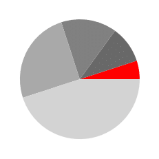
1箇所だけ赤になり、他のグラフ領域は灰色になりました。
ちなみにmatplotlibで指定できる色の名前リストはこちらです。
また色のリストの要素数がグラフ領域のリストの要素数と違っている場合、前から順番に使われていき、使い切ったら、また最初の色に戻ります。
from matplotlib import pyplot as plt
%matplotlib inline

fig = plt.figure()
plt.clf()

x = [5, 10, 15, 25, 45]

plt.pie(x, colors=["red", "blue", "green"])

実行結果
([<matplotlib.patches.Wedge at 0x7fa60efd3750>,
  <matplotlib.patches.Wedge at 0x7fa60efd3a50>,
  <matplotlib.patches.Wedge at 0x7fa60efd3dd0>,
  <matplotlib.patches.Wedge at 0x7fa60efd3590>,
  <matplotlib.patches.Wedge at 0x7fa60efde990>],
 [Text(1.0864571742518743, 0.1720779140872905, ''),
  Text(0.8899186877588753, 0.6465637858537406, ''),
  Text(0.1720778759417422, 1.086457180293535, ''),
  Text(-0.9801072023231266, 0.4993894992431598, ''),
  Text(0.17207792680247347, -1.086457172237987, '')])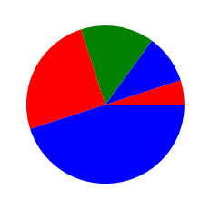
影をつける:shadow
円グラフを立体的に見せるため、「shadow」のオプションを使って影をつけることができます。
選択肢としては影をつける(True)と影をつけない(False)があり、影をつけいないがデフォルトです。
from matplotlib import pyplot as plt
%matplotlib inline

fig = plt.figure()
plt.clf()

x = [5, 10, 15, 25, 45]

plt.pie(x, shadow=True)

実行結果
([<matplotlib.patches.Wedge at 0x7fa60da5ba90>,
  <matplotlib.patches.Wedge at 0x7fa60da5be50>,
  <matplotlib.patches.Wedge at 0x7fa60da67410>,
  <matplotlib.patches.Wedge at 0x7fa60da67cd0>,
  <matplotlib.patches.Wedge at 0x7fa60da72f90>],
 [Text(1.0864571742518743, 0.1720779140872905, ''),
  Text(0.8899186877588753, 0.6465637858537406, ''),
  Text(0.1720778759417422, 1.086457180293535, ''),
  Text(-0.9801072023231266, 0.4993894992431598, ''),
  Text(0.17207792680247347, -1.086457172237987, '')])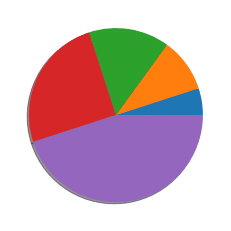
円の左下にわずかながら影ができているのが分かりますでしょうか?
explodeで各グラフ領域を離した場合、切り口にも影が付きます。
from matplotlib import pyplot as plt
%matplotlib inline

fig = plt.figure()
plt.clf()

x = [5, 10, 15, 25, 45]

plt.pie(x, explode=[0.1, 0.1, 0.1, 0.1, 0.1], shadow=True)

実行結果
([<matplotlib.patches.Wedge at 0x7fa60dac4390>,
  <matplotlib.patches.Wedge at 0x7fa60dac4750>,
  <matplotlib.patches.Wedge at 0x7fa60dac4cd0>,
  <matplotlib.patches.Wedge at 0x7fa60db145d0>,
  <matplotlib.patches.Wedge at 0x7fa60db20890>],
 [Text(1.1852260082747719, 0.18772136082249874, ''),
  Text(0.9708203866460458, 0.7053423118404443, ''),
  Text(0.18772131920917332, 1.1852260148656746, ''),
  Text(-1.0692078570797745, 0.5447885446289016, ''),
  Text(0.18772137469360742, -1.185226006077804, '')])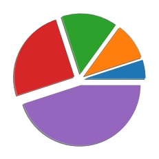
円グラフの開始の角度:startangle
円グラフの開始の角度を変更するには、「startagnle」を使います。
一番最初のグラフ領域を上にするにはこのstartangleを「90」と指定します。
from matplotlib import pyplot as plt
%matplotlib inline

fig = plt.figure()
plt.clf()

x = [5, 10, 15, 25, 45]

plt.pie(x, startangle=90)

実行結果
([<matplotlib.patches.Wedge at 0x7fa60dbac890>,
  <matplotlib.patches.Wedge at 0x7fa60dbacb90>,
  <matplotlib.patches.Wedge at 0x7fa60dbacf10>,
  <matplotlib.patches.Wedge at 0x7fa60dbb9510>,
  <matplotlib.patches.Wedge at 0x7fa60dbc4190>],
 [Text(-0.1720779140872905, 1.0864571742518743, ''),
  Text(-0.6465637858537403, 0.8899186877588755, ''),
  Text(-1.086457180293535, 0.1720778759417423, ''),
  Text(-0.49938949924316023, -0.9801072023231264, ''),
  Text(1.086457172237987, 0.17207792680247339, '')])
円グラフの半径を変更:radius
円グラフの半径を変更するには「radius」を使います。
通常の半径が1なので、半径を2倍にしたい場合はこのradiusを「2」とします。
from matplotlib import pyplot as plt
%matplotlib inline

fig = plt.figure()
plt.clf()

x = [5, 10, 15, 25, 45]

plt.pie(x, radius=2)

実行結果
([<matplotlib.patches.Wedge at 0x7fa60dc45e50>,
  <matplotlib.patches.Wedge at 0x7fa60dc52190>,
  <matplotlib.patches.Wedge at 0x7fa60dc52510>,
  <matplotlib.patches.Wedge at 0x7fa60dc52ad0>,
  <matplotlib.patches.Wedge at 0x7fa60dc5b750>],
 [Text(2.1729143485037485, 0.344155828174581, ''),
  Text(1.7798373755177506, 1.2931275717074813, ''),
  Text(0.3441557518834844, 2.17291436058707, ''),
  Text(-1.9602144046462533, 0.9987789984863196, ''),
  Text(0.34415585360494694, -2.172914344475974, '')])
グラフの並ぶ方向を変更:counterclock
グラフの並ぶ方向を変更するには「counterclock」を用います。
counterclockは英語で「反時計回り」で、このオプションのデフォルトは「True」となっています。
そのため、これまでのグラフは全部反時計回りに出力されていました。
時計回りに出力するには、「counterclock = False」とします。
from matplotlib import pyplot as plt
%matplotlib inline

fig = plt.figure()
plt.clf()

x = [5, 10, 15, 25, 45]

plt.pie(x, counterclock=False)

実行結果
([<matplotlib.patches.Wedge at 0x7fa60dd3c3d0>,
  <matplotlib.patches.Wedge at 0x7fa60dd3c6d0>,
  <matplotlib.patches.Wedge at 0x7fa60dd3ca50>,
  <matplotlib.patches.Wedge at 0x7fa60dd46050>,
  <matplotlib.patches.Wedge at 0x7fa60dd46c90>],
 [Text(1.0864571742518743, -0.1720779140872905, ''),
  Text(0.8899186877588753, -0.6465637858537406, ''),
  Text(0.1720778759417422, -1.086457180293535, ''),
  Text(-0.9801072023231266, -0.4993894992431598, ''),
  Text(0.17207792680247347, 1.086457172237987, '')])
グラフ領域の線の変更:wedgeprops
グラフ領域の囲線を変更するには、「wedgeprops」を使います。
指定の方法は前回紹介した「textprops」と似ています。
線の太さを「5」と色を「黒」と指定する場合は、「wedgeprops = {‘linewidth’: 5, ‘edgecolor’:”black”}」とします。
from matplotlib import pyplot as plt
%matplotlib inline

fig = plt.figure()
plt.clf()

x = [5, 10, 15, 25, 45]

plt.pie(x, wedgeprops = {'linewidth': 5, 'edgecolor':"black"})

実行結果
([<matplotlib.patches.Wedge at 0x7fa60ddd1b50>,
  <matplotlib.patches.Wedge at 0x7fa60ddd1e50>,
  <matplotlib.patches.Wedge at 0x7fa60dddd210>,
  <matplotlib.patches.Wedge at 0x7fa60dddd7d0>,
  <matplotlib.patches.Wedge at 0x7fa60dde9450>],
 [Text(1.0864571742518743, 0.1720779140872905, ''),
  Text(0.8899186877588753, 0.6465637858537406, ''),
  Text(0.1720778759417422, 1.086457180293535, ''),
  Text(-0.9801072023231266, 0.4993894992431598, ''),
  Text(0.17207792680247347, -1.086457172237987, '')])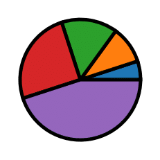
線を付けると一気に雰囲気が変わるので、色々試してみるといいかもしれません。
残りのオプションとしては「center」と「frame」があるようなのですが、使ってみたところ、何が変わっているのか、使う場面があるのかよく分からなかったので解説は割愛します。
これで円グラフを色々と操れるようになったかと思います。
次回からはまた機械学習に戻り、新しいデータセットを試していきましょう。
ということで今回はこんな感じで。
コメント