目次
matplotlib
前回、matplotlibで二つのグラフの間を塗りつぶす「fill_between」の解説をしました。
あわせて読みたい
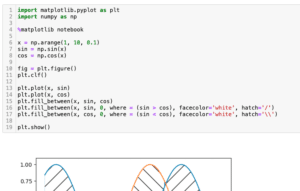
【matplotlib】二つのグラフの間を塗りつぶす方法:fill_between[Python]
matplotlib 前回、matplotlibのplt.savefig()で真っ白なグラフが保存される場合の対処法を解説しました。 今回もmatplitlibの話題で、二つのグラフの間を塗りつぶす「fi…
今回はmatplotlibのグラフで自動で使われる標準的な色を手動で設定する方法を解説していきます。
matplotlibでは複数のデータがある場合、色を自動で設定し、出力してくれます。
例えばこんな感じ。
import matplotlib.pyplot as plt

x1 = range(10)

y1_1 = [1 for _ in x1]
y1_2 = [2 for _ in x1]
y1_3 = [3 for _ in x1]
y1_4 = [4 for _ in x1]
y1_5 = [5 for _ in x1]
y1_6 = [6 for _ in x1]
y1_7 = [7 for _ in x1]
y1_8 = [8 for _ in x1]
y1_9 = [9 for _ in x1]
y1_10 = [10 for _ in x1]

fig = plt.figure()
plt.clf()

plt.plot(x1, y1_1, linewidth=5)
plt.plot(x1, y1_2, linewidth=5)
plt.plot(x1, y1_3, linewidth=5)
plt.plot(x1, y1_4, linewidth=5)
plt.plot(x1, y1_5, linewidth=5)
plt.plot(x1, y1_6, linewidth=5)
plt.plot(x1, y1_7, linewidth=5)
plt.plot(x1, y1_8, linewidth=5)
plt.plot(x1, y1_9, linewidth=5)
plt.plot(x1, y1_10, linewidth=5)

plt.show()

実行結果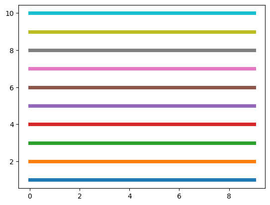
このように10個のデータまでなら、色被りせず自動で色を設定してくれます。
11個以上になるとこの色のパターンの繰り返しになります。
ただグラフの作り方によっては色を手動で設定する必要があることがあります。
その際、大体の感覚で色を指定してみても、同じ色にならなくて困ったというのが今回の話の発端です。
例えばこんな感じ。
import matplotlib.pyplot as plt

x1 = range(10)

y1_1 = [1 for _ in x1]
y1_2 = [2 for _ in x1]
y1_3 = [3 for _ in x1]
y1_4 = [4 for _ in x1]
y1_5 = [5 for _ in x1]
y1_6 = [6 for _ in x1]
y1_7 = [7 for _ in x1]
y1_8 = [8 for _ in x1]
y1_9 = [9 for _ in x1]
y1_10 = [10 for _ in x1]

fig = plt.figure()
plt.clf()

plt.plot(x1, y1_1, linewidth=5)
plt.plot(x1, y1_2, linewidth=5)
plt.plot(x1, y1_3, linewidth=5)
plt.plot(x1, y1_4, linewidth=5)
plt.plot(x1, y1_5, linewidth=5)
plt.plot(x1, y1_6, linewidth=5)
plt.plot(x1, y1_7, linewidth=5)
plt.plot(x1, y1_8, linewidth=5)
plt.plot(x1, y1_9, linewidth=5)
plt.plot(x1, y1_10, linewidth=5)

x2 = range(11,20)

y2_1 = [1 for _ in x2]
y2_2 = [2 for _ in x2]
y2_3 = [3 for _ in x2]
y2_4 = [4 for _ in x2]
y2_5 = [5 for _ in x2]
y2_6 = [6 for _ in x2]
y2_7 = [7 for _ in x2]
y2_8 = [8 for _ in x2]
y2_9 = [9 for _ in x2]
y2_10 = [10 for _ in x2]

plt.plot(x2, y2_1, linewidth=5, color='blue')
plt.plot(x2, y2_2, linewidth=5, color='orange')
plt.plot(x2, y2_3, linewidth=5, color='green')
plt.plot(x2, y2_4, linewidth=5, color='red')
plt.plot(x2, y2_5, linewidth=5, color='purple')
plt.plot(x2, y2_6, linewidth=5, color='brown')
plt.plot(x2, y2_7, linewidth=5, color='magenta')
plt.plot(x2, y2_8, linewidth=5, color='gray')
plt.plot(x2, y2_9, linewidth=5, color='yellow')
plt.plot(x2, y2_10, linewidth=5, color='cyan')

plt.show()

実行結果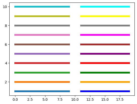
左側が自動で出力した色、右側は色を名前で指定して出力した色です。
自動で出力した色の方が全体的に落ち着いた色となっているのが分かると思います。
これを出力するにはどうしたらいいかというわけです。
名前で指定する方法
まずは名前で指定する方法です。
名前で指定する場合、「tab:色名」という形で指定するとほとんどの色が自動で出力した色と同じ色になります。
ただ一つ、黄色に関しては「tab:olive」という馴染みにない名前になっています。
import matplotlib.pyplot as plt

x1 = range(10)

y1_1 = [1 for _ in x1]
y1_2 = [2 for _ in x1]
y1_3 = [3 for _ in x1]
y1_4 = [4 for _ in x1]
y1_5 = [5 for _ in x1]
y1_6 = [6 for _ in x1]
y1_7 = [7 for _ in x1]
y1_8 = [8 for _ in x1]
y1_9 = [9 for _ in x1]
y1_10 = [10 for _ in x1]

fig = plt.figure()
plt.clf()

plt.plot(x1, y1_1, linewidth=5)
plt.plot(x1, y1_2, linewidth=5)
plt.plot(x1, y1_3, linewidth=5)
plt.plot(x1, y1_4, linewidth=5)
plt.plot(x1, y1_5, linewidth=5)
plt.plot(x1, y1_6, linewidth=5)
plt.plot(x1, y1_7, linewidth=5)
plt.plot(x1, y1_8, linewidth=5)
plt.plot(x1, y1_9, linewidth=5)
plt.plot(x1, y1_10, linewidth=5)

x2 = range(11,20)

y2_1 = [1 for _ in x2]
y2_2 = [2 for _ in x2]
y2_3 = [3 for _ in x2]
y2_4 = [4 for _ in x2]
y2_5 = [5 for _ in x2]
y2_6 = [6 for _ in x2]
y2_7 = [7 for _ in x2]
y2_8 = [8 for _ in x2]
y2_9 = [9 for _ in x2]
y2_10 = [10 for _ in x2]

plt.plot(x2, y2_1, linewidth=5, color='tab:blue')
plt.plot(x2, y2_2, linewidth=5, color='tab:orange')
plt.plot(x2, y2_3, linewidth=5, color='tab:green')
plt.plot(x2, y2_4, linewidth=5, color='tab:red')
plt.plot(x2, y2_5, linewidth=5, color='tab:purple')
plt.plot(x2, y2_6, linewidth=5, color='tab:brown')
plt.plot(x2, y2_7, linewidth=5, color='tab:pink')
plt.plot(x2, y2_8, linewidth=5, color='tab:gray')
plt.plot(x2, y2_9, linewidth=5, color='tab:olive')
plt.plot(x2, y2_10, linewidth=5, color='tab:cyan')

plt.show()

実行結果
カラーコードで指定する方法
次に「#ffffff」のようなカラーコードで指定する方法です。
後で一覧をまとめますが、とりあえずプログラムはこんな感じ。
import matplotlib.pyplot as plt

x1 = range(10)

y1_1 = [1 for _ in x1]
y1_2 = [2 for _ in x1]
y1_3 = [3 for _ in x1]
y1_4 = [4 for _ in x1]
y1_5 = [5 for _ in x1]
y1_6 = [6 for _ in x1]
y1_7 = [7 for _ in x1]
y1_8 = [8 for _ in x1]
y1_9 = [9 for _ in x1]
y1_10 = [10 for _ in x1]

fig = plt.figure()
plt.clf()

plt.plot(x1, y1_1, linewidth=5)
plt.plot(x1, y1_2, linewidth=5)
plt.plot(x1, y1_3, linewidth=5)
plt.plot(x1, y1_4, linewidth=5)
plt.plot(x1, y1_5, linewidth=5)
plt.plot(x1, y1_6, linewidth=5)
plt.plot(x1, y1_7, linewidth=5)
plt.plot(x1, y1_8, linewidth=5)
plt.plot(x1, y1_9, linewidth=5)
plt.plot(x1, y1_10, linewidth=5)

x2 = range(11,20)

y2_1 = [1 for _ in x2]
y2_2 = [2 for _ in x2]
y2_3 = [3 for _ in x2]
y2_4 = [4 for _ in x2]
y2_5 = [5 for _ in x2]
y2_6 = [6 for _ in x2]
y2_7 = [7 for _ in x2]
y2_8 = [8 for _ in x2]
y2_9 = [9 for _ in x2]
y2_10 = [10 for _ in x2]

plt.plot(x2, y2_1, linewidth=5, color='#1f77b4')
plt.plot(x2, y2_2, linewidth=5, color='#ff7f0e')
plt.plot(x2, y2_3, linewidth=5, color='#2ca02c')
plt.plot(x2, y2_4, linewidth=5, color='#d62728')
plt.plot(x2, y2_5, linewidth=5, color='#9467bd')
plt.plot(x2, y2_6, linewidth=5, color='#8c564b')
plt.plot(x2, y2_7, linewidth=5, color='#e377c2')
plt.plot(x2, y2_8, linewidth=5, color='#7f7f7f')
plt.plot(x2, y2_9, linewidth=5, color='#bcbd22')
plt.plot(x2, y2_10, linewidth=5, color='#17becf')

plt.show()

実行結果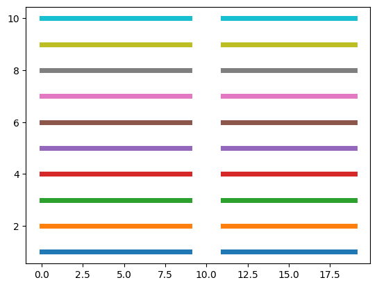
まとめ
一覧にしてみるとこんな感じです。
| インデックス | 色名 | カラーコード |
| 0 | tab:blue | #1f77b4 |
| 1 | tab:orange | #ff7f0e |
| 2 | tab:green | #2ca02c |
| 3 | tab:red | #d62728 |
| 4 | tab:purple | #9467bd |
| 5 | tab:brown | #8c564b |
| 6 | tab:pink | #e377c2 |
| 7 | tab:gray | #7f7f7f |
| 8 | tab:olive | #bcbd22 |
| 9 | tab:cyan | #17becf |
これでmatplotlibの標準色を手動で設定できるようになりました。
次回はカラーマップを使って複数のグラフの色を自動で設定する方法を紹介します。
あわせて読みたい
【matplotlib】カラーマップを使って複数のグラフの色を自動(グラデーションなど)で被らないように設…
matplotlib 前回、matplotlibの標準の色を手動で設定する方法を解説しました。 今回はmatplotlibでカラーマップを使って複数のグラフの色を自動(グラデーションなど)…
ではでは今回はこんな感じで。
コメント