matplotlib
前回、matplotlibのplt.savefig()で真っ白なグラフが保存される場合の対処法を解説しました。
今回もmatplitlibの話題で、二つのグラフの間を塗りつぶす「fill_between」を紹介します。
ということでまずは塗りつぶしを試すための二つのグラフをこんな感じで準備しました。
import matplotlib.pyplot as plt
import numpy as np

%matplotlib notebook

x = np.arange(1, 10, 0.1)
sin = np.sin(x)
cos = np.cos(x)

fig = plt.figure()
plt.clf()

plt.plot(x, sin)
plt.plot(x, cos)

plt.show()

実行結果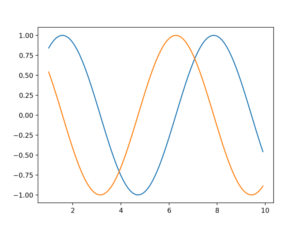
準備したのは「numpy」を使って作成したサイン波(np.sin()) とコサイン派(np.cos())です。
それではこの二つのグラフの間を塗りつぶしてみましょう。
二つのグラフの間を塗りつぶす:fill_between
二つのグラフの間を塗りつぶすには「fill.between(軸の方向, グラフ1, グラフ2)」を使います。
ということでこんな感じ。
import matplotlib.pyplot as plt
import numpy as np

%matplotlib notebook

x = np.arange(1, 10, 0.1)
sin = np.sin(x)
cos = np.cos(x)

fig = plt.figure()
plt.clf()

plt.plot(x, sin)
plt.plot(x, cos)
plt.fill_between(x, sin, cos)

plt.show()

実行結果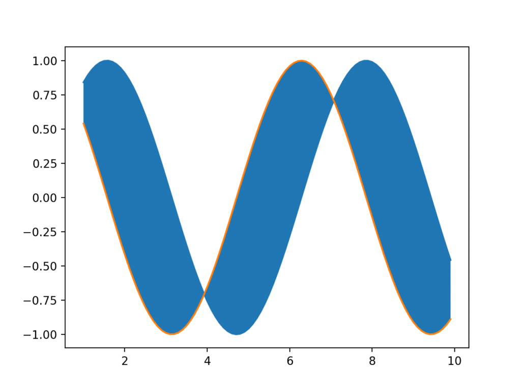
特定の区間だけ塗りつぶす
二つのグラフの間を塗りつぶす際、特定の区間だけ塗りつぶしたいということもあるでしょう。
その場合は「fill.between(軸の方向, グラフ1, グラフ2)」に「where = 条件式」を追加します。
例えば先ほどのグラフで5より小さい区間のみ塗りつぶしたい場合は「where = x < 5」を追加します。
import matplotlib.pyplot as plt
import numpy as np

%matplotlib notebook

x = np.arange(1, 10, 0.1)
sin = np.sin(x)
cos = np.cos(x)

fig = plt.figure()
plt.clf()

plt.plot(x, sin)
plt.plot(x, cos)
plt.fill_between(x, sin, cos, where = x < 5)

plt.show()

実行結果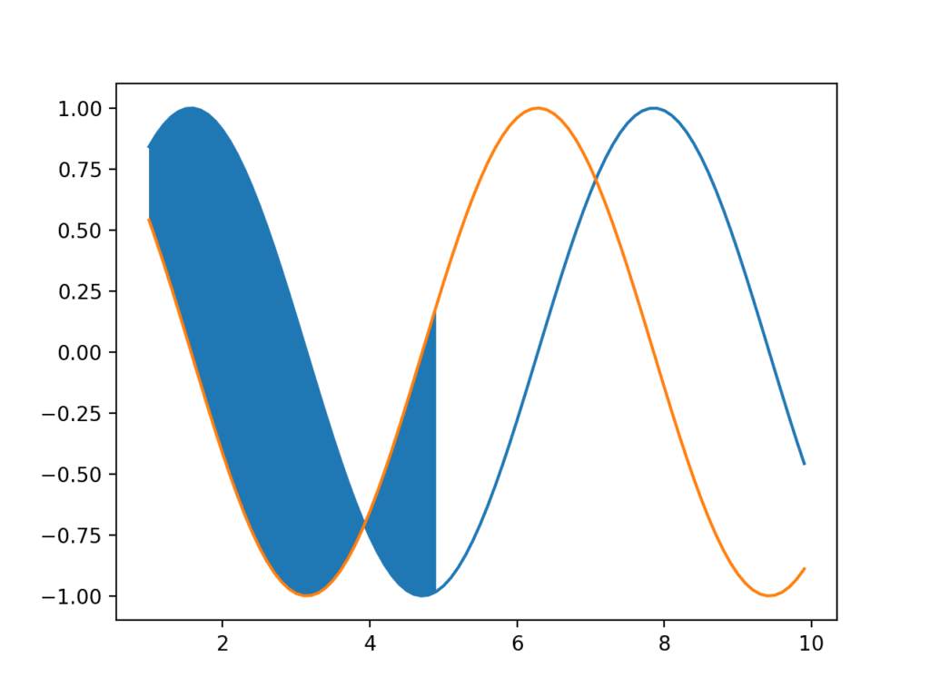
and/orによる範囲指定
塗りつぶす範囲の指定ではand/orを使って範囲を指定することも可能です。
andの場合は「where = (条件1)&(条件2)」とします。
import matplotlib.pyplot as plt
import numpy as np

%matplotlib notebook

x = np.arange(1, 10, 0.1)
sin = np.sin(x)
cos = np.cos(x)

fig = plt.figure()
plt.clf()

plt.plot(x, sin)
plt.plot(x, cos)
plt.fill_between(x, sin, cos, where = (x > 2)&(x < 5))

plt.show()

実行結果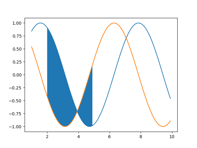
orの場合は「where = (条件1)|(条件2)」とします。
import matplotlib.pyplot as plt
import numpy as np

%matplotlib notebook

x = np.arange(1, 10, 0.1)
sin = np.sin(x)
cos = np.cos(x)

fig = plt.figure()
plt.clf()

plt.plot(x, sin)
plt.plot(x, cos)
plt.fill_between(x, sin, cos, where = (x < 2)|(x > 5))

plt.show()

実行結果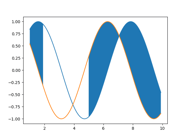
色の指定
塗りつぶす色の指定は「facecolor=’色’」をオプションとして追加します。
import matplotlib.pyplot as plt
import numpy as np

%matplotlib notebook

x = np.arange(1, 10, 0.1)
sin = np.sin(x)
cos = np.cos(x)

fig = plt.figure()
plt.clf()

plt.plot(x, sin)
plt.plot(x, cos)
plt.fill_between(x, sin, cos, facecolor='yellow')

plt.show()

実行結果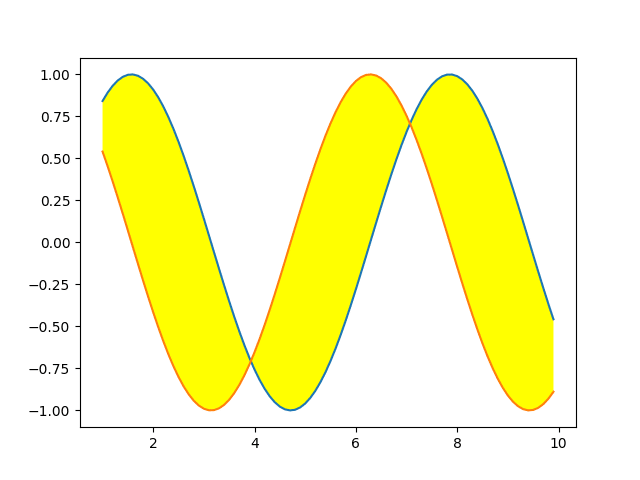
また略称である「fc=’色’」でも指定できます。
import matplotlib.pyplot as plt
import numpy as np

%matplotlib notebook

x = np.arange(1, 10, 0.1)
sin = np.sin(x)
cos = np.cos(x)

fig = plt.figure()
plt.clf()

plt.plot(x, sin)
plt.plot(x, cos)
plt.fill_between(x, sin, cos, fc='cyan')

plt.show()

実行結果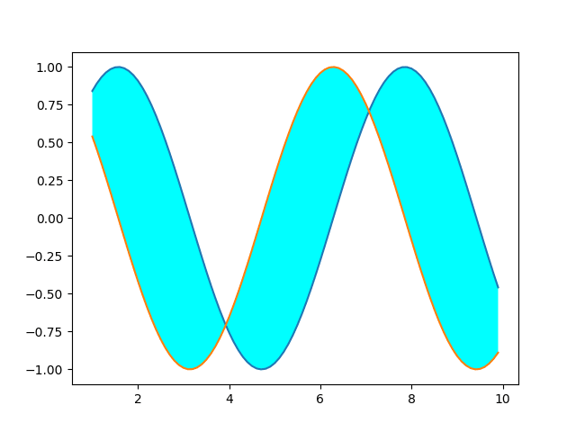
透明化する場合は「alpha=’不透明度’」をオプションに追加します。
値は0〜1で0に近いほど透明に、1に近いほど不透明になります。
import matplotlib.pyplot as plt
import numpy as np

%matplotlib notebook

x = np.arange(1, 10, 0.1)
sin = np.sin(x)
cos = np.cos(x)

fig = plt.figure()
plt.clf()

plt.plot(x, sin)
plt.plot(x, cos)
plt.fill_between(x, sin, cos, fc='cyan', alpha=0.1)

plt.show()

実行結果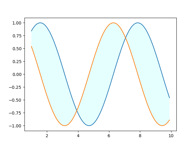
網掛け
塗りつぶす部分には網掛けをすることも可能です。
どんな網掛けができるかはこちらの公式サイトを確認してください。
網掛けを設定するには「hatch=’網掛けの種類’」をオプションに追加します。
import matplotlib.pyplot as plt
import numpy as np

%matplotlib notebook

x = np.arange(1, 10, 0.1)
sin = np.sin(x)
cos = np.cos(x)

fig = plt.figure()
plt.clf()

plt.plot(x, sin)
plt.plot(x, cos)
plt.fill_between(x, sin, cos, hatch='/')

plt.show()

実行結果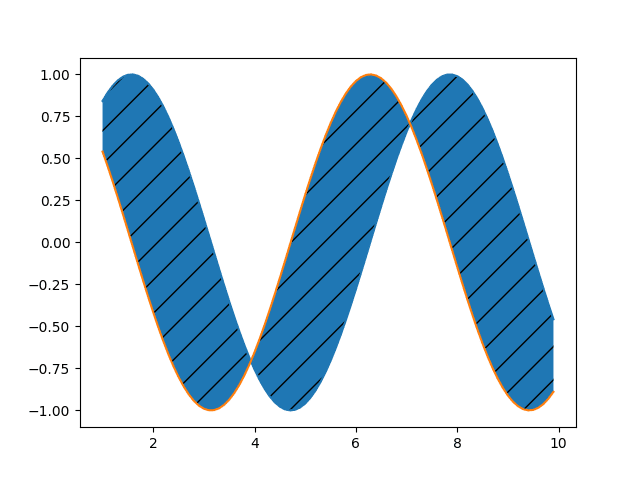
もし網掛けだけにしたい場合は「facecolor=’white’」で背景色を白にします。
import matplotlib.pyplot as plt
import numpy as np

%matplotlib notebook

x = np.arange(1, 10, 0.1)
sin = np.sin(x)
cos = np.cos(x)

fig = plt.figure()
plt.clf()

plt.plot(x, sin)
plt.plot(x, cos)
plt.fill_between(x, sin, cos, hatch='/', facecolor='white')

plt.show()

実行結果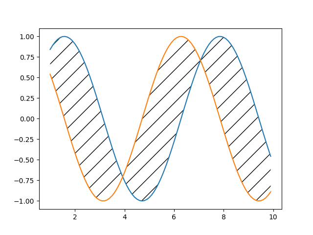
複数の塗りつぶしを組み合わせて表示
グラフでは通常横軸がX軸であり、連続的に変化するのはX軸であるため、「fill_between()」で塗りつぶす軸の方向は必然的にX軸方向になります。
Y軸方向を塗りつぶすために色々やってみたのですが、結局上手くはできませんでした。
で、そのような場合どうするかというと「複数の塗りつぶしを組み合わせて塗りつぶしたい場所を表現する」というのがいいのかなと思います。
そこで例として最初のsin波とcos波のグラフでy<0となるように塗りつぶすということをしてみました。
import matplotlib.pyplot as plt
import numpy as np

%matplotlib notebook

x = np.arange(1, 10, 0.1)
sin = np.sin(x)
cos = np.cos(x)

fig = plt.figure()
plt.clf()

plt.plot(x, sin)
plt.plot(x, cos)
plt.fill_between(x, sin, cos)
plt.fill_between(x, sin, 0, where = (sin > cos), facecolor='white')
plt.fill_between(x, cos, 0, where = (sin < cos), facecolor='white')

plt.show()

実行結果
それぞれ塗りつぶした場所を網掛けで表示してみるとこんな感じです。
import matplotlib.pyplot as plt
import numpy as np

%matplotlib notebook

x = np.arange(1, 10, 0.1)
sin = np.sin(x)
cos = np.cos(x)

fig = plt.figure()
plt.clf()

plt.plot(x, sin)
plt.plot(x, cos)
plt.fill_between(x, sin, cos)
plt.fill_between(x, sin, 0, where = (sin > cos), facecolor='white', hatch='/')
plt.fill_between(x, cos, 0, where = (sin < cos), facecolor='white', hatch='\\')

plt.show()

実行結果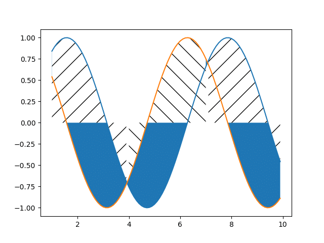
グラフで特定の場所を強調したい場合は結構使えると思うので、ぜひ試してみてください。
次回はmatplotlibnのグラフの標準の色に関して解説していきます。

ではでは今回はこんな感じで。
コメント