データ解析支援ライブラリPandas
前回はデータ解析支援ライブラリPandasで新しくデータフレームを作成する方法を解説しました。
今回はデータをグラフにする方法を解説していきたいと思います。
実はグラフに関しては前に少し解説していたりします。
その際は折れ線グラフだけを紹介していたのですが、他にも散布図や棒グラフ、ヒストグラムも使う機会もあると思うので、もう一度グラフ表示に関してまとめてみようかなと思ったわけです。
ということで準備から行っていきましょう。
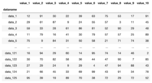
まずデータはダミーデータ作成プログラムで作ったこちらのデータを用います。

ちなみに今回はグラフの表示の仕方に集中するため、欠損値Nanはなしのデータとしました。
ということでPandasで読み込んで、一度表示してみましょう。
ちなみに今回はグラフ表示をするので、pandasだけではなく、matplotlibのpyplotもインポートしておきましょう。
import pandas as pd
from matplotlib import pyplot as plt

df = pd.read_csv("python-pandas-19_data1.txt", index_col = 0)

df

実行結果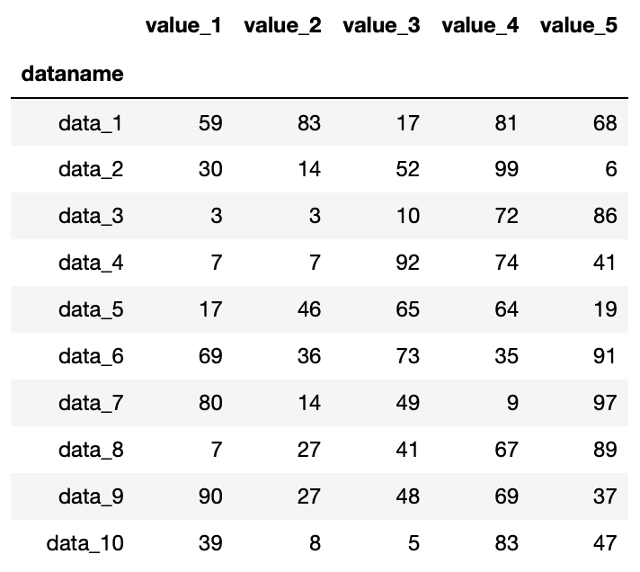
読み込めました。
ではこれでグラフを表示していきましょう。
折れ線グラフを表示する方法:.plot()
まずは一番簡単なグラフ、折れ線グラフを表示してみましょう。
その場合は「データフレーム名.plot()」で表示することができます。
import pandas as pd
from matplotlib import pyplot as plt

df = pd.read_csv("python-pandas-19_data1.txt", index_col = 0)

df.plot()

実行結果
折れ線グラフを表示できました。
他のグラフを表示する方法:.plot(kind=”X”)
他のグラフを表示するには、kindというオプションを使います。
ということで「.plot(kind=”X”)」という形になります。
Xには
- line:折れ線グラフ(オプションを指定しない場合はこれ)
- bar:棒グラフ(縦方向)
- barh:横棒グラフ
- hist:ヒストグラム
- box:ボックスグラフ
- kde:カーネル密度推定グラフ
- density:カーネル密度推定グラフと同様のグラフ
- area:エリアグラフ
- pie:円グラフ
- scatter:散布図
- hexbin:ヘッスクビングラフ
とりあえず一つずつ試してみましょう。
折れ線グラフ:.plot(kind=”line”)
オプションを指定しなくても折れ線グラフは表示できますが、オプションで指定しても同じなのか確認しておきましょう。
import pandas as pd
from matplotlib import pyplot as plt

df = pd.read_csv("python-pandas-19_data1.txt", index_col = 0)

df.plot(kind="line")

実行結果
オプションで指定しない場合と同じグラフが表示されました。
棒グラフ:.plot(kind=”bar”)
次は棒グラフです。
棒グラフの場合はオプションに「kind=”bar”」を追加します。
ということでこんな感じ。
import pandas as pd
from matplotlib import pyplot as plt

df = pd.read_csv("python-pandas-19_data1.txt", index_col = 0)

df.plot(kind="bar")

実行結果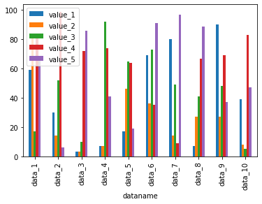
横棒グラフ:.plot(kind=”barh”)
横棒グラフを表示する場合は、「kind=”barh”」を追加します。
import pandas as pd
from matplotlib import pyplot as plt

df = pd.read_csv("python-pandas-19_data1.txt", index_col = 0)

df.plot(kind="barh")

実行結果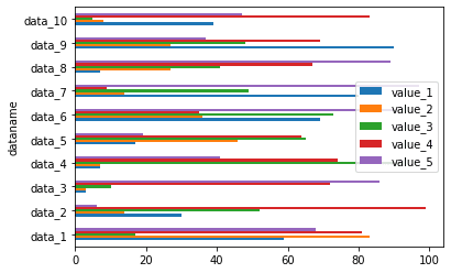
ヒストグラム:.plot(kind=”hist”)、.hist()
ヒストグラムを表示する場合は、オプションに「kind=”hist”」を追加します。
import pandas as pd
from matplotlib import pyplot as plt

df = pd.read_csv("python-pandas-19_data1.txt", index_col = 0)

df.plot(kind="hist")

実行結果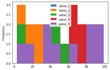
ちなみにヒストグラムに関しては、「データフレーム名.hist()」でも表示することができます。
import pandas as pd
from matplotlib import pyplot as plt

df = pd.read_csv("python-pandas-19_data1.txt", index_col=0)

df.hist()

実行結果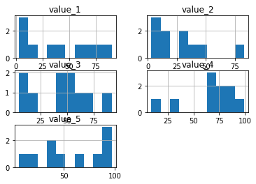
「.hist()」とするとそれぞれの列のデータがバラバラに表示されるようです。
ボックスグラフ:.plot(kind=”box”)
次はボックスグラフ。
ボックスグラフと言われるとどんなグラフかイメージできないかもしれませんが、株価を表示する、日本語だと箱ひげ図と呼ばれるグラフです。
ボックスグラフを表示するには、オプションに「kind=”box”」を追加します。
import pandas as pd
from matplotlib import pyplot as plt

df = pd.read_csv("python-pandas-19_data1.txt", index_col = 0)

df.plot(kind="box")

実行結果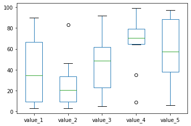
カーネル密度グラフ:.plot(kind=”kde”)
次はカーネル密度グラフというグラフなのですが、ちょっと何に使うか分かりません。
とりあえず表示方法だけ。
カーネル密度グラフを表示する場合は、オプションに「kind=”kde”」を追加します。
import pandas as pd
from matplotlib import pyplot as plt

df = pd.read_csv("python-pandas-19_data1.txt", index_col = 0)

df.plot(kind="kde")

実行結果
できたグラフを見ても、何に使うかよく分かりません。
密度グラフ:.plot(kind=”density”)
こちらのグラフはどうやらカーネル密度グラフとよく似たグラフらしいのですが、やはりこちらもよく分かりません。
こちらもとりあえず表示方法だけ。
ということで密度グラフを表示するにはオプションに「kind=”density”」を追加します。
import pandas as pd
from matplotlib import pyplot as plt

df = pd.read_csv("python-pandas-19_data1.txt", index_col = 0)

df.plot(kind="density")

実行結果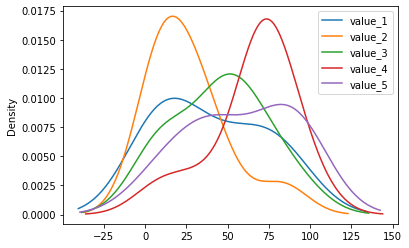
エリアグラフ:.plot(kind=”area”)
次はエリアグラフです。
こちらは見たら分かると思いますので、まずは表示してみましょう。
表示方法はオプションに「kind=”area”」を追加します。
import pandas as pd
from matplotlib import pyplot as plt

df = pd.read_csv("python-pandas-19_data1.txt", index_col = 0)

df.plot(kind="area")

実行結果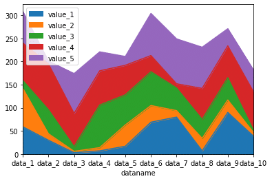
ということでエリアグラフとは累積グラフということでした。
円グラフ:.plot(kind=”pie”)
次は円グラフです。
円グラフを表示するには、オプションに「kind=”pie”」を追加します。
import pandas as pd
from matplotlib import pyplot as plt

df = pd.read_csv("python-pandas-19_data1.txt", index_col=0)

df.plot(kind="pie")

実行結果
---------------------------------------------------------------------------
ValueError                                Traceback (most recent call last)
<ipython-input-22-7cc08cb58218> in <module>
      4 df = pd.read_csv("python-pandas-19_data1.txt", index_col=0)
      5
----> 6 df.plot(kind="pie")

/opt/anaconda3/lib/python3.7/site-packages/pandas/plotting/_core.py in __call__(self, *args, **kwargs)
    745                 if y is None and kwargs.get("subplots") is False:
    746                     msg = "{} requires either y column or 'subplots=True'"
--> 747                     raise ValueError(msg.format(kind))
    748                 elif y is not None:
    749                     if is_integer(y) and not data.columns.holds_integer():

ValueError: pie requires either y column or 'subplots=True'
ここでエラーが出てしまいました。
エラーを見ると「pie requires either y column or ‘subplots=True’」ということで、yの値を追加するか「subplot=True」を追加してくれということでした。
ということで「subplots=True」を足してみましょう。
import pandas as pd
from matplotlib import pyplot as plt

df = pd.read_csv("python-pandas-19_data1.txt", index_col=0)

df.plot(kind="pie", subplots=True)

実行結果
後ろにうっすら円グラフが出ていますが、凡例が大きくなってしまっています。
そのうちに表示の方法に関しても解説をしていきますので、今回はとりあえず表示できたということでOKにしておきましょう。
散布図:.plot(kind=”scatter”, x= “X値の列”, y=”Y値の列”)
次は散布図です。
散布図を表示するにはオプションに「kind=”scatter”」を追加します。
import pandas as pd
from matplotlib import pyplot as plt

df = pd.read_csv("python-pandas-19_data1.txt", index_col=0)

df.plot(kind="scatter")

実行結果
---------------------------------------------------------------------------
ValueError                                Traceback (most recent call last)
<ipython-input-31-37de54a8b958> in <module>
      4 df = pd.read_csv("python-pandas-19_data1.txt", index_col=0)
      5
----> 6 df.plot(kind="scatter")

/opt/anaconda3/lib/python3.7/site-packages/pandas/plotting/_core.py in __call__(self, *args, **kwargs)
    736         if kind in self._dataframe_kinds:
    737             if isinstance(data, ABCDataFrame):
--> 738                 return plot_backend.plot(data, x=x, y=y, kind=kind, **kwargs)
    739             else:
    740                 raise ValueError(

/opt/anaconda3/lib/python3.7/site-packages/pandas/plotting/_matplotlib/__init__.py in plot(data, kind, **kwargs)
     59                 ax = plt.gca()
     60             kwargs["ax"] = getattr(ax, "left_ax", ax)
---> 61     plot_obj = PLOT_CLASSES[kind](data, **kwargs)
     62     plot_obj.generate()
     63     plot_obj.draw()

/opt/anaconda3/lib/python3.7/site-packages/pandas/plotting/_matplotlib/core.py in __init__(self, data, x, y, s, c, **kwargs)
    928             # the handling of this argument later
    929             s = 20
--> 930         super().__init__(data, x, y, s=s, **kwargs)
    931         if is_integer(c) and not self.data.columns.holds_integer():
    932             c = self.data.columns[c]

/opt/anaconda3/lib/python3.7/site-packages/pandas/plotting/_matplotlib/core.py in __init__(self, data, x, y, **kwargs)
    862         MPLPlot.__init__(self, data, **kwargs)
    863         if x is None or y is None:
--> 864             raise ValueError(self._kind + " requires an x and y column")
    865         if is_integer(x) and not self.data.columns.holds_integer():
    866             x = self.data.columns[x]

ValueError: scatter requires an x and y column
実は「kind=”scatter”」をオプションに追加するだけではだめで、X値とY値を指定する必要があります。
ということで「kind=”scatter”, x=”x値の列”, y=”y値の列”」となります。
import pandas as pd
from matplotlib import pyplot as plt

df = pd.read_csv("python-pandas-19_data1.txt", index_col=0)

df.plot(kind="scatter", x="value_1", y="value_2")

実行結果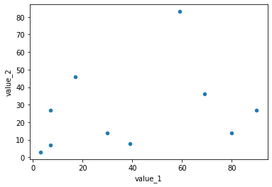
六角形ビニンググラフ:.plot(kind=”hexbin”, x=”X値の列”, y=”Y値の列”)
次は六角形ビニンググラフですが、こちらもX値とY値の指定が必要になります。
そのためオプションに「kind=”hexbin”, x=”X値の列”, y=”Y値の列”」を追加する必要があります。
import pandas as pd
from matplotlib import pyplot as plt

df = pd.read_csv("python-pandas-19_data1.txt", index_col=0)

df.plot(kind="hexbin", x="value_1", y="value_2")

実行結果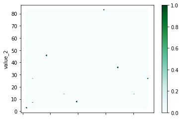
ちなみにX値とY値を指定しないとエラーになります。
import pandas as pd
from matplotlib import pyplot as plt

df = pd.read_csv("python-pandas-19_data1.txt", index_col=0)

df.plot(kind="hexbin")

実行結果
---------------------------------------------------------------------------
ValueError                                Traceback (most recent call last)
<ipython-input-34-b037a64bc373> in <module>
      4 df = pd.read_csv("python-pandas-19_data1.txt", index_col=0)
      5
----> 6 df.plot(kind="hexbin")

/opt/anaconda3/lib/python3.7/site-packages/pandas/plotting/_core.py in __call__(self, *args, **kwargs)
    736         if kind in self._dataframe_kinds:
    737             if isinstance(data, ABCDataFrame):
--> 738                 return plot_backend.plot(data, x=x, y=y, kind=kind, **kwargs)
    739             else:
    740                 raise ValueError(

/opt/anaconda3/lib/python3.7/site-packages/pandas/plotting/_matplotlib/__init__.py in plot(data, kind, **kwargs)
     59                 ax = plt.gca()
     60             kwargs["ax"] = getattr(ax, "left_ax", ax)
---> 61     plot_obj = PLOT_CLASSES[kind](data, **kwargs)
     62     plot_obj.generate()
     63     plot_obj.draw()

/opt/anaconda3/lib/python3.7/site-packages/pandas/plotting/_matplotlib/core.py in __init__(self, data, x, y, C, **kwargs)
    990
    991     def __init__(self, data, x, y, C=None, **kwargs):
--> 992         super().__init__(data, x, y, **kwargs)
    993         if is_integer(C) and not self.data.columns.holds_integer():
    994             C = self.data.columns[C]

/opt/anaconda3/lib/python3.7/site-packages/pandas/plotting/_matplotlib/core.py in __init__(self, data, x, y, **kwargs)
    862         MPLPlot.__init__(self, data, **kwargs)
    863         if x is None or y is None:
--> 864             raise ValueError(self._kind + " requires an x and y column")
    865         if is_integer(x) and not self.data.columns.holds_integer():
    866             x = self.data.columns[x]

ValueError: hexbin requires an x and y column
今回とりあえずPandasのplotで使えるグラフを紹介しました。
1行のコマンドだけでここまでのグラフが表示できるというのは、ざっとデータをみたい時にはいいですね。
ただ軽く見るだけであればこれでいいのですが、グラフのサイズだったり、軸名だったり、まだまだ細かいところに手が届いていない状況です。
そこでここからはグラフの見栄えの変更の仕方を見ていきましょう。
オプション全部紹介すると分かりづらくなってしまうので、使いそうなものに絞って紹介していきます。
グラフのサイズを変える:figsize
まずはグラフのサイズを変えてみましょう。
グラフのサイズを変えるには「figsize=(横のサイズ, 縦のサイズ)」をオプションとして加えます。
import pandas as pd
from matplotlib import pyplot as plt

df = pd.read_csv("python-pandas-19_data1.txt", index_col=0)

df.plot(kind="line", figsize=(5,3))

実行結果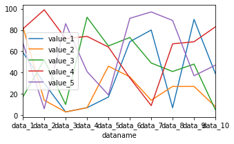
ちょっと小さくしてみました。
今度は大きめにしてみましょう。
import pandas as pd
from matplotlib import pyplot as plt

df = pd.read_csv("python-pandas-19_data1.txt", index_col=0)

df.plot(kind="line", figsize=(10,6))

実行結果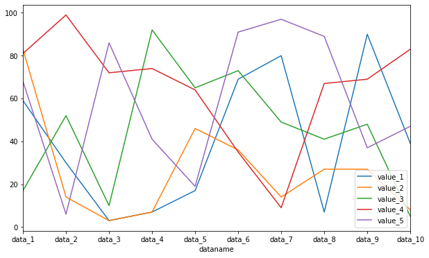
グラフが小さくなってしまったり、重なってしまった場合はこのfigsizeを調整してやることで解決することがあるので試してみてください。
フォントサイズを変更する:fontsize
グラフのフォントサイズを変更するには「fontsize=フォントの大きさ」を用います。
import pandas as pd
from matplotlib import pyplot as plt

df = pd.read_csv("python-pandas-19_data1.txt", index_col=0)

df.plot(kind="line", fontsize=15)

実行結果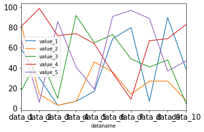
フォントサイズを大きくしたら、X軸の値が重なってしまいました。
X軸の値に角度をつける:rot
先ほどのようにX軸の値が重なってしまった場合、X軸の値に角度をつけると見易くなります。
その場合は「rot=角度」で指定できます。
import pandas as pd
from matplotlib import pyplot as plt

df = pd.read_csv("python-pandas-19_data1.txt", index_col=0)

df.plot(kind="line", fontsize=15, rot=45)

実行結果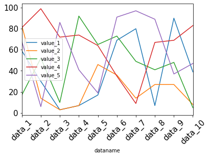
複数のグラフに分割する:subplots, sharex, sharey, layout
これまでは全てのデータを一つのグラフに表示していましたが、それぞれ別のグラフとして表示することも可能です。
その場合はオプションに「subplots=True」を追加します。
import pandas as pd
from matplotlib import pyplot as plt

df = pd.read_csv("python-pandas-19_data1.txt", index_col=0)

df.plot(kind="line", subplots=True)

実行結果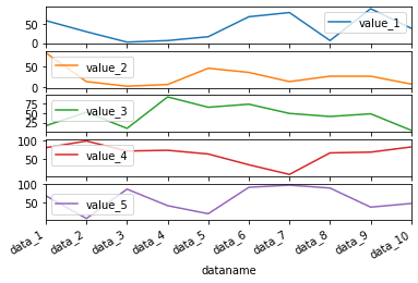
そしてこのsubplotsを使った際に、X軸やY軸を同じ値を使うことも可能です。
その場合はさらにオプションにX軸なら「sharex=True」、Y軸なら「sharey=Ture」を追加しますが、sharexはデフォルトでTrueになっています。
ということで「sharey=True」のみ試してみましょう。
import pandas as pd
from matplotlib import pyplot as plt

df = pd.read_csv("python-pandas-19_data1.txt", index_col=0)

df.plot(kind="line", subplots=True, sharey=True)

実行結果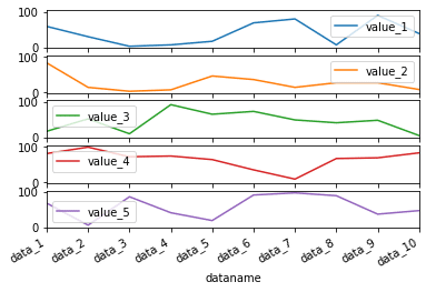
Y軸の数値に注目すると5つ全てのグラフが同じ値になっているのが分かります。
ちなみに上に戻ってもらうと分かるのですが、元々は揃っていませんでした。
またグラフの並びですが、デフォルトでは縦に一列に並んでいます。
これを変更するには「layout=(縦の個数, 横の個数)」をオプションとして追加します。
import pandas as pd
from matplotlib import pyplot as plt

df = pd.read_csv("python-pandas-19_data1.txt", index_col=0)

df.plot(kind="line", subplots=True, layout=(2,3))

実行結果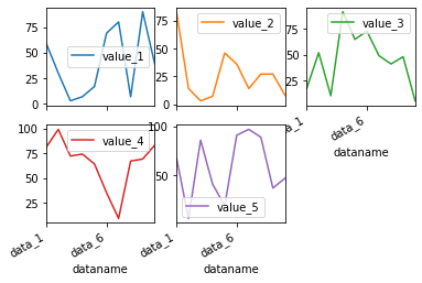
タイトルを表示する:title=”タイトル”
グラフタイトルを表示するには、「title=”タイトル”」を追加します。
import pandas as pd
from matplotlib import pyplot as plt
df = pd.read_csv("python-pandas-19_data1.txt", index_col=0)
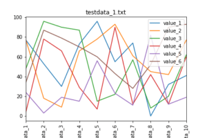
df.plot(kind="line", title="test data")
実行結果
先ほどの「subplots=True」で複数のグラフとして表示した時もこの「title」を使用することができます。
その場合はグラフの数のタイトルをリストとして「title」に渡します。
import pandas as pd
from matplotlib import pyplot as plt

df = pd.read_csv("python-pandas-19_data1.txt", index_col=0)

subtitle = ["A", "B", "C", "D", "E"]

df.plot(kind="line", subplots=True, title=subtitle)

実行結果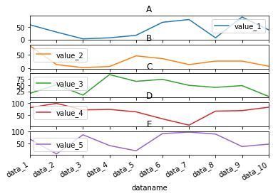
被ってしまっていますが、それぞれのグラフに対してタイトルが設置されました。
グリッドを表示する:grid
グラフにグリッドを表示するには、オプションに「grid=True」とします。
import pandas as pd
from matplotlib import pyplot as plt

df = pd.read_csv("python-pandas-19_data1.txt", index_col=0)

df.plot(kind="line", grid=True)

実行結果
線のスタイルを変更する:style
それぞれの線のスタイルを変更するには、styleのオプションを使います。
その際、複数の線のスタイルを変更するには、リストを用います。
import pandas as pd
from matplotlib import pyplot as plt

df = pd.read_csv("python-pandas-19_data1.txt", index_col=0)

linestyle = ["-", "--", "-.", ":"]

df.plot(kind="line", style=linestyle)

実行結果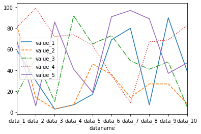
| ラインスタイル | 日本語名 | 英語名 |
|---|---|---|
| – | 実線 | solid |
| — | 破線 | dashed |
| -. | 破線とドット | dashed-dotted |
| : | ドット | dotted |
X軸、Y軸の表示範囲を設定する:xlim、ylim
X軸、Y軸の表示範囲を設定するには、xlim、ylimを用います。
範囲指定にはリスト形式で[最小値,最大値]として指定します。
import pandas as pd
from matplotlib import pyplot as plt

df = pd.read_csv("python-pandas-19_data1.txt", index_col=0)

df.plot(kind="line", xlim=[2,7], ylim=[20,70])

実行結果
グラフの下に表を表示する:table
これはPandas特有の機能かもしれませんが、グラフの下に表を表示することができます。
その場合は「table=表示するデータ」をオプションに追加します。
import pandas as pd
from matplotlib import pyplot as plt

df = pd.read_csv("python-pandas-19_data1.txt", index_col=0)

df.plot(kind="line", table=df)

実行結果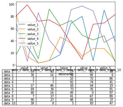
グラフのX軸と表の行が同じになるはずなのにずれてしまっています。
こういう場合は表を転置させましょう。
転置させるには、「データフレーム名.T」とします。
import pandas as pd
from matplotlib import pyplot as plt

df = pd.read_csv("python-pandas-19_data1.txt", index_col=0)

df.plot(kind="line", table=df.T)

実行結果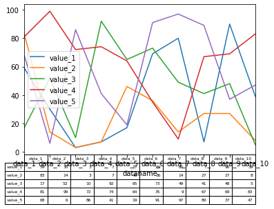
一応表示はできたのですが、X軸と被ってしまっています。
まだまだ色々修正しなければいけなさそうですが、まぁ表示できたのでよしとしましょう。
タイトルを表示する:plt.title(“タイトル”, fontsize=X)
タイトルを表示するには、.plot()より後の行に「plt.title(“タイトル”)」を追加することでタイトルを表示することができます。
また「fontsize=X」を追加することで、タイトルのフォントの大きさを変えることができます。
import pandas as pd
from matplotlib import pyplot as plt

df = pd.read_csv("python-pandas-19_data1.txt", index_col=0)

df.plot(kind="line")

plt.title("title", fontsize=15)

実行結果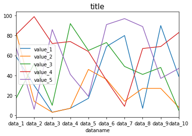
軸名を表示:plt.xlabel(“X軸名”)、plt.ylabel(“Y軸名”)
次はX軸名、Y軸名を追加する方法です。
X軸名を追加するにはplt.xlabel(“X軸名”)、Y軸名を追加するにはplt.ylabel(“Y軸名”)で追加できます。
またオプションに「fontsize=X」を追加することで、それぞれの軸名のフォントサイズを変更することができます。
import pandas as pd
from matplotlib import pyplot as plt

df = pd.read_csv("python-pandas-19_data1.txt", index_col=0)

df.plot(kind="line")

plt.xlabel("xlabel", fontsize=15)
plt.ylabel("ylabel", fontsize=15)

実行結果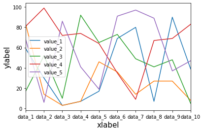
軸の数値のフォントサイズ変更:plt.xticks(fontsize=X)、plt.yticks(fontsize=X)
軸の数値のフォントサイズを変更するには、X軸の場合はplt.xticks(fontsize=X)、Y軸の場合はplt.yticks(fontsize=X)を追加します。
import pandas as pd
from matplotlib import pyplot as plt

df = pd.read_csv("python-pandas-19_data1.txt", index_col=0)

df.plot(kind="line")

plt.xticks(fontsize=15)
plt.yticks(fontsize=15)

実行結果
軸の数値の角度を変更:.plt.xticks(rotation=X)、plt.yticks(rotation=X)
軸の数値の角度を変更するには、X軸の場合はplt.xticks(rotation=X)、Y軸の場合はplt.yticks(rotation=Y)とします。
import pandas as pd
from matplotlib import pyplot as plt

df = pd.read_csv("python-pandas-19_data1.txt", index_col=0)

df.plot(kind="line")

plt.xticks(rotation=45)
plt.yticks(rotation=45)

実行結果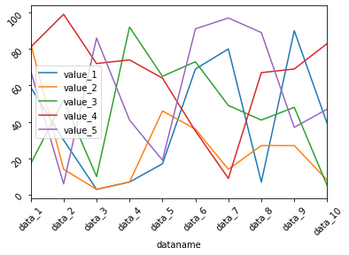
また先ほどの軸のフォントサイズの変更と一緒に使うことも可能です。
import pandas as pd
from matplotlib import pyplot as plt

df = pd.read_csv("python-pandas-19_data1.txt", index_col=0)

df.plot(kind="line")

plt.xticks(fontsize=15, rotation=45)
plt.yticks(fontsize=15, rotation=45)

実行結果
グリッドを表示:plt.grid()
グラフにグリッドを表示するには、plt.grid()を追加します。
import pandas as pd
from matplotlib import pyplot as plt

df = pd.read_csv("python-pandas-19_data1.txt", index_col=0)

df.plot(kind="line")

plt.grid()

実行結果
表示範囲を変更:plt.xlim(値1, 値2)、plt.ylim(値1, 値2)
X軸方向の表示範囲を変更するにはplt.xlim(値1, 値2)、Y軸方向の表示範囲を変更するにはplt.ylim(値1, 値2)とします。
import pandas as pd
from matplotlib import pyplot as plt

df = pd.read_csv("python-pandas-19_data1.txt", index_col=0)

df.plot(kind="line")

plt.xlim(2,8)
plt.ylim(20, 80)

実行結果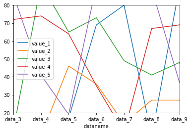
番外編:グラフサイズは変更できない?
前回、Pandasの.plot(figsize=(X, Y))でグラフのサイズを変更できると解説しました。
同じようにグラフサイズを.plot()のオプションではない形でグラフサイズを変更できないか検討してみました。
まずはグラフサイズを設定しない場合のサイズはこちら。
import pandas as pd
from matplotlib import pyplot as plt

df = pd.read_csv("python-pandas-19_data1.txt", index_col=0)

df.plot(kind="line")

実行結果
グラフサイズを設定した場合のサイズはこちら。
import pandas as pd
from matplotlib import pyplot as plt

df = pd.read_csv("python-pandas-19_data1.txt", index_col=0)

df.plot(kind="line", figsize=(8,6))

実行結果
これが違う形で再現できるのか、色々試してみた結果はこんな感じです。
import pandas as pd
from matplotlib import pyplot as plt

df = pd.read_csv("python-pandas-19_data1.txt", index_col=0)

df.plot(kind="line")
plt.figure(figsize=(8,6))

実行結果
import pandas as pd
from matplotlib import pyplot as plt

df = pd.read_csv("python-pandas-19_data1.txt", index_col=0)

df.plot(kind="line")
plt.figsize=(8,6)

実行結果
import pandas as pd
from matplotlib import pyplot as plt

df = pd.read_csv("python-pandas-19_data1.txt", index_col=0)

plt.figure(figsize=(8,6))
df.plot(kind="line")

実行結果
import pandas as pd
from matplotlib import pyplot as plt

df = pd.read_csv("python-pandas-19_data1.txt", index_col=0)

plt.figsize=(8,6)
df.plot(kind="line")

実行結果
とまぁこんな感じでグラフサイズを規定するコマンドを場所とか、書き方とか変えてみたのですが、どうしてもグラフサイズが変わらなかったわけです。
できないことをずっとやっていても仕方ないので、ここら辺にしておきましょう。
ということでグラフサイズを変えるなら「.plot(figsize=(X, Y))」とPandasの.plot()のオプションとして規定するのが間違いがないということでした。
今回のことでPandasの.plot()のオプションとして規定するほうが良い値、別途matplotlibのコマンドとして規定するほうが良い値色々とあることが分かりました。
ここら辺は使う個人が使いやすようにやればいいのかなと思います。
次回はPandasでデータの概要や統計情報を表示する方法を解説していきます。
ではでは今回はこんな感じで。
コメント