plotly
前回、HTML上でインタラクティブなグラフ描写ができるライブラリplotlyでScatterやBarで複数のデータを並べる方法とScatterで散布図を表示する方法を紹介しました。
今回はグラフにタイトルを表示したり、フォントや色、位置を設定する方法を紹介します。
基本となるプログラムはこちら。
import random
import plotly.graph_objects as go

data_points = 100

x_val = [i for i in range(data_points)]
y_val = [random.randrange(100) for _ in range(data_points)]

graph = go.Scatter(x=x_val,y=y_val)

fig = go.Figure(data=graph)

with open('./plotly4-1.txt', 'w') as f:
     f.write(fig.to_html(include_plotlyjs='cdn',full_html=False))

実行結果
それでは始めていきましょう。
レイアウトを設定する方法
まずplotlyでレイアウトを設定する方法ですが、「fig.update_layout(レイアウトの設定)」を用います。
今回、タイトルの表示から、フォントや色、位置の設定全てこの「fig.update_layout(レイアウトの設定)」の中に書いていきます。
ということで早速タイトルの表示をしてみましょう。
タイトルを表示する方法
タイトルを表示するには、「fig.update_layout(title=’グラフのタイトル’)」とします。
import random
import plotly.graph_objects as go
data_points = 100
x_val = [i for i in range(data_points)]
y_val = [random.randrange(100) for _ in range(data_points)]
graph = go.Scatter(x=x_val,y=y_val)
fig = go.Figure(data=graph)
fig.update_layout(title='Graph Title')
with open('./plotly4-2.txt', 'w') as f:
f.write(fig.to_html(include_plotlyjs='cdn',full_html=False))
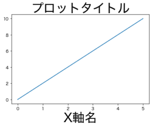
実行結果またタイトルを日本語で表示したい場合は、特に難しい設定なく、そのまま日本語で書けば日本語で表示されます。
import random
import plotly.graph_objects as go

data_points = 100

x_val = [i for i in range(data_points)]
y_val = [random.randrange(100) for _ in range(data_points)]

graph = go.Scatter(x=x_val,y=y_val)

fig = go.Figure(data=graph)

fig.update_layout(title='グラフタイトル')

with open('./plotly4-3.txt', 'w') as f:
     f.write(fig.to_html(include_plotlyjs='cdn',full_html=False))

実行結果
出力がHTMLなので考えてみれば当たり前なのですが、matplotlibで日本語を使うのはなかなか苦労したので、これだけ簡単に出てくれると助かりますね。
タイトルを太字やイタリックにする方法
タイトルを目立つように太字やイタリックにしたいこともあることでしょう。
太字にする場合はタイトルの文字列を「<b>グラフタイトル</b>」のようにします。
この書き方はHTMLの書き方ですね。
import random
import plotly.graph_objects as go

data_points = 100

x_val = [i for i in range(data_points)]
y_val = [random.randrange(100) for _ in range(data_points)]

graph = go.Scatter(x=x_val,y=y_val)

fig = go.Figure(data=graph)

fig.update_layout(title='<b>グラフタイトル</b>')

with open('./plotly4-4.txt', 'w') as f:
     f.write(fig.to_html(include_plotlyjs='cdn',full_html=False))

実行結果
イタリックの場合は「<i>グラフタイトル</i>」となります。
import random
import plotly.graph_objects as go

data_points = 100

x_val = [i for i in range(data_points)]
y_val = [random.randrange(100) for _ in range(data_points)]

graph = go.Scatter(x=x_val,y=y_val)

fig = go.Figure(data=graph)

fig.update_layout(title='<i>グラフタイトル</i>')

with open('./plotly4-5.txt', 'w') as f:
     f.write(fig.to_html(include_plotlyjs='cdn',full_html=False))

実行結果
タイトルのフォントや色、サイズを変える方法
タイトルのフォント設定ですが、設定できるフォントは以下の13種類のようです。
“Arial”, “Balto”, “Courier New”, “Droid Sans”, “Droid Serif”, “Droid Sans Mono”, “Gravitas One”, “Old Standard TT”, “Open Sans”, “Overpass”, “PT Sans Narrow”, “Raleway”, “Times New Roman”.
https://plotly.com/python/reference/layout/#layout-title-font
今回は「Times New Roman」を設定してみましょう。
フォントを設定するには辞書型を使い、「title=dict(title=’グラフタイトル’, font=dict(family=’フォント’))」とします。
少し複雑になりましたが、設定項目が複数ある場合は辞書型を使うということを覚えておけばいいのかなと思います。
import random
import plotly.graph_objects as go

data_points = 100

x_val = [i for i in range(data_points)]
y_val = [random.randrange(100) for _ in range(data_points)]

graph = go.Scatter(x=x_val,y=y_val)

fig = go.Figure(data=graph)

fig.update_layout(title=dict(text='Graph Title', font=dict(family='Times New Roman')))

with open('./plotly4-6.txt', 'w') as f:
     f.write(fig.to_html(include_plotlyjs='cdn',full_html=False))

実行結果
次にフォントの大きさを変えてみますが、先ほどfig.update_layoutのtitleにfontの辞書を加え、その中にfamilyを設定しました。
フォントの大きさもfontに関連する項目なので、この中に設定することになり、「font=dict(family=’フォント’, size=フォントサイズ)」とします。
もちろんフォントサイズはint型で指定します。
つまりこんな感じです。
import random
import plotly.graph_objects as go
data_points = 100
x_val = [i for i in range(data_points)]
y_val = [random.randrange(100) for _ in range(data_points)]
graph = go.Scatter(x=x_val,y=y_val)
fig = go.Figure(data=graph)
fig.update_layout(title=dict(text='Graph Title',
font=dict(family='Times New Roman', size=30)))
with open('./plotly4-7.txt', 'w') as f:
f.write(fig.to_html(include_plotlyjs='cdn',full_html=False))
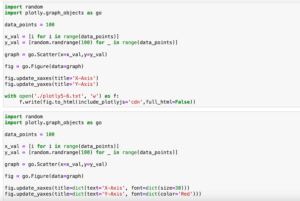
実行結果今度はフォントの色ですが、フォントサイズと同様に設定するので、「font=dict(family=’ファミリー’, size=フォントサイズ, color=’色’)」となります。
import random
import plotly.graph_objects as go

data_points = 100

x_val = [i for i in range(data_points)]
y_val = [random.randrange(100) for _ in range(data_points)]

graph = go.Scatter(x=x_val,y=y_val)

fig = go.Figure(data=graph)

fig.update_layout(title=dict(text='Graph Title',
                             font=dict(family='Times New Roman', size=30, color='Red')))

with open('./plotly4-8.txt', 'w') as f:
     f.write(fig.to_html(include_plotlyjs='cdn',full_html=False))

実行結果
タイトルの位置を変える方法
次にタイトルの位置を変えてみましょう。
タイトルの位置を変更する場合、fontに関する設定ではなく、titleに関する設定であるため、textと同列の場所に「x」、「y」を追加します。
つまり「title=dict(text=’グラフタイトル’, x=X軸方向の相対位置, y=Y軸方向の相対位置)」(fontの項目はここでは関係ないので消してあります)となるわけです。
先ほどのfontの項目を残しつつ書いてみるとこんな感じです。
import random
import plotly.graph_objects as go

data_points = 100

x_val = [i for i in range(data_points)]
y_val = [random.randrange(100) for _ in range(data_points)]

graph = go.Scatter(x=x_val,y=y_val)

fig = go.Figure(data=graph)

fig.update_layout(title=dict(text='Graph Title',
                             font=dict(family='Times New Roman', size=30, color='Red'),
                            x=0.5,
                            y=0.8))

with open('./plotly4-9.txt', 'w') as f:
     f.write(fig.to_html(include_plotlyjs='cdn',full_html=False))

実行結果
基準を変える:xref、yref
先ほどのX軸方面の相対位置、Y軸方面の相対位置ですが、その相対位置の基準は2種類の中から選ぶことができます。
それを設定するオプションが「xref」、「yref」で、設定できる値は以下の通りです。
- グラフエリアに対して = paper
- 画像全体 = container
今回はX軸方向(つまりxref)に対して試してみましょう。
まずは「xref = ‘paper’」、つまりグラフエリアに対してです。
import random
import plotly.graph_objects as go

data_points = 100

x_val = [i for i in range(data_points)]
y1_val = [random.randrange(100) for _ in range(data_points)]
y2_val = [random.randrange(100) for _ in range(data_points)]

graph1 = go.Scatter(x=x_val,y=y1_val)
graph2 = go.Scatter(x=x_val,y=y2_val)

graph=[graph1, graph2]
fig = go.Figure(data=graph)

fig.update_layout(title=dict(text='Graph Title',
                             font=dict(family='Times New Roman', size=30, color='Red'),
                             xref='paper',
                            x=0.5,
                            y=0.8))

with open('./plotly4-10.txt', 'w') as f:
     f.write(fig.to_html(include_plotlyjs='cdn',full_html=False))

実行結果
次は「xref=’container’」 、つまり画像全体に対してです。
import random
import plotly.graph_objects as go

data_points = 100

x_val = [i for i in range(data_points)]
y1_val = [random.randrange(100) for _ in range(data_points)]
y2_val = [random.randrange(100) for _ in range(data_points)]

graph1 = go.Scatter(x=x_val,y=y1_val)
graph2 = go.Scatter(x=x_val,y=y2_val)

graph=[graph1, graph2]
fig = go.Figure(data=graph)

fig.update_layout(title=dict(text='Graph Title',
                             font=dict(family='Times New Roman', size=30, color='Red'),
                             xref='container',
                            x=0.5,
                            y=0.8))

with open('./plotly4-11.txt', 'w') as f:
     f.write(fig.to_html(include_plotlyjs='cdn',full_html=False))

実行結果
「xref=’paper’」(グラフエリア)に対して「xref=’container’」(画像全体)はタイトルがわずかに右にずれているが分かると思います。
ということでグラフタイトルは色々と設定できるようになりました。
次回は軸ラベルに関して色々といじっていきましょう。
ではでは今回はこんな感じで。
コメント