plotly
前回、HTML上でインタラクティブなグラフ描写ができるライブラリplotlyで軸の値の範囲を指定する方法と軸を対数(log)にする方法を解説しました。
今回は左右に2つのY軸をもつグラフや上下に2つのX軸をもつグラフの作成方法を勉強していきます。
それでは始めていきましょう。
左右に2つのY軸をもつグラフ
まずはより使うだろうと思われる左右に2つのY軸をもつグラフの作成方法から勉強していきます。
最初のプログラムはこちら。
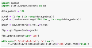
import random
import plotly.graph_objects as go

data_points = 100

x1_val = [i for i in range(data_points)]
y1_val = [random.randrange(100) for _ in range(data_points)]

x2_val = [i for i in range(data_points)]
y2_val = [random.randrange(1000) for _ in range(data_points)]

graph1 = go.Scatter(x=x1_val,y=y1_val)
graph2 = go.Scatter(x=x2_val,y=y2_val)

graph = [graph1, graph2]
fig = go.Figure(data=graph)

with open('./plotly9-1.txt', 'w') as f:
     f.write(fig.to_html(include_plotlyjs='cdn',full_html=False))

実行結果
2つのデータを準備しましたが、1つ目のデータのYの値が0から100の間のランダムな値に対し、2つ目のデータのYの値は0から1000の間のランダムな値になっています。
そこで今回は左のY軸を0から100、右のY軸を0から1000にして、1つ目のデータのY軸を左に、2つ目のデータのY軸を右になるように設定します。
それをしたのがこちら。
import random
import plotly.graph_objects as go

data_points = 100

x1_val = [i for i in range(data_points)]
y1_val = [random.randrange(100) for _ in range(data_points)]

x2_val = [i for i in range(data_points)]
y2_val = [random.randrange(1000) for _ in range(data_points)]

graph1 = go.Scatter(x=x1_val,y=y1_val, yaxis='y1')
graph2 = go.Scatter(x=x2_val,y=y2_val, yaxis='y2')

graph = [graph1, graph2]
fig = go.Figure(data=graph)

fig.update_layout(yaxis1=dict(side='left'), yaxis2=dict(side='right', overlaying = 'y'))

with open('./plotly9-2.txt', 'w') as f:
     f.write(fig.to_html(include_plotlyjs='cdn',full_html=False))

実行結果
まず変更したのが「go.Scatter()」の部分。
2つのデータに対して、それぞれ「yaxis=’y1’」、「yaxis=’y2’」というオプションが追加されています。
graph1 = go.Scatter(x=x1_val,y=y1_val, yaxis='y1')
graph2 = go.Scatter(x=x2_val,y=y2_val, yaxis='y2')
これによりgraph1のY軸は「y1」に分類され、graph2のY軸は「y2」の分類されます。
ちなみにこの時点では「y1」、「y2」がそれぞれ左のY軸、右のY軸に設定されているわけではありません。
その証拠として、位置の設定をしている「fig.update_layout()」なしで実行してみましょう。
import random
import plotly.graph_objects as go

data_points = 100

x1_val = [i for i in range(data_points)]
y1_val = [random.randrange(100) for _ in range(data_points)]

x2_val = [i for i in range(data_points)]
y2_val = [random.randrange(1000) for _ in range(data_points)]

graph1 = go.Scatter(x=x1_val,y=y1_val, yaxis='y1')
graph2 = go.Scatter(x=x2_val,y=y2_val, yaxis='y2')

graph = [graph1, graph2]
fig = go.Figure(data=graph)

with open('./plotly9-3.txt', 'w') as f:
     f.write(fig.to_html(include_plotlyjs='cdn',full_html=False))

実行結果
2つの軸が両方とも左側に表示されてしまいました。
それではそれぞれの軸の位置を設定していきましょう。
軸の位置の設定には「fig.update_layout()」を使います。
「fig.update_layout()」では「yaxis1=dict(side=’left’), yaxis2=dict(side=’right’, overlaying = ‘y’)」が設定されています。
この「yaxis1」が先ほどgo.Scatterで設定した「y1」、「yaxis2」が「y2」と紐づけられています。
そして「yaxis1=dict(side=’left’)」とすることで「y1を左の軸に配置」と位置を設定しています。
また「yaxis2=dict(side=’right’, overlaying = ‘y’)」で「y2」を右の軸に設定していますが、ここではもう一つ「overlaying = ‘y’」が設定されています。
「overlaying = ‘y’」はY軸を2軸にした際に、その2つ目のグラフを1つ目のグラフ上に重ね合わせするためのオプションです。
つまりこれを書かないと、1つ目のデータは表示されなくなります。
試してみましょう。
import random
import plotly.graph_objects as go

data_points = 100

x1_val = [i for i in range(data_points)]
y1_val = [random.randrange(100) for _ in range(data_points)]

x2_val = [i for i in range(data_points)]
y2_val = [random.randrange(1000) for _ in range(data_points)]

graph1 = go.Scatter(x=x1_val,y=y1_val, yaxis='y1')
graph2 = go.Scatter(x=x2_val,y=y2_val, yaxis='y2')

graph = [graph1, graph2]
fig = go.Figure(data=graph)

fig.update_layout(yaxis1=dict(side='left'), yaxis2=dict(side='right'))

with open('./plotly9-4.txt', 'w') as f:
     f.write(fig.to_html(include_plotlyjs='cdn',full_html=False))

実行結果
確かに2つ目のデータのプロットしか表示されなくなりました。
ということで「overlaying = ‘y’」をお忘れなく。
上下に2つのX軸をもつグラフ
次に使う機会はY軸が2軸のグラフと比べると少ないでしょうが、上下に2つのX軸があるグラフを作成してみましょう。
ということで最初のプログラムはこちら。
import random
import plotly.graph_objects as go

data_points = 100

x1_val = [i for i in range(data_points)]
y1_val = [random.randrange(100) for _ in range(data_points)]

x2_val = [i*10 for i in range(data_points)]
y2_val = [random.randrange(100) for _ in range(data_points)]

graph1 = go.Scatter(x=x1_val,y=y1_val)
graph2 = go.Scatter(x=x2_val,y=y2_val)

graph = [graph1, graph2]
fig = go.Figure(data=graph)

with open('./plotly9-5.txt', 'w') as f:
     f.write(fig.to_html(include_plotlyjs='cdn',full_html=False))
2つ目のグラフのX軸の値を10倍することにより、Xの値が異なる2つのグラフを作成しました。
ここからX軸を上下に2軸にするには先ほどのY軸を左右に2軸にした方法とほぼ同じです。
ということでまずは「go.Scatter()」に「xaxis=’x1’」と「xaxis=’x2’」をそれぞれ追加します。
graph1 = go.Scatter(x=x1_val,y=y1_val, xaxis='x1')
graph2 = go.Scatter(x=x2_val,y=y2_val, xaxis='x2')
そして次に「fig.update_layout()」に「xaxis1=dict(side=’top’)」と「xaxis2=dict(side=’bottom’, overlaying = ‘x’)」を追加します。
fig.update_layout(xaxis1=dict(side='top'), xaxis2=dict(side='bottom', overlaying = 'x'))この際、それぞれの軸を表示する場所ですが、上下なので「top」と「bottom」ですのでご注意ください。
これで全体としてはこんな感じになります。
import random
import plotly.graph_objects as go

data_points = 100

x1_val = [i for i in range(data_points)]
y1_val = [random.randrange(100) for _ in range(data_points)]

x2_val = [i*10 for i in range(data_points)]
y2_val = [random.randrange(100) for _ in range(data_points)]

graph1 = go.Scatter(x=x1_val,y=y1_val, xaxis='x1')
graph2 = go.Scatter(x=x2_val,y=y2_val, xaxis='x2')

graph = [graph1, graph2]
fig = go.Figure(data=graph)

fig.update_layout(xaxis1=dict(side='top'), xaxis2=dict(side='bottom', overlaying = 'x'))

with open('./plotly9-6.txt', 'w') as f:
     f.write(fig.to_html(include_plotlyjs='cdn',full_html=False))

実行結果
これで上下に2つのX軸をもつグラフを作成することができました。
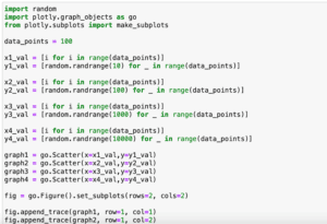
各軸に軸ラベルを設置する方法
2軸グラフが描けるようになったので、各軸ラベルを設置してみましょう。
その場合、「fig.update_layout()」を使い、各軸のオプションに「title」を追加します。
例えばY軸が左右に2軸のグラフの場合こうなります。
import random
import plotly.graph_objects as go

data_points = 100

x1_val = [i for i in range(data_points)]
y1_val = [random.randrange(100) for _ in range(data_points)]

x2_val = [i for i in range(data_points)]
y2_val = [random.randrange(1000) for _ in range(data_points)]

graph1 = go.Scatter(x=x1_val,y=y1_val, yaxis='y1')
graph2 = go.Scatter(x=x2_val,y=y2_val, yaxis='y2')

graph = [graph1, graph2]
fig = go.Figure(data=graph)

fig.update_layout(xaxis=dict(title='X-Axis'),
                  yaxis1=dict(title='Y-Axis1', side='left'),
                  yaxis2=dict(title='Y-Axis2', side='right', overlaying = 'y'))

with open('./plotly9-7.txt', 'w') as f:
     f.write(fig.to_html(include_plotlyjs='cdn',full_html=False))
またX軸が上下に2軸の場合はこのようになります。
import random
import plotly.graph_objects as go

data_points = 100

x1_val = [i for i in range(data_points)]
y1_val = [random.randrange(100) for _ in range(data_points)]

x2_val = [i*10 for i in range(data_points)]
y2_val = [random.randrange(100) for _ in range(data_points)]

graph1 = go.Scatter(x=x1_val,y=y1_val, xaxis='x1')
graph2 = go.Scatter(x=x2_val,y=y2_val, xaxis='x2')

graph = [graph1, graph2]
fig = go.Figure(data=graph)

fig.update_layout(xaxis1=dict(title='X-Axis1', side='top'),
                  xaxis2=dict(title='X-Axis2', side='bottom', overlaying = 'x'),
                  yaxis=dict(title='Y-Axis'))

with open('./plotly9-8.txt', 'w') as f:
     f.write(fig.to_html(include_plotlyjs='cdn',full_html=False))
このように「fig.update_layout()」で軸の番号込みで指定してやることで、その軸のレイアウトを変更することができます。
次回は複数のグラフエリアを表示し、それぞれにグラフをプロットする方法を試してみましょう。
ではでは今回はこんな感じで。
コメント