Matplotlibで二次元リストを画像表示
前回、Matplotlibライブラリのimshowのうち、カラーマップの範囲指定、アスペクト、開始位置を解説しました。
今回は補完(interpolation)というオプションを使ってみたいと思います。
補完とは荒い画像(解像度の低い画像)だと、画像がドット絵みたいに見えますよね。
それをピクセル間の色差をスムーズになるように間の色を挿入して調整することです。
とりあえずやってみるというのが感覚が掴めていいと思いますので、進めていきましょう。
まずはデータの読み込みから。
<セル1>
from sklearn.datasets import load_digits
import matplotlib.pyplot as plt
digits = load_digits()
print(digits.images[0])
実行結果
[[ 0. 0. 5. 13. 9. 1. 0. 0.]
[ 0. 0. 13. 15. 10. 15. 5. 0.]
[ 0. 3. 15. 2. 0. 11. 8. 0.]
[ 0. 4. 12. 0. 0. 8. 8. 0.]
[ 0. 5. 8. 0. 0. 9. 8. 0.]
[ 0. 4. 11. 0. 1. 12. 7. 0.]
[ 0. 2. 14. 5. 10. 12. 0. 0.]
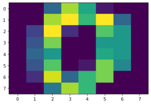
[ 0. 0. 6. 13. 10. 0. 0. 0.]]オプションなしの基本画像の表示。
<セル2>

plt.imshow(digits.images[0])

実行結果
補完の種類
まずはどんな補完があるのか、ヘルプで確認してみましょう。
<セル3>

help(plt.imshow)

実行結果
imshow(X, cmap=None, norm=None, aspect=None, interpolation=None, alpha=None, vmin=None, vmax=None, origin=None, extent=None, shape=<deprecated parameter>, filternorm=1, filterrad=4.0, imlim=<deprecated parameter>, resample=None, url=None, *, data=None, **kwargs)

(中略)

interpolation : str, optional
        The interpolation method used. If *None*, :rc:`image.interpolation`
        is used.

        Supported values are 'none', 'antialiased', 'nearest', 'bilinear',
        'bicubic', 'spline16', 'spline36', 'hanning', 'hamming', 'hermite',
        'kaiser', 'quadric', 'catrom', 'gaussian', 'bessel', 'mitchell',
        'sinc', 'lanczos'.

(以下略)
ということで18種類あるみたいです。
それでは順にどんな画像になるのか試していきましょう。
補完方法全てを試してみる。
18種類も補完方法があるので、とりあえず解説無く、どんどん表示させていきましょう。
none
plt.imshow(digits.images[0], interpolation='none')

実行結果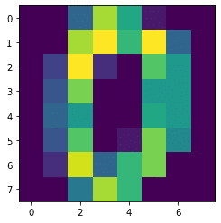
antialiased
plt.imshow(digits.images[0], interpolation='antialiased')

実行結果
nearest
plt.imshow(digits.images[0], interpolation='nearest')

実行結果
bilinear
plt.imshow(digits.images[0], interpolation='bilinear')

実行結果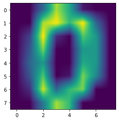
bicubic
plt.imshow(digits.images[0], interpolation='bicubic')

実行結果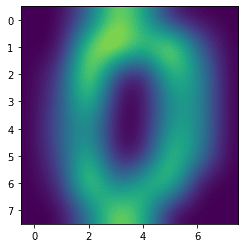
spline16
plt.imshow(digits.images[0], interpolation='spline16')

実行結果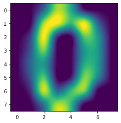
spline36
plt.imshow(digits.images[0], interpolation='spline36')

実行結果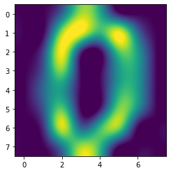
hanning
plt.imshow(digits.images[0], interpolation='hanning')

実行結果
hamming
plt.imshow(digits.images[0], interpolation='hamming')

実行結果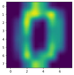
hermite
plt.imshow(digits.images[0], interpolation='hermite')

実行結果
kaiser
plt.imshow(digits.images[0], interpolation='kaiser')

実行結果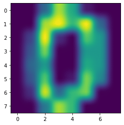
quadric
plt.imshow(digits.images[0], interpolation='quadric')

実行結果
catrom
plt.imshow(digits.images[0], interpolation='catrom')

実行結果
gaussian
plt.imshow(digits.images[0], interpolation='gaussian')

実行結果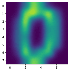
bessel
plt.imshow(digits.images[0], interpolation='bessel')

実行結果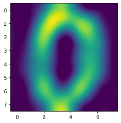
mitchell
plt.imshow(digits.images[0], interpolation='mitchell')

実行結果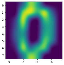
sinc
plt.imshow(digits.images[0], interpolation='sinc')

実行結果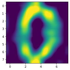
lanczos
plt.imshow(digits.images[0], interpolation='lanczos')

実行結果
Interpolationまとめ
ということで全18種類を表示し終わりました。
最初の方にあった「antialiased」と「nearest」はオプションなしの基本の画像と同じ画像のように見えます。
もしかしたらデータが補完される条件に合わなかったのかもしれません。
他のものに関しては補完されたことにより、全体がボヤけて見える感じになるのですが、その見え方がそれぞれ特徴がありそうです。
ちなみにMatplotlibの公式サイトにも同様に全部の補完オプションを試した図があったので、リンクを貼っておきます。
それぞれ数学的な計算をしてぼやかしていると思うのですが、流石にその計算方法までは調べていません。
18種類しかありませんし、とりあえず出力して画像を見て、自分のイメージに近いオプションを選択するのがいいのかなと思います。
これでとりあえずimshowに関しての解説は終了とします。
次回からはまた手書き数字のデータセットを使った機械学習を試していきたいなと思います。
ではでは今回はこんな感じで。
コメント